If you’re entering the world of color theory and wondering what color is opposite green on the color wheel, the straightforward answer is red. You can easily observe this fundamental concept in color theory on any standard color wheel, where red and green are positioned directly across from each other, indicating their complementary relationship. Understanding this basic principle of complementary colors, such as red being opposite green, is crucial for artists, designers, and anyone interested in color dynamics. The color wheel is a vital tool in visual arts, helping to create color harmony and contrast in various forms of design and art. By studying the color wheel below, you see the direct opposition of red and green, representing this fundamental aspect of color theory.

The Impact of Complementary Colors in Art
Red and green, positioned opposite one another on the color wheel, create an energetic and high contrast effect. This complimentary pair of colors produces striking visual effects. It enhances the overall appeal and energy of the piece. When paired, these colors intensify each other’s brightness, making the artwork more visually engaging. Artists often leverage this understanding of color relationships, particularly the impact of complementary colors. This creates compelling and aesthetically pleasing works.
Vincent van Gogh’s Use of Complementary Colors
Vincent van Gogh’s “The Night Café” is a perfect example of the red/green complementary color scheme in action. In this masterpiece, van Gogh skillfully employs the vivid contrast of red and green to create an emotionally charged atmosphere. The reds and greens, placed adjacently, don’t just coexist; they resonate with each other. It’s as if the colors are singing.
This deliberate color scheme intensifies the scene’s emotional impact, with the warm reds evoking a sense of urgency and unease. At the same time, the cooler greens add a contrasting calmness and stillness. Van Gogh’s use of these complementary colors goes beyond mere aesthetic appeal; it’s a powerful tool to convey the mood and psychological undertones of the setting. The interplay of these colors in “The Night Café” demonstrates van Gogh’s deep understanding of color theory and his ability to use it to evoke strong emotional responses from the viewer.
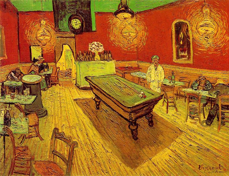
1888
by Vincent Van Gogh
I hope you found this post helpful. Find more posts on color theory here.
Leave a Reply