Enjoy this watercolour tutorial step by step by artist John Fisher.
This is another of a series of free watercolour demonstrations I’ll be posting in the months ahead. These are lengthy and detailed and show how I strive to achieve a high degree of realism in my work.
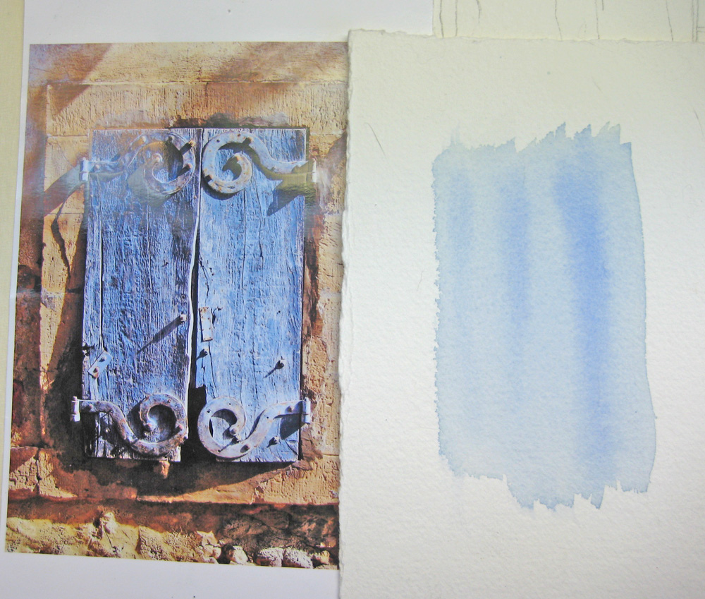
Step 1

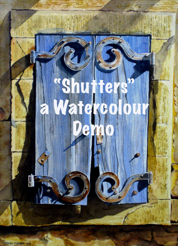
Credit for this beautiful photograph of some shutters somewhere in Portugal must go to Donnah Cameron, www.donnahcameron.com/biography.htm a talented artist and teacher, who lives in Newmarket, Ontario. Image size is 15″ x 11″ on 300 lb Arches, using Winsor & Newton artists quality colours.
Step 2
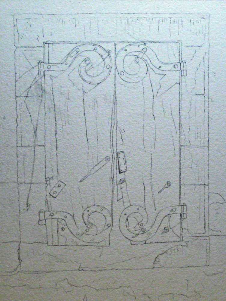
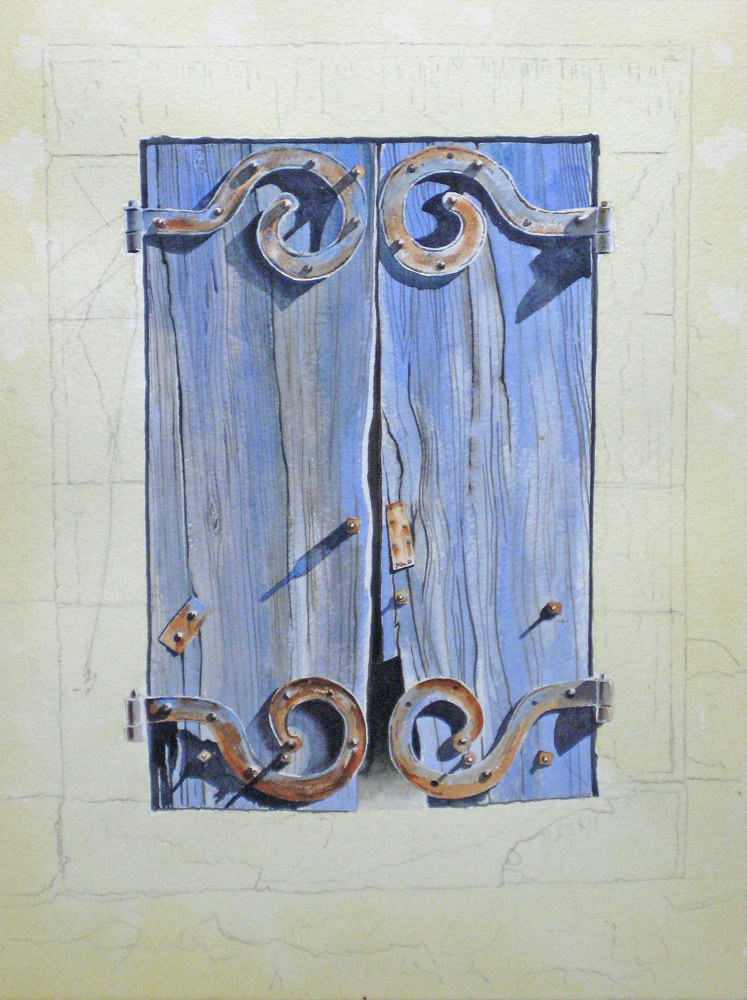
Because I like realism in watercolours I prefer to start off with an accurate drawing using a 4H pencil. This was a complicated project and I needed the security of an accurate drawing as my start in order to complete this watercolour tutorial step by step with confidence.
Step 3

Cobalt Blue seemed match the blue throughout this piece, and after using misket on the protruding nuts and bolts, I worked wet-in-wet with some pure Burnt Sienna, my favourite rust colour.
Step 4
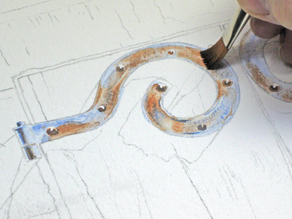
A close-up of blending in the rusty look of my hinges.
Step 5
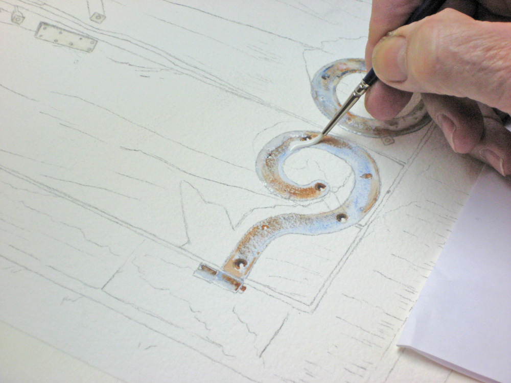
Here I’m masking my hinges with liquid misket before tackling the wood grain areas. In hindsight it would have been easier to have done the wood grain first and thus have a clean white edge to the hinges, but any problems I encountered were easily overcome.
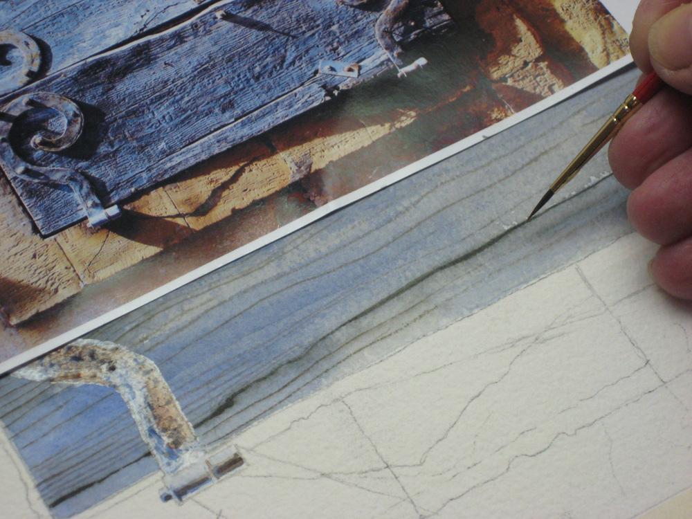
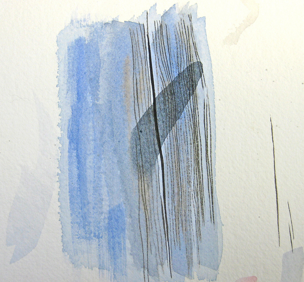
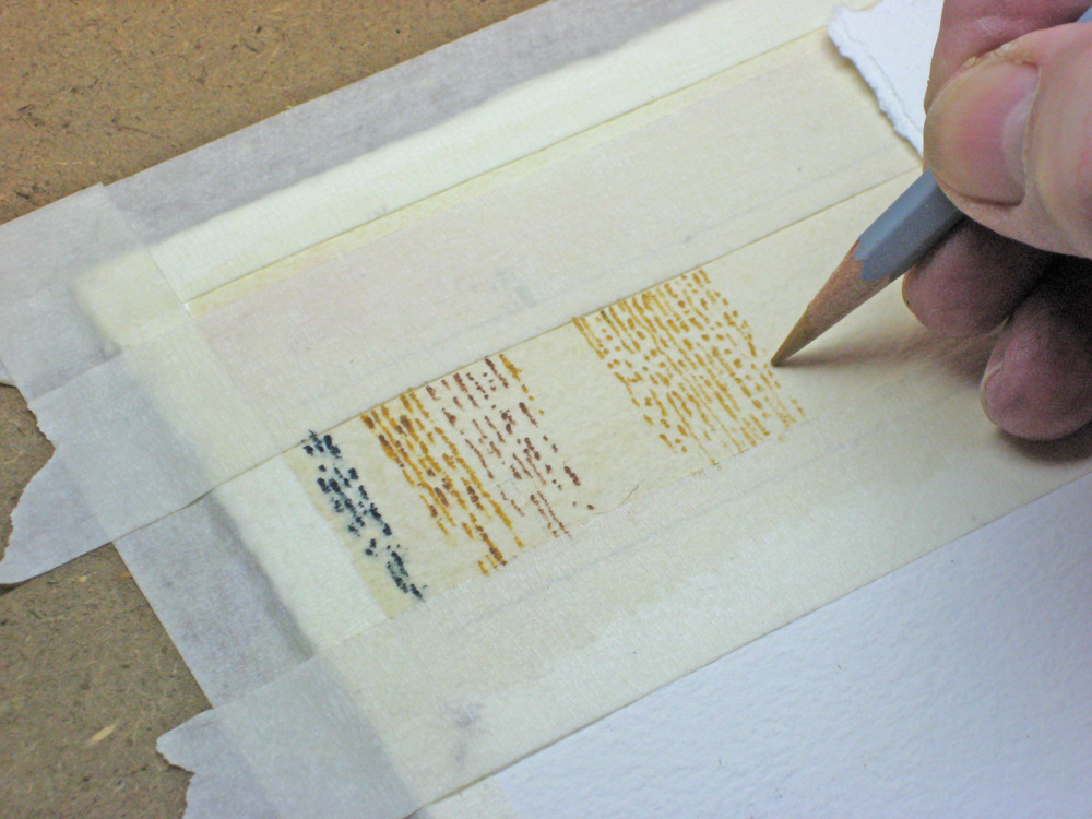
How to tackle the complex wood grain with dramatic slanting sunlight? I had to decide what was colour, what was shadow, and how the two interacted to give this sharply etched wood grain effect. I experimented first on a scrap piece of the same paper (300lb Arches) and worked wet-in-wet with Cobalt Blue with just a touch of Antwerp Blue.
Step 6
Here I’m trying out my basic blue shutter colour on scrap paper first.
Step 7
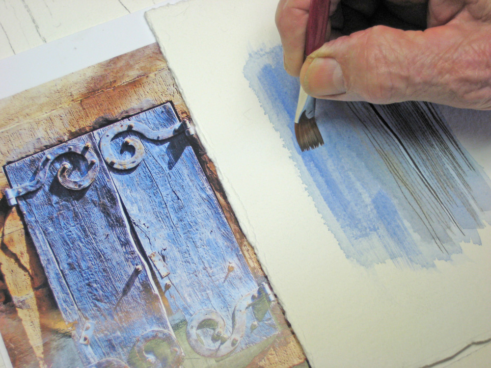
Here I’m working on my scrap paper again, trying to pin down exactly how much contrast I need in those clearly defined cracks. It’s time-consuming, but I feel more at ease working this way. I can make mistakes without ruining an expensive sheet of 300lb Arches, and I can transfer my successful attempts to the final work.
Step 8
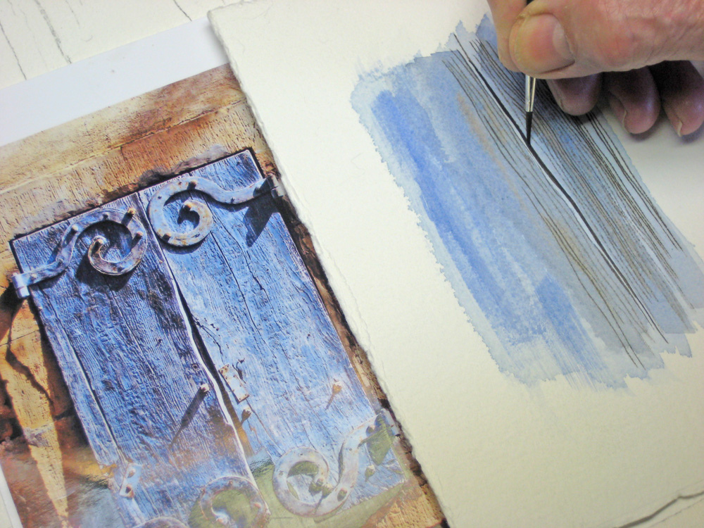
Another close-up in this watercolour tutorial as I experiment with how to get those lovely sun-lit cracks in the wood. I’m using a mixture of Antwerp Blue and Brown Madder for the cracks.
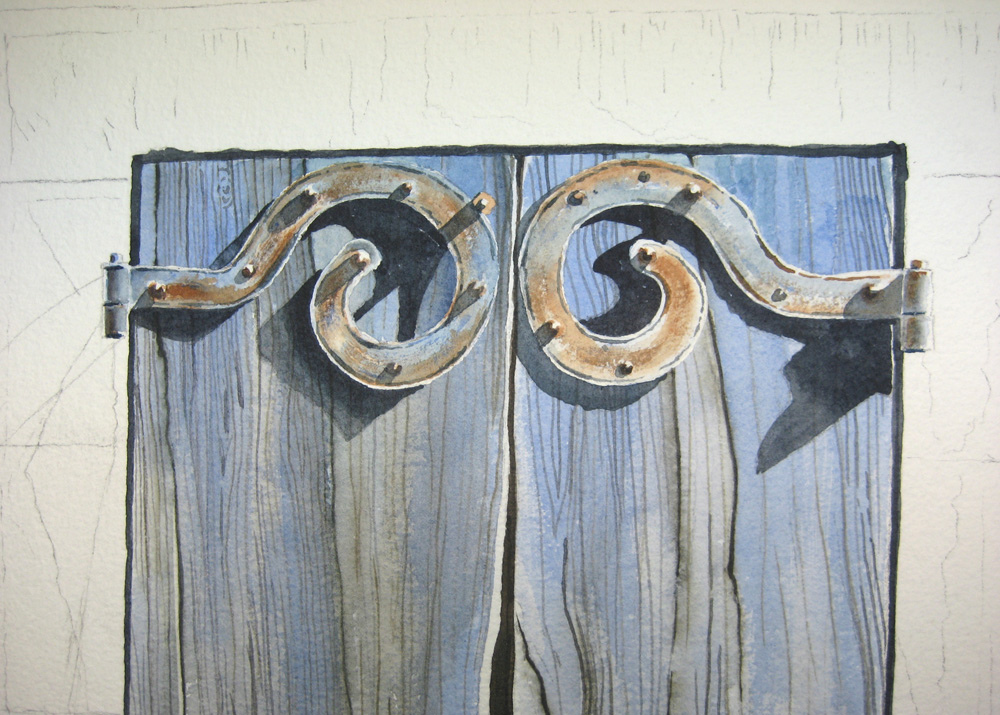
Step 9

The moment of truth! I cover the wood area with a wash of clear water and carefully work in my pure Cobalt Blue wash. The hinge areas are still masked off of course.
Step 10
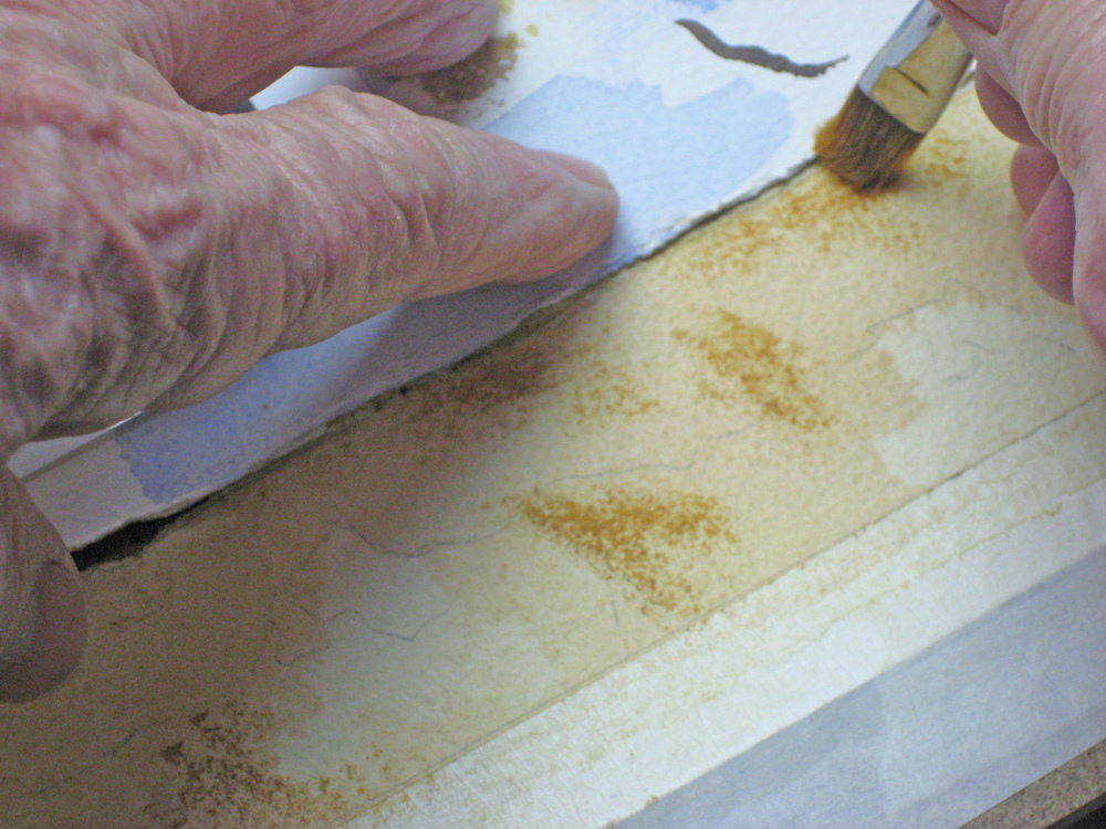
While my wash is still glistening I work wet-in-wet with pure Cobalt Blue to try and achieve that lovely weathered look.
Step 11
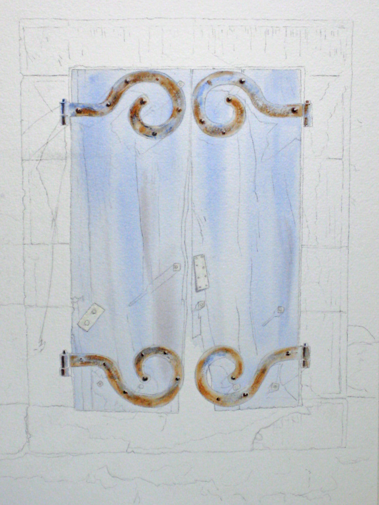
At this stage of this watercolour tutorial we’re at the “Uglies”…. a mess of undercoating and hinges covered with misket. I often get nervous about now, but I tell myself I must be patient and hope my scrap paper experiments will work. While still in my wet-in-wet mode I’ve added some darker areas with my basic warm shadow made from Ultramarine Blue and Burnt Sienna.
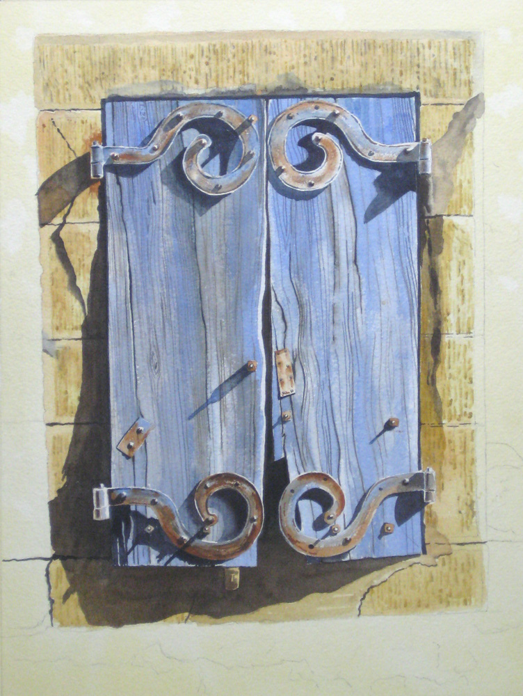
Step 12

Now I can breathe a little easier. Here I’ve tried out the techniques from my scrap paper experiments, and I’ve put in that dramatic shadow between the shutters
Step 13
I go back in and begin making the cracks more obvious with a fine brush and my cool shadow made of Antwerp Blue and Brown Madder. The hinges are still masked off.
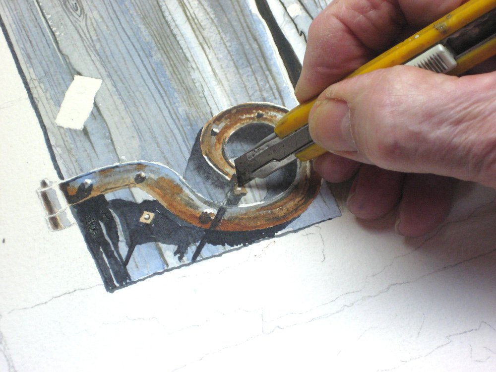
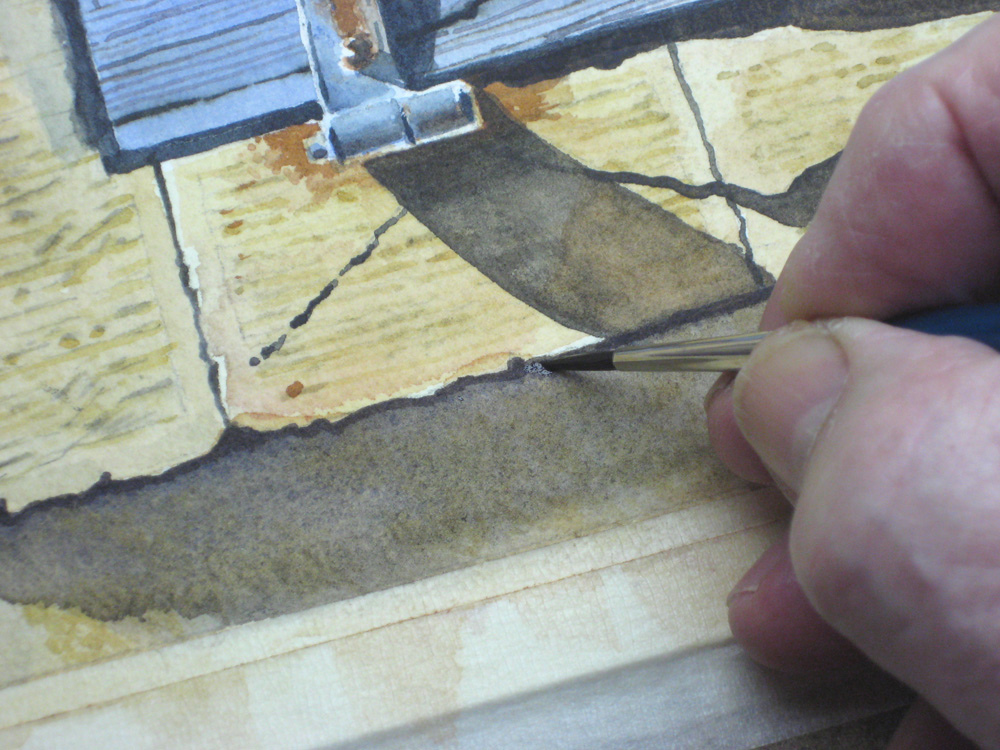
Step 14
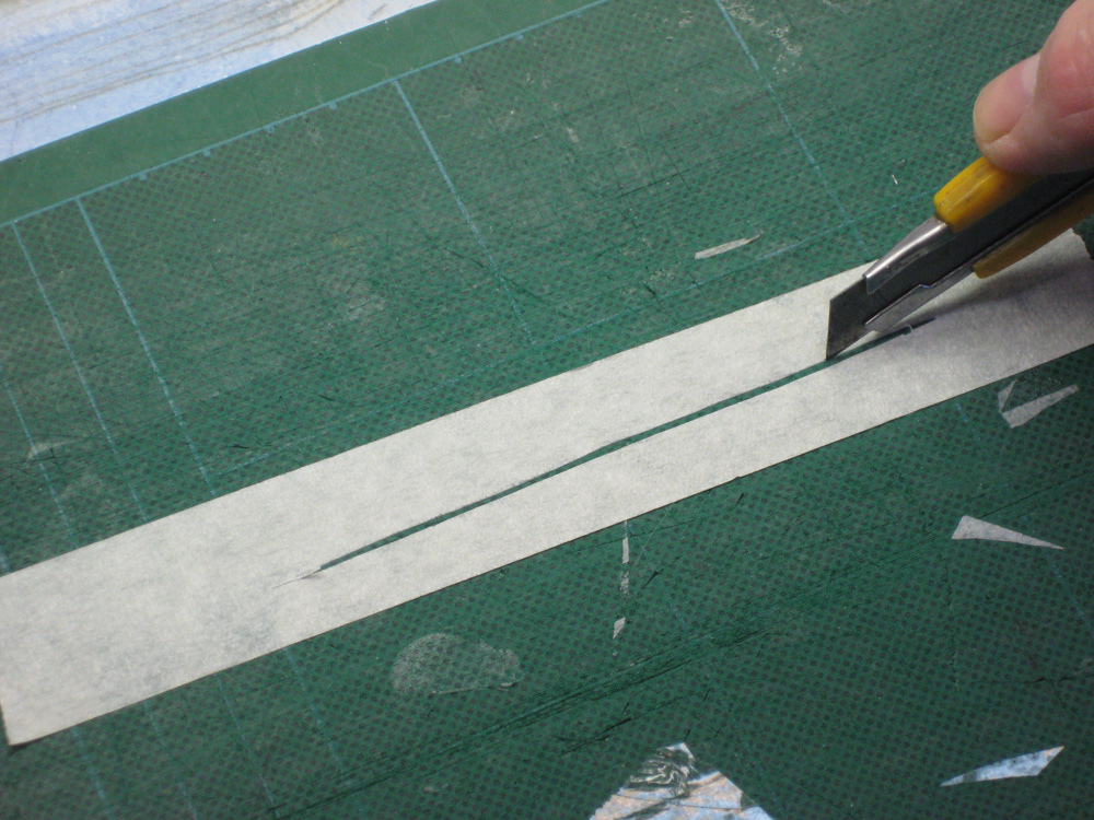
At this stage. I accidentally painted over of one my highlights along a ridge which helped make this look 3-dimensional. I used an old trick I’ve tried many times before. I trace the outline of the part I want to remove on a piece of masking tape, then cut if carefully with a sharp knife as shown here.
Step 15
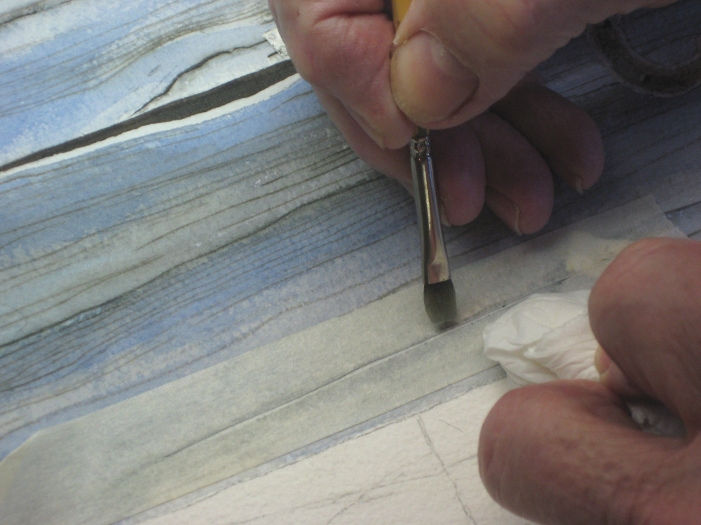
I stick this down in place, and using a stiff bristle brush I wet the area and lift off the colour and dab it with a facial tissue. If you’ve never tried this, experiment first on scrap paper as you’ll need to gain experience in how much water, how hard to scrub, and how to lift off the masking tape.
Step 16
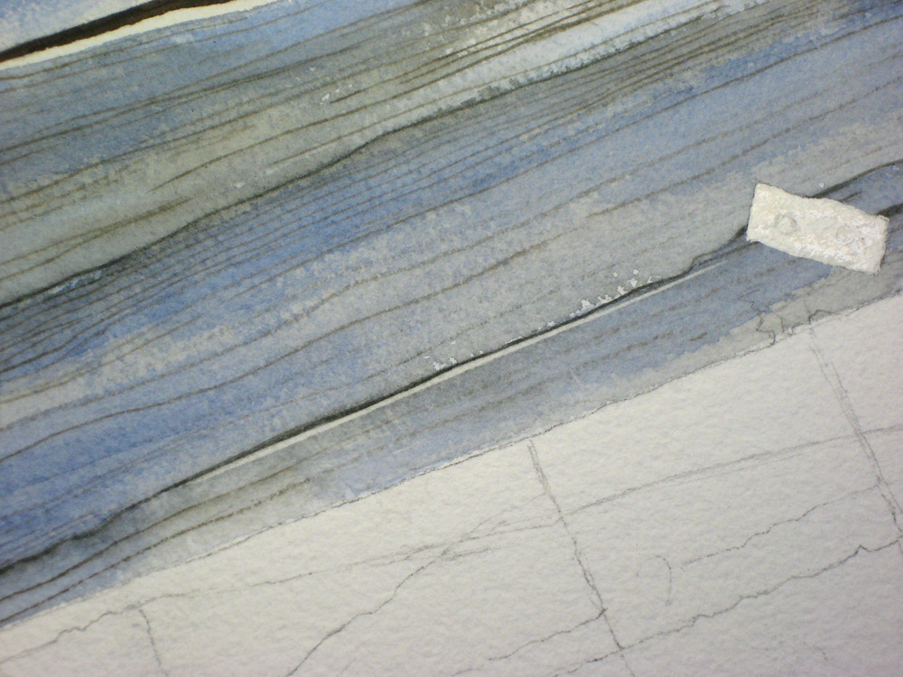
The finished result is my restored highlight along the edge of a vital crack in my wood area. This trick can be used in many of your watercolours, and as long as you don’t overdo it, it can be quite effective.
[adinserter block=”55″]
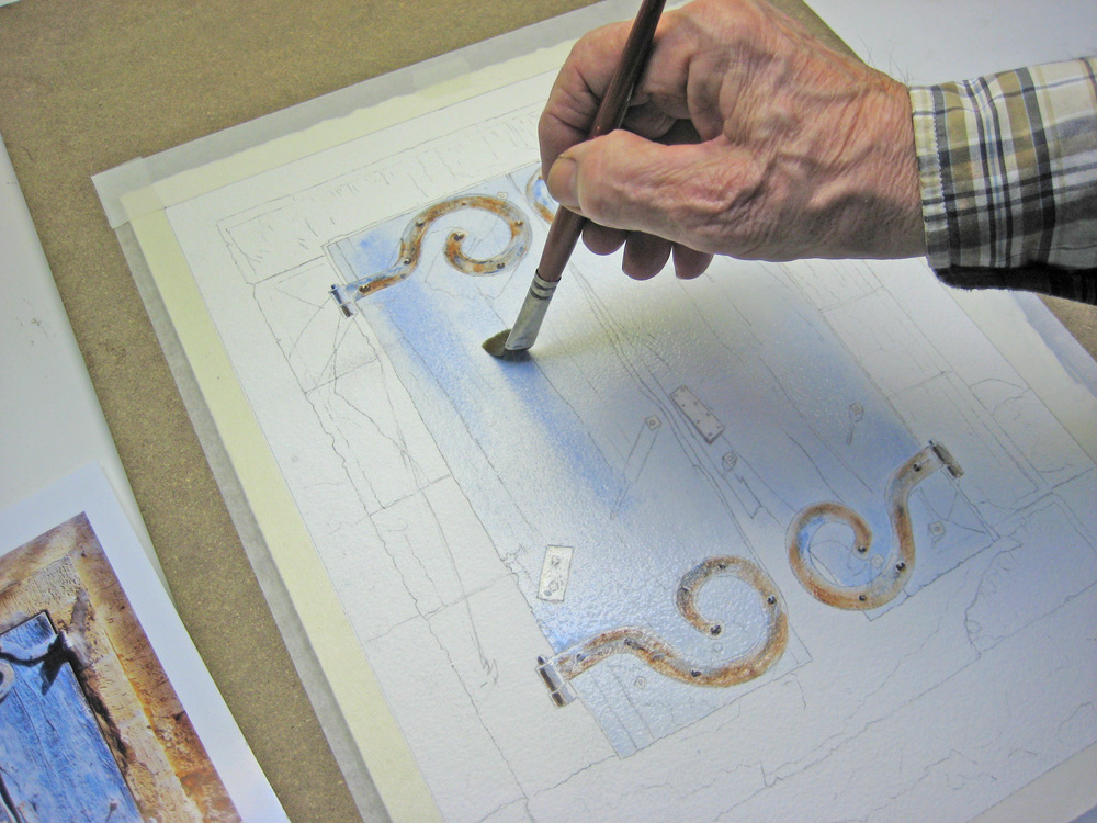
Step 17
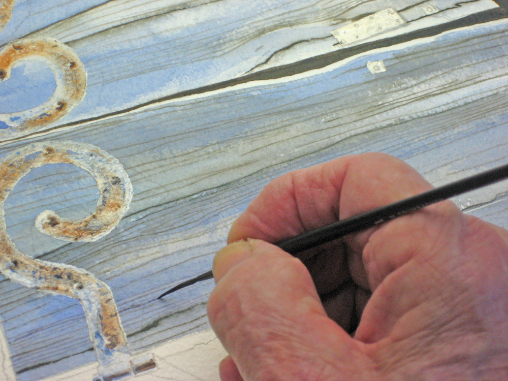
With my hinges still masked off, I decide to strengthen some of the grain effects using a rigger brush well loaded with colour.
Step 18
Next I was worried about my shadow area, and how it might bleed if I applied it over the existing grain patterns. Here my trial scrap came in handy again. I carefully laid a full brush with my cool shadow across the grain and tapered it off. It seemed to work OK. Note how the shadow follows the open groove in the wood, thus giving it a realistic look.
Step 19
I don’t normally put in my final shadows until my painting is almost complete, but I was worried about the mess I ran into after removing my misket from those hinges. I decided to completely finish the top hinges and shadows just to reassure myself I was on the right track. Here is the result.
step 20
Here’s a close-up of the detail from this watercolour tutorial. I’m using a cool shadow made up of Antwerp Blue and Brown Madder. In places I softened the edge of some shadows as this picture is a complex variation of shadows, reflected light and shadows within shadows, all influenced by bright slanted sunlight.
Step 21
Because I messed up some of my highlights when I pulled off the misket on the hinges, I used a sharp knife to lift off and restore my highlights.
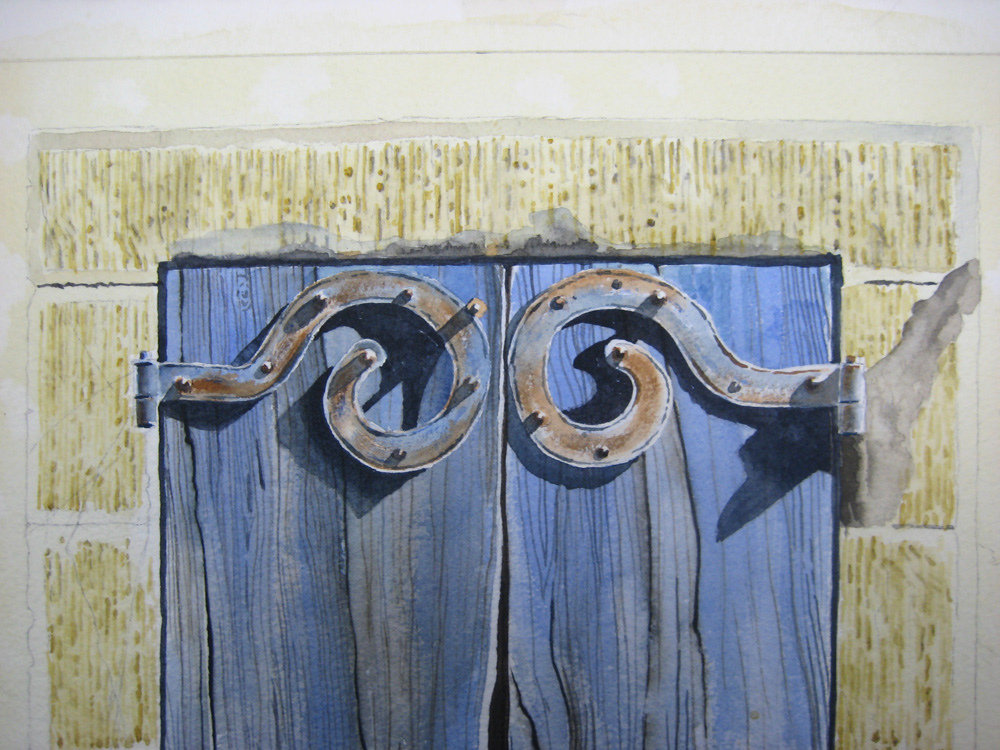
Step 22
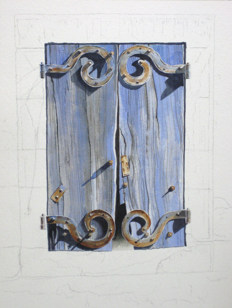
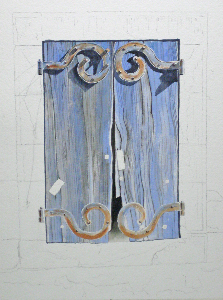
After adding more Cobalt Blue to some areas and darkening some cracks in the wood, here is the finished result up to now. I’m beginning to feel more in control now, and after giving this a rest over a weekend, I started on the surrounding stone-work.
Step 23
I had no clear idea how to proceed on the stonework, so my trial scrap of paper idea came into effect again. You have to be patient here, unless you’ve done this sort of thing time and time again. I spent many hours trying out ideas and I’ll spare you the wasted images. One idea I thought up was to use the appropriate watercolour pencil on a wet-in-wet surface, but I felt it was too mechanical and over-worked.
Step 24
Here is a failed experiment, just to show it pays to at least try. I used a watercolour pencil on dry paper and applied a wet brush, and used a pencil on wet paper. I finally abandoned this technique and decided to use a small brush and make it more freehand. For beginners out there, this is not really a waste of time. You learn what will and what won’t work without wrecking your painting. You also learn, sometimes accidentally, a technique you can use at a later date. You have to have patience and accept the fact that you don’t have to complete this project tonight.
Step 25
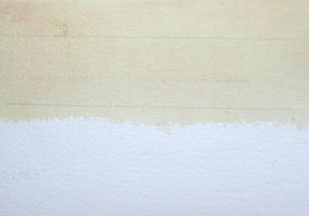
Having abandoned my trial experiments in favour of a freehand brush technique, I applied wash of Raw Sienna and Raw Umber with a touch of my warm shadow colour to my stone-work area, dabbing it with tissue while still damp.
Step 26
Here is an extreme close-up of how I decided to tackle the stone parts. I worked on dry paper and went in after with some light shadow highlights.
Step 27
Here I’ve completed the basic stone texture background.
Step 28

Next I went in with a loaded wet brush with a faintly warmed tint to pick up the sunlight. This also blended in the long brush strokes.
Step 29
I did a little stipple work here and there, using an old brush and a piece of torn watercolour paper as a guide.
Step 30
Here I’ve almost completed the basic stone work surround.
Step 31
I often use this next technique. It involves putting in an extra dark shadow right next to the start of the main shadow; a kind of shadow within a shadow. I soften this at the edge and it seems to add to the three-dimensional look of the painting. In this extreme close-up you can note the cool to warm shadow effect. Note also, the reflected light on the outer edge of the hinge butt. Even if it isn’t there, put it in anyway as it adds to the illusion.
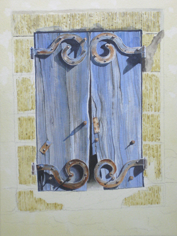
Step 32
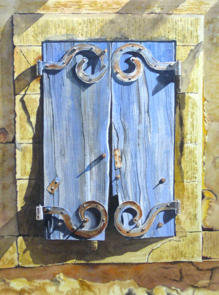
Here is the finished painting. If you’re interested, I’ll post other watercolour demos in the months ahead.
About John Fisher

I was born and educated in England, graduating from the Luton School of Arts (now Barnfield College) in 1945. It was my hope to become a graphic artist, but at the end of the Second World War returning service men and women had first crack at the few jobs available, and rightly so. I took a number of jobs while I tried to break into my chosen field, and ended up being a reluctant carpenter. Many years passed and I emigrated to Canada in 1952, married a Canadian woman, started a family, and in 1955 finally started on a career which took in graphic arts, owner of my own graphics arts company, art director at an advertising agency, and careers in marketing, advertising and public relations.
I wish I could claim that my passion for art burned brightly throughout those years, but alas, the need to make a living took prominence. As with many people, I always promised myself that when I retired I would get back to painting again. That time came in 1989, when my wife and I were living the winter months in our condo in Destin, Florida. Robert Long, a talented watercolour artist, was offering private lessons from his nearby condo. He was my mentor, and made my retirement years infinitely richer.
In those days Robert taught only technique, and there were rarely more than four to six of us in those early classes. From Robert I regained my interest in photography as an adjunct to painting, and as the cliche goes – I never looked back. I have had many paintings accepted and hung in exhibitions in Florida and Ontario, where I now live. I’ve won some prizes, come first in some exhibitions, and occasionally won the Citizens’ Choice awards. But I mainly paint for fun – hence the choice of name for this site.
To learn more about John and to view more of his work, please follow the link below:
Thank you for a clear demonstration and explanation. Would love to see more of your demonstrations.
Great Demo!
Please post more.
THANK YOU for your demo. WOW, such detail and so much to learn. Plus your final watercolor painting is beautiful. Please do more.
beautiful extraordinary skill
You are very talented. Thanks for the demo. Please submit more when you have the time!
You do beautiful work. How very nice of you to share your talent!
Thank you for this. Particularly showing your trial and error experiments. I tend to get disheartened if things don’t go right the first time and it’s really good to see that even people as good as you have to work long and hard to get the results they want!
Thank you for this generous tutorial as the previous person said, I enjoyed the experiments. I often regret NOT doing the experiments on the same paper with the same materials and your reflections. Beautiful work! I liked it on my Facebook page.
Thank you so very much for posting this tutorial,I am only just beginning the journey and it is great to get information from such a wonderfully talented artist!
Many thanks
Barbara
I learned so much from you tutorial. Thank you so much for sharing your knowledge. Showing and talking about your boo-boos, made me feel that I too can tackle art and focus on the learning even more than the finished result. Now I am going to also try this method on a different picture of patina that I have been wanting to paint. I had not known how to start it, but practicing on your piece has given me the confidence to try.
I love your step by step demos. Do you give permission for people that view your demo to paint it. Kathy
Hi Kathy. John creates these demos because he believes in freely sharing his knowledge and helping other artists. So yes, by all means paint!
Thank you! Beautiful work. Compliments!
Can you advise if private watercolor painting lessons are available here in Newmarket?
Wonderful demo! I can’t wait to try this myself. Beautiful painting and exactly the style I enjoy painting.
This is absolutely awesome! Thank you so much!