About Steve Fleming

Good art is the result of hard work and dedication. It only happens when the artist finds his or her own story to tell and then learns to do so with his or her own unique language.
I am an artist who works in watercolor and acrylic, and I teach both for The Art League in Alexandria, Virginia, as well as workshops across the country and abroad. My goal as an artist is to be creative; my goal as a teacher is to help my students learn to interpret the world around them, not to promote the belief the goal of art is the perfect rendering of a subject. One of my core messages: art is a creative process and is not just the sum total of the work we sell. In this era of digital cameras, I caution artists to look — really look both inside and outside — for the subject matter that lights our artistic fires. Otherwise, our work will be lacking everything but technique.
Enjoy. — Steve Fleming
Creative Jumpstart
The “Creative Jumpstart” section of Steve’s blog is designed to help all artists, regardless of medium, with ideas to get them thinking in expressive ways. They are intended to take about 30 minutes to an hour to finish and are warm-ups not finished paintings. Each one has a specific focus, such as gestural drawing with color accents, and they will be of value to artists of all levels. I plan to do at least 1 per week and hope to challenge readers to really broaden their horizons and move beyond their comfort zones. Along the way the artists will enhance their skills in drawing, color usage and have general less fear when being creative.
Follow this link to learn more!
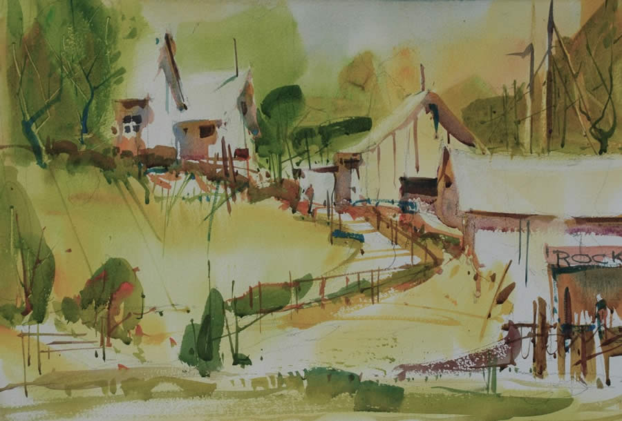
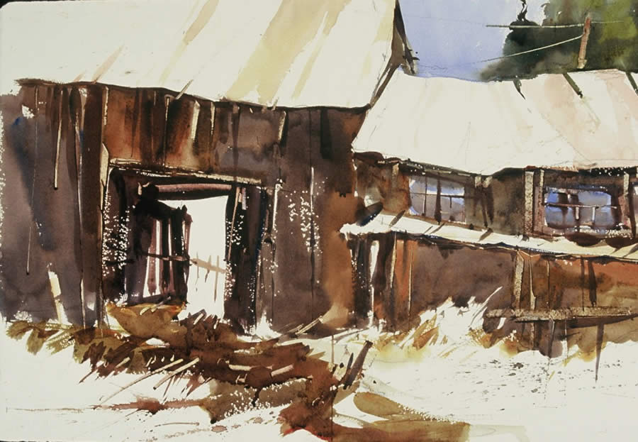
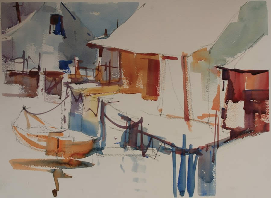
Abstracting the Shapes, Simplifying the Message
(Click Images For Larger Views)
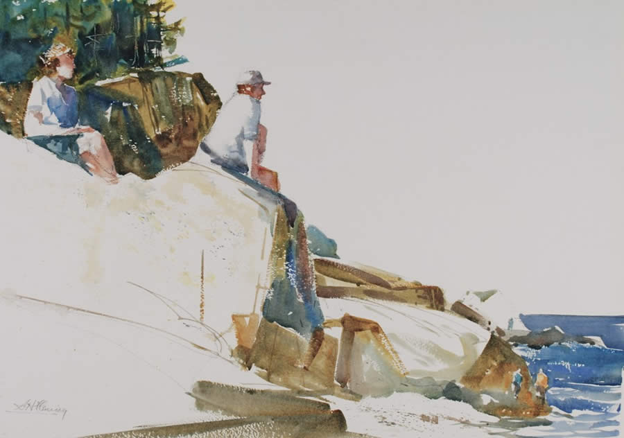
When painting it is easy to become so involved in the subject matter with all of the details, textures, and colors presenting so many possibilities that our paintings never quite have focus or a feeling of unity. Sometimes we achieve nothing more than to present to the viewer either a collection of random thoughts about a place or detail laden color drawing. We paint around the subject never quite making a point. The work lacks creativity and artistic involvement, and the painting lacks a dominance of major shapes. By not focusing on the major shapes we are forced to paint a collection of things and this is a difficult and tedious task.
Sometimes it is a worthwhile exercise to minimize the complexity of the subject matter and reduce the shapes down to three to four major shapes. We need to look at each of these shapes for the quality of their shape, what relationship they have to the other shapes in the painting and what would be the best way to contrast these shapes against one another. Several ways I contrast shapes is by color, value, and texture.
If I am looking for a really dramatic statement I push the relationships between the shapes as far as I can. I use big value jumps, lots of line and texture at the edge of the silhouette, and look for color chords that are rich, expressive, and complementary. I make sure that the edge of the shape is where I create focus and is where I define the identity of the objects. Remember if you put good information at the edge of the shape then you need less details in the interior of the object. Although you have reduced the subject matter down to major shapes in the design phase, you will be able to clarify some of the individual shapes inside the big shapes during the painting process. The goal will be to keep a big shape feel to the painting.
It is important to understand that although a shape can be a singular object, it doesn’t have to be. It makes for a really great painting when you can tie several related objects together and create a very expressive shape. As an example Try linking figures together as one value shape, or take a row boat, a figure, a rock and a pole and hook them together into one shape. When we begin to see objects in terms of their potential joining with other things to make larger more dynamic shapes we make a huge jump towards becoming creative shape makers. I believe this is one of the great goals of an artist. This allows you to rearrange the scene in front of you to tell your story with clarity and focus. I believe very strongly that no amount of detail and finish will make a poorly conceived painting work.

What makes a good shape? A good shape should have a significant difference in it’s width and height. It should have movement or direction, a static shape is not as exciting a one that moves through the picture space. Good shape should have a variety of edges, hard, textured, and soft or blended. It should have a exciting silhouette, exaggerate the position of elements to improve the edge.
Remember the edge of the shape is what defines it, not the interior, so put a lot of interest and defining information at the edge. It is good to try to get some gradation across the shape for instance from warm to cool or intense to less intense, or one hue to another hue. A good shape should tie into the background or foreground at several points, try to invent a rock, a fence, or a figure to help attach the major shape into the adjacent shapes. Lastly and of utmost importance this wonderful shape must not have major value jumps across it. You can have some slight changes in value, but you can’t jump from light to dark to light to dark or the shape will fall apart into value pieces. You can make many color changes and they will not tear up the shape but big value changes will destroy the continuity of the shape.
To begin a painting with a focus on the big shapes it is best to start with a value pattern in your sketch book. Look at the subject matter and mentally organize the different pieces of what you are looking at. Think about which small shapes could be moved around or joined to other shapes. The goal is to connect minor pieces together as one big interlocked shape. At this stage don’t concern yourself about which shapes are lighter or darker in value because you will change their value for the purposes of the painting. Also mentally try to eliminate the shapes which are not going to help in creating good big shapes. Remember this is going to be your painting and you are under no edict from the painting gods to paint everything you see in front of you. Only use what you need.
Once you have thought about what to make your big shapes roughly sketch them onto the page in your sketch book. Analyze and adjust the shapes to follow the rules of a good shape. Remember to incorporate the unique features of the subject matter to enliven the silhouette. Make sure the shapes have an interesting relationship to the other shapes in the painting. Always work from the largest shapes to the smallest shapes and leave out all consideration for the details of the shapes until all of the shapes are well established on the page. Try to have all of the major shapes be a different size, make sure exterior angles are not the same and make sure shapes do not enter and leave the paper at a similar place on the opposite side of the paper.
Assign each shape a value and try to keep your lightest value shapes next to your darkest value shapes this will create the strongest focus and contrast. It is always a good idea to put your center of interest where the strongest value change is located. Once you have the design finished sketch it on the watercolor paper and paint it remembering to follow the value organization. Put some change of color, texture or value in each shape and watch that the edges have variety. Keep the painting simple. When your are done try reversing and rearranging the values of the major shapes and changing the color chords. This will result in some exciting variations on a simple theme.

Exercises
- Take a subject with a strong shadow pattern and just paint the shadow areas. Play this pattern against a light middle value
- Take a black and white newspaper photo and with a small view finder, a 35mm slide holder is perfect, pick a interesting dark shape and use for the shape in your painting.
- Extract the key elements from the photo and make one large shape against a light midtone background
Mi scusi ,il vostro lavoro é meraviglioso ..
ma io vorrei vedere , un retratto piturato in questo vostro sistema ..,
Pina
Il vostro lavoro e meraviglioso
e a me piacerebbe vedere un retrato piturato in questo modo ,,,com aquarela
gracie
Pina
Thank you so much for this tutorial necessarily take advantage of your advice
Thank you for your in depth tutorial. I think your points about unity are right on. A viewer may not look at all the details that the artist obsesses over. He is more likely to make a first impression judgment based on the overall picture and the emotions it invokes in him. My favorite of your above paintings is the one with the boats. I like how you used reflections in the water to convey motion.
Beautiful watery effects. Could you show how to paint like this, in a video perhaps? Thanks