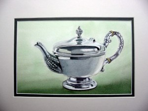
Silver Teapot Watercolor Demonstration
Getting started
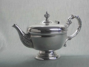
Metal objects always pose a special problem for painters in watercolour. The purists among us don’t like to use a solid white to pick out the highlights, and beginners often avoid tackling shiny metal in still life paintings. Brass and copper are usually easier, as they have base colours – but what colour is a silver teapot? As with chrome, it depends. It depends on what surrounds the silver teapot. Is is being painted in natural daylight? Incandescent light? Fluorescent light or a mixture. For this demonstration I’ve chosen a silver plated teapot lit by fluorescent light on a no-seam pale green background.
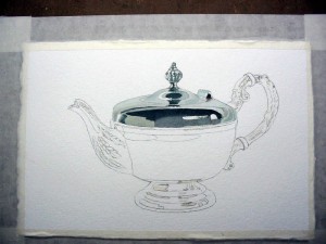
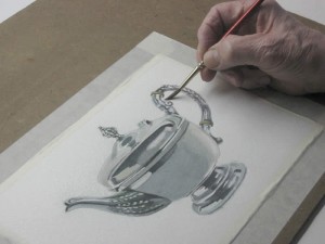
Tracing the image
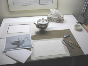
I’m using modern computer technology in this demonstration, but you can still achieve good results the old-fashioned way. I printed out an 8″ x 10″ colour shot and used it as a tracing source. Using 300 lb Arches paper, I taped the print-out to the paper and used artists’ graphite paper to transfer the image, using a sharp 5H pencil. Note I kept the actual teapot close by for reference, plus the photograph and the mat in which it will be eventually mounted.
Re-drawing the image
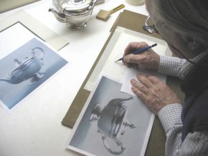
I needed a darker than usual pencil image in order to photograph this for you, so I gently erased the original before my final re-drawing of the image. Don’t hesitate to turn the drawing and the reference photograph upside down to help draw difficult curves. This also helps in giving you a different perspective to the object you’re drawing.
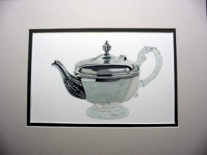
The final image
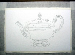
You must decide how much detail you want in your final image. If you want an impression of a silver teapot, and not a more representational image, you can leave out what you think you won’t need. I’ve chosen an accurate drawing for this demonstration. Now we’re ready to paint. Here I always suggest a few moments of quiet reflection on exactly how you will paint this picture. Look at the teapot carefully (or whatever it is you’re painting). Look right into the object and see what is there. What is being reflected? What might be left out or emphasized to make the metal look like metal? Decide what areas need misket to allow the white paper to show through. What is the colour theme?
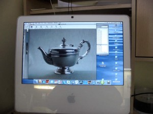
The computer image
Thanks to modern computer technology we can now keep the original image up on the monitor for frequent reference. This helps if you simply cannot paint a still life in place. You may not have the room to keep it up for weeks, and the transmitted light from your computer monitor acts like a slide show. A computer isn’t essential of course. You can paint from a photograph, a magazine or a calendar. The idea is to have fun.
Where to start?
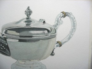
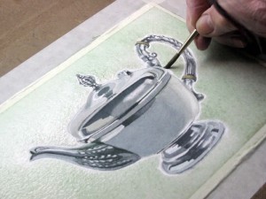
In any of my paintings I usually start at the centre of interest, unless I decide the background or sky should go in first. There’s no hard and fast rule. Here I started at the top and worked down. It’s already looking like metal I think. I used a wash of Antwerp Blue and Brown Madder as my basic colour, with a little Sap Green to pick up the green background. Note the misket detail is in to help leave white paper for the main highlights.
Introducing the mat
Early in any of my paintings I introduce the mat I will eventually use. This always gives an immediate lift to the painting and seems to enhance the colours. It also gives you an added motivation to continue, and acts as a kind of cheerleader and shows you how far you’ve come.The bigger the painting the more need you have for anything which helps you keep going, especially if you paint alone with no input from teachers or other painters. Notice how the highlight along the top of the lid has been softened to make a diffused highlight. Do this with a small, stiff oil brush, using water and a gentle scrubbing motion and dabbing with facial tissue. Don’t overdo this technique or you’ll damage the paper and subsequent colours will run. Experiment first.
The handle
Leaving the misket in place, the basic wash goes over the handle area, with a couple of darker places to emphasize contours. The darker parts are made from a mixture of Antwerp Blue, Brown Madder and Sepia. I mixed three shades from darkest to light. Once you’ve experimented with metal objects, you will begin to see where certain areas will need emphasis to exaggerate the contrast between highlights and shadows. This is really two-dimensional trickery. You must fool the eye into thinking – hey – this is metal. It’s shiny looking.
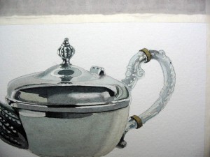
Removing the misket
Gently remove the misket area with masking tape or the special lifter sold for this purpose. Now you have white highlights to allow your illusion to take hold.
Creating the illusion
Now you add the darker touches to create the illusion of embossed leaves on the handle. Gently soften the extreme highlights with the scrub-brush technique, and go back in with more dark shadows.
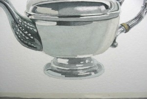
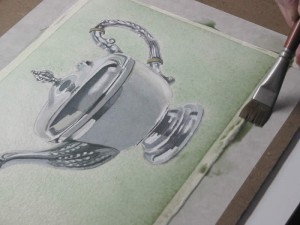
The base area
Here the misket has already been removed and the base wash applied. A light sap green wash was added to pick up the colour from the background. Put the mat back frequently to bolster your spirits. Don’t forget – this is supposed to be fun!

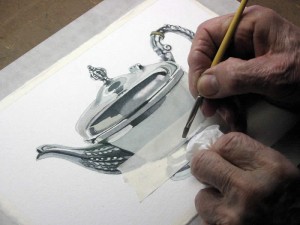
Correcting mistakes
Two things went wrong at this stage: one was the accidental use of Turquoise instead of Antwerp Blue, which gave me a distinctly green shadow, the the other was painting over a place which should have been left white.The wrong shadow colour was quickly corrected, but I had to lift out some colour to allow white paper to show through. Experiment with this technique first, but place some masking tape over the affected area and carefully draw in what you want to lift out. Cut this out with an art knife and press in place as shown. Experience will teach you how hard to press; you don’t want to damage the surface of the paper. Now use the stiff brush, clean water and facial tissue, to alternatively dab and blot. Then use a small hairdryer to carefully and gently lift off the mask.
Almost done
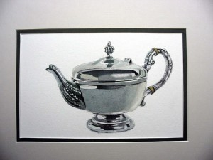
All that remains is to re-paint the area that went wrong, soften up the highlights you feel are too hard, and it’s time for the background. The finished result is suitably metallic I think, and of course these infuriating demonstrations always look easier than the really are! I can’t be there in person to look over your shoulder, and even if I was, I could only help you so far. Ultimately you’re on your own, and only through constant practice and experience can you perfect any technique. You’re going to fail many times, but you will learn from your failures and each time get a little better.
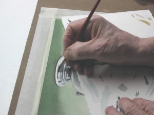
Background wash
Now comes the tricky part: the background wash. Lock the front door, draw the drapes, turn off your cell phone, banish the dog and the kids, and be prepared for a high-wire act. Put on a clean wash of water all over and paint right up within 1/16″ of the painting. Then push the water right up to the outline of your teapot with a wet brush as shown. Be careful not to go over the painting or the background colour will follow the water and mess it up. You’ll need a steady hand here and something to stop you smudging what you’ve done. Turn the painting upside down if it will help. OK – you can start breathing again now!
Applying the colour
When the clean wash is almost dry, I used a wash of Sap Green with a touch of Brown Madder and Sepia. The colour followed my water wash and then I pushed the colourinto the edge of the painting as shown. You’ll notice the colour wash still glistens but you’ll have to work quickly or you will have a double line showing when it dries. Practice this technique before doing an actual painting.
Cleaning up the wash
To prevent blossoming from the surplus colour along the edge of your painting, use a flat brush to carefully sop up the colour all around the edges. Your painting is very vulnerable at this stage, so move everything out of the way to let it dry. Use a hair-dryer if you want to speed things.
The finishing touches
I added a little extra shadow at the base of my picture, using a stronger mix of Sap Green a touch of Brown Madder and Sepia. I blended this in with a slightly moist brush. After this was throughly dry I painted in that intense shadow just along the bottom edge, softened it with a moist brush, and sharpened up a few mid-toned reflections on the base.
All done!
| OK – switch on your cell-phone, unlock the front door and let the dog and the kids in. You’re done. The finished result looks nicely metallic I think, and although a single teapot is not a candidate for anyone’s living room wall, the experience should help you the next time you are faced with painting metal in watercolours. |
About John Fisher
I was born and educated in England, graduating from the Luton School of Arts (now Barnfield College) in 1945. It was my hope to become a graphic artist, but at the end of the Second World War returning service men and women had first crack at the few jobs available, and rightly so. I took a number of jobs while I tried to break into my chosen field, and ended up being a reluctant carpenter. Many years passed and I emigrated to Canada in 1952, married a Canadian woman, started a family, and in 1955 finally started on a career which took in graphic arts, owner of my own graphics arts company, art director at an advertising agency, and careers in marketing, advertising and public relations.
I wish I could claim that my passion for art burned brightly throughout those years, but alas, the need to make a living took prominence. As with many people, I always promised myself that when I retired I would get back to painting again. That time came in 1989, when my wife and I were living the winter months in our condo in Destin, Florida. Robert Long, a talented watercolour artist, was offering private lessons from his nearby condo. He was my mentor, and made my retirement years infinitely richer.
In those days Robert taught only technique, and there were rarely more than four to six of us in those early classes. From Robert I regained my interest in photography as an adjunct to painting, and as the cliche goes – I never looked back. I have had many paintings accepted and hung in exhibitions in Florida and Ontario, where I now live. I’ve won some prizes, come first in some exhibitions, and occasionally won the Citizens’ Choice awards. But I mainly paint for fun – hence the choice of name for this site.
To learn more about John and to view more of his work, please follow the link below:
Thank you. I enjoyed this immensely. I especially found your “correcting” process with masking tape interesting. In fact – I plan to spend some time practicing on purposeful ‘mistakes’ just to see if I can master this tool before I am faced with the need to use it. Again – thank you!
Beautiful! I’m always searching for new ideas: as you said in your biography, life brings you far from your art, sometimes, so it happens that I studied as an Illustrator but I work as a teacher with children. I want to paint and I ended my oil painted third yeard of lessons. My first love are watercolours, so I will try to paint new subjects! Metal is a real challenge so I will try my new painting from your experience! thank you!
This is wonderful techique Thanks John Fisher and newsletter
very nice lesson on one of the hardest things to paint ever – polished silver
Thank you so much for letting me see how you creat these beauties.
I’m a beginner and need more instruction. Can we see you in real time painting?
A video lessons?
Please
Hi John,
It is incredible how you have been able to create a metallic look from these colours. When should an artist use metallic watercolour paints? Would these detract from a beautifully impressionistic painting such as the one you have done above? What are the pros and cons of using metallic watercolour paints. I notice there are several metallic watercolour paints on the market, but I imagine achieving the beautiful effects you have achieved with shading and lighting would not be as effective. Have you ever experimented with such paints?
hello, John.
say thank you – it’s nothing to say. following your material, I first got a watercolor, after many fiasco. not as good as for illustrations or vernissages, but enough for my heart now. sorry for weak english, he’s worse than my watercolor. https://i.pinimg.com/originals/8f/10/9b/8f109b608e645ddd5f489cf507b39784.jpg