Enjoy this wonderful free lesson that teaches important watercolor painting landscape techniques and how to create paintings that give the illusion of being bathed in beautiful sunlight!
Painting those Light-Filled Days – Watercolor Painting Landscape Techniques by Steve Fleming
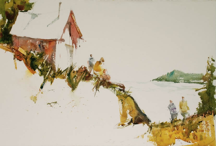
(18 x 24 watercolor “Treasure Hunters” using an invented passage of white paper I have moved the viewer from the left corner of the painter up through the figures and into the building. A clearly stated center of interest with a strong feeling of sun and light)
One of the most wonderful subjects you’ll ever find to paint in watercolor is the landscape bathed in sunlight. To paint with authority, it is a must for you to first spend time observing the unique characteristics of the sunny day and then use these observations as the structure of your painting.
Too many artists fail in their attempt to interpret the sunny day because they forget to use or don’t know the characteristics of the typical sun-filled setting. If you mix a little knowledge, careful observation and pre-planning in the form of a well-designed value pattern, you’ll create quality paintings infused with the realistic play of light and shadow.
(15 x 22 watercolor “Bleached White” notice the cast shadows and form shadows feel like they are on white but they have color merged into them.)
I believe the most important aspect of a sunny day is the need for shadows, both cast and form. Cast shadows are those that are cast by the object. Form shadows are the dark side of the object that is casting the shadow. Also, depending on the amount of sun and time of day, the painting must have bounce and reflected light that shows up primarily as reflected color in the form shadow areas. Typically the higher the sun is in the sky the more bounce light and reflected color shows up in the form shadows. Remember the sun is much bigger than the earth so it is flooding the horizontal planes with light which bounces off of the irregular surfaces and goes up into all vertical surfaces.
The length and direction of the cast shadows are related to the position of the sun and the angle of the object that the sunlight is cast upon. The lower the sun is in the sky, the longer the cast shadow conversely, the higher the sun, the shorter the shadow. If you don’t pay attention to this interplay of sunlight and shadow, your sunny-day painting will be less of a success.
So, before beginning your painting, you should embark on a study of how sunlight falls on the landscape, object or person. Then, you should decide what time of day you want the painting to suggest.
Long dark shadows really give the impression of early morning or late in the day. Midday has very short shadows. Shadow areas are darker and less colorful in the early morning and late afternoon, and lighter and more color-filled in the strong sun of the middle of the day.
When painting shadows, a few pointers you should keep in mind are: Cast shadows are darker than form shadows, form shadows will have the reflected or bounce light in them, and cast shadows have harder edges, cooler and darker the closer to the object producing the shadow. They soften, warm and lighten the farther away from the object that they are. The color of the shadow is a darker color and less intense than the object on which it is cast but it is the same color. A shadow on a white building is a darker, cooler white, and it should read as white. A shadow on green grass is green but darker, cooler and less intense. It is absolutely acceptable to paint the shadows any color you want as long as your painting has a more abstract or expressive feel to it.
(18 x 24 Watercolor “Lazy Summer Days” Although I have painted the light of the building white, I have told you that it is a red brown building because of the color of the shadows. Remember the shadow is the color of the object it is on and form shadows have reflected color.)
The beauty of art is to be creative. You are inventing your own world on the canvas, so feel free to use any and all possibilities, limited only by your imagination. One thing to remember, though, is that if you intend to use a more traditional, realistic palette of colors, then you should consider making shadows relate to the color of the illuminated object.
Another important thing you should remember when expressing a sunny day is to have a wide value range in your painting. You should use a value scale that goes from lightest light to darkest dark. The relationship in your painting between the values should not be equal lights, darks and middle values. You should design your painting with a dominance of one of the three, and leave the remaining two values with an unequal share of the painting. Here are a few examples: For either early or late in the day, the darks should represent a larger share of your painting than the lights. If you’re portraying the middle part of the day, light colors should dominate. On a bright, sun-filled day the form shadow areas should be cool hues with hints of warm bounce lights painted into them. To really get the feeling of sunlight, put a strong value and color contrast right at the lightest area of the subject. Also, it is a good idea to use a little piece of a complementary dark color in the adjacent dark — if you are painting the light a yellow hue, for example, then daub some purple or violet into the shadow area. Or if the color of the light is orange, make the dark color a bluish pigment.
(detail of “Bleached White” I have brushed cobalt blue and violet with a strong touch of raw sienna into the shadows to get the reflected light. Also notice the top edge of the rocks are very textured which gives the feeling of light on the top of the rock. Remember to always consider the edges on your major shapes.)
Another very important feature of a sunny day painting is the use of white paper or lightly tinted paper to indicate the strong power of the sun. Although I am not a big believer that all good watercolors must have white paper, I do think that it is easier to paint convincing sun by leaving large areas of paper which are very light and warm. The more you leave the areas facing the sun a light value or warm color the more you will achieve the feeling of a sunny day. Something to consider is that the part of the object that faces directly to the sun will be the lightest area of the painting no matter what its local color is. A black roof facing directly into the sun will be lighter than a white wall which is turned away from the sun.
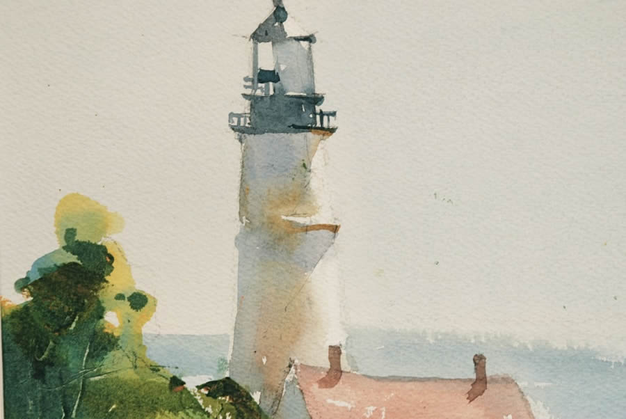
(detail of “Portland Head Light” the top of the light house is black but in full sun it appears to be white.)
You’ll also go a long way towards creating the feel of a sunny day if you use vibrant colors. Of course, it’s important to remember that the time of year you’re portraying is going to affect the type of vibrant colors. In most areas where there is a season change, winter is a time of muted colors compared to spring and summer. The vibrant colors of the winter landscape are different than those of summer. The use of expressive grays, rich browns, and blues create the vibrancy of the winter and late fall. When painting a sunny day I use a lively color palette and shy away from the pigments that lead to a gray mood. For example, in mixing a green, I would use yellows like New Gamboge, Auereolin and all of my blues. I would stay away from mixtures of Raw Sienna and Ultramarine Blue. I pay close attention to the graying effects of complementary colors and use them with care in my mixtures. I also try not to overmix my color on the palette. I like to get my colors to merge on the paper, which emphasizes the feeling of light. The more light, the more color we can see. If I was doing a sunny late fall landscape the grays I would use would definitely be merged on the paper to create a feeling of vibrant colors.
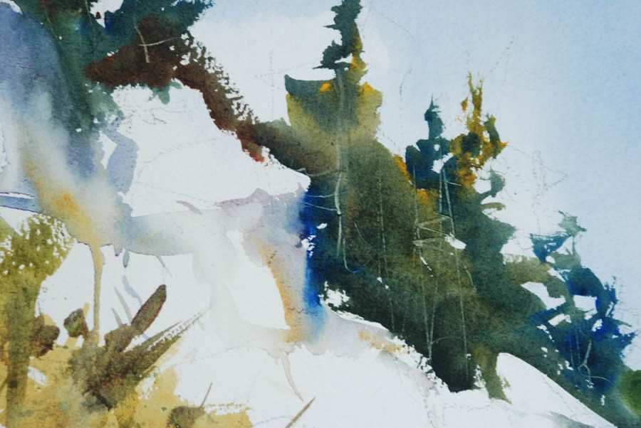
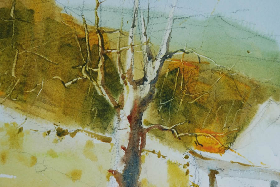
(detail of “Fall Plains, VA” I have really merged the colors into the shadow side of the tree getting reflected color and maintaining the feeling for the true color of the tree. Also notice the warm tones in the background it really feels sunny.)
Another related characteristic is that on a sunny day you will see more texture on the surface of the objects in the landscape. Feel free to liven up your paintings with creative colors and expressive texture when painting the sunny day.
Although it is best not to become a slave to hard and fast rules when painting, you will be well served when trying to paint a sunny day if you’ll keep all the preceding pointers in mind.
(18 x 24 watercolor, “Culpeper Farm”, Although the light is a very small piece of the painting it captures the light on the building and even the porches. I was pretty happy with the merged colors in the background trees and the undulations in the field which moves you into the painting. I scraped the trees with a pocket knife.)
Ideally, before embarking on your painting, you’ll go outside and do some sketching or painting of the sunny landscape you want to portray. Pay close attention to the effects of light on the subject and don’t worry as much about the details of the subject. If the light is not right, then no amount of detail will enhance the feeling of sun. Remember, the sun is continuously moving across the sky so shadows don’t stay put but the shape of the buildings they are cast upon will stay the same. So, it’s wise to sketch the shadow pattern you are looking at and worry about the subject matter later. You can refer to the sketch of the shadow throughout the painting process.
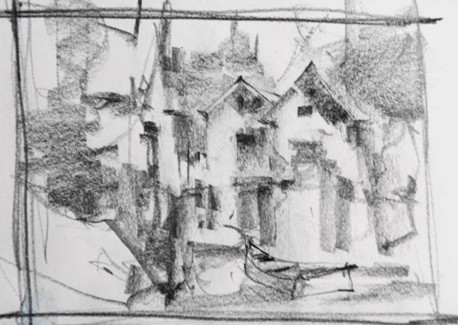
(Value pattern of with a definite understanding of where the lights and darks are going to be placed. Never begin a journey without a road map.)
I also never proceed on a sunny, light-filled painting without a very solid value sketch. I find that knowing the placement of lights and darks before I start painting really helps me stay focused. Light is hard to paint with a good sketch and almost impossible to grasp without one. I begin my value pattern with the emphasis on the movement of light across the page or with a strong dark shape against a well-lit background. In both situations the emphasis is on the shape of the pattern of light or the silhouette of the dark shape against the light. A good painting always rests on the quality of the major shapes in the painting. Shapes are not always specific things but can be a collection of objects tied together into a large shape. A major shape can be just the passage of the light as it weaves throughout the darker shapes.
(15 x 22 watercolor, “Owls Head Pines)
When looking at your painting and doing a critique of how well you did on creating the feeling of sunny day, check these key points:
Are the shadows related to the direction of the sun?
Are the shadows lively and is there reflected color in the form shadows?
Have you used a wide enough value range?
Do the lights dominate?
Did you remember the white paper and the dark values?
Are your shadows cool and complementary to the color of the light?
Are your colors vibrant and did you allow them to merge on the paper?
Are your horizontal surfaces or the surfaces facing the light warmer in color temperature?
Did your value pattern have a feeling of light and do you need to refine it?
Good art is the result of hard work and dedication. It only happens when the artist finds his or her own story to tell and then learns to do so with his or her own unique language.
I am an artist who works in watercolor and acrylic, and I teach both for The Art League in Alexandria, Virginia, as well as workshops across the country and abroad. My goal as an artist is to be creative; my goal as a teacher is to help my students learn to interpret the world around them, not to promote the belief the goal of art is the perfect rendering of a subject. One of my core messages: art is a creative process and is not just the sum total of the work we sell. In this era of digital cameras, I caution artists to look — really look both inside and outside — for the subject matter that lights our artistic fires. Otherwise, our work will be lacking everything but technique.
The article “Watercolor Painting Lesson – Painting those Light-Filled Days” by Steve Fleming is great! I really enjoyed it and found it to be very useful and “illuminating” . I hope to read more article like this (and also plan to re-read it as well).
Alisays
The article “Watercolor Painting Lesson – Painting those Light-Filled Days” by Steve Fleming was very useful for me. Thanks a lot.


The article “Watercolor Painting Lesson – Painting those Light-Filled Days” by Steve Fleming is great! I really enjoyed it and found it to be very useful and “illuminating” . I hope to read more article like this (and also plan to re-read it as well).
The article “Watercolor Painting Lesson – Painting those Light-Filled Days” by Steve Fleming was very useful for me. Thanks a lot.
Thank you for these wonderful
lessons!! Thank you, thank
you, thank you.
Thank very very much. I found this lesson “Days filled Light” very very instructive. I liked it very much.