About the Artist

David Gray (b. 1970) acquired a strong foundational education in art while obtaining his BFA from Pacific Lutheran University in Tacoma, Washington. His art education has continued with independent and occasional formal studies in pictorial expression and oil painting. The resulting work reveals a personal and contemporary expression of beauty and order which pays homage to the Classical Tradition in its craftsmanship.
David’s paintings have earned several national awards and his career has been covered by major art publications including Southwest Art, Art of the West, and American Art Collector. David’s works are included in many discriminating private art collections throughout the United States and abroad.
David’s Websites:
Still Life Painting Demonstration in Oils
[adinserter block=”30″]

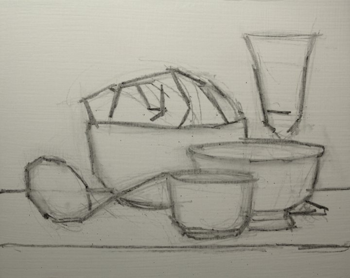
Vine charcoal. Just getting a feel for the shapes and where they go. I’m flying by the seat of my pants here by not taking a few careful measurements. My eye is still traveling all over the composition to see shape relationships… so in a way I am measuring, just in a different way.
After dusting off that first scribble I now block in the shapes more completely. I’m being fairly heavy handed here. Still eyeballing height and width relationships and how forms overlap.
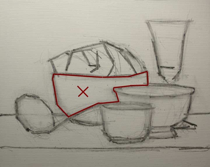
This is an example of a positive shape. This is what we typically look for. Try to isolate this shape and duplicate it on your panel or canvas. I like to simplify my shapes into blocky forms using only straight lines.
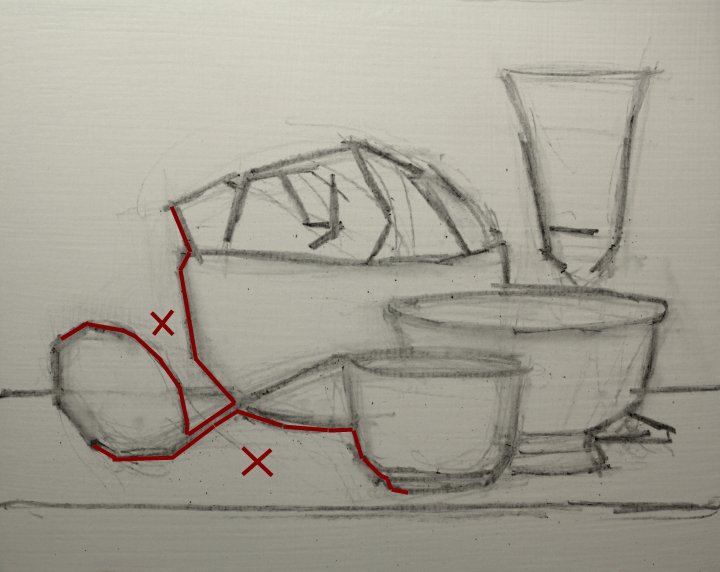
Don’t forget about negative shapes! They can tell you just as much about where things go sometimes.

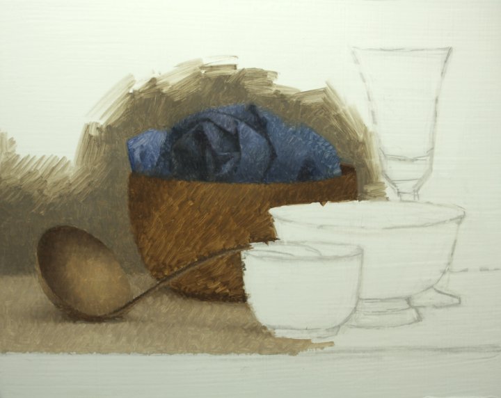
So, again, I dust off the previous step and refine. I’m now ready to start my underpainting. I do not spray fix this drawing. I just dust it off a little. The remaining charcoal does not interfere with my painting.

Where to begin? Well, this is just the underpainting so to me it doesn’t really matter. I just start painting form by form. I try to get the basic colors and values pretty correct. But I don’t get too picky. This is just an intermediate step between the blank panel and the real business of the painting. I keep the paint fairly thin and loose, but controlled. I also use this step to refine my drawing where needed.
…form by form…
…and a little more…
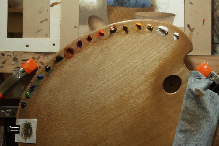
Here’s my palette. From right to left: Stiff mixed white, Titanium White, Naples Yellow, Hansa Yellow Deep, Yellow Ochre, Raw Sienna, Cadmium Orange, Venetian Red, Quinacridone Violet, Burnt Sienna, Raw Umber, Ivory Black, Cerulean Blue, Ultramarine Blue, Chromium Green Oxide, Pthalo Green. I don’t always have this many nor need this many colors on my palette. But I’m presently working on my color sense a little more and am seeing if it makes a difference having a few more pure colors available.
[adinserter block=”30″]
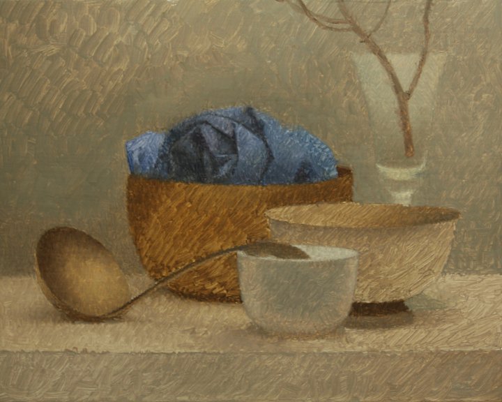
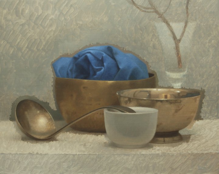
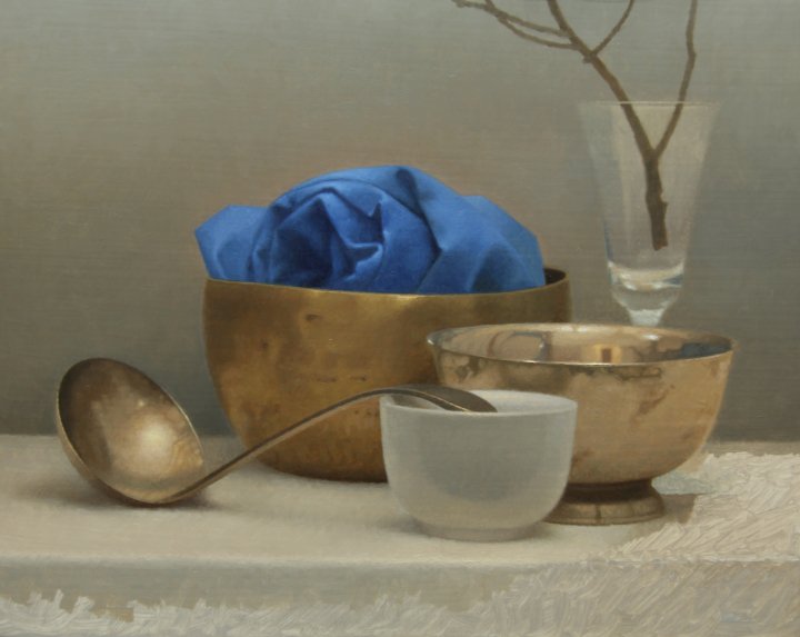
Finished underpainting. When you see the finished painting (to be posted later) you should look back at this image. You will then notice how simple I’m keeping things here. Just feeling out the forms, solidifying the drawing, starting to feel out the color.
The color temperature difference is due to a different white balance setting on my camera. I just bought a new Canon D50 and am dickering with what the proper white balance setting should be in my studio. I think this is a little better but maybe a smidge cool.

Notice I paint a little of the background around the objects I am trying to complete. This will help to ensure a smoother transition between old work and new.
Next form…

Carefully block it in and “finesse” it next (next image).
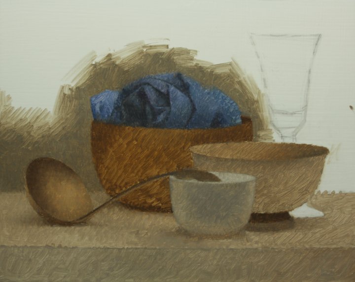
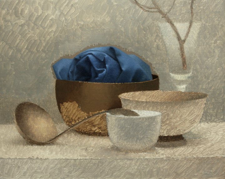
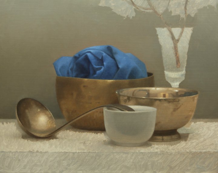
Notice inside the silver bowl — there are a lot of reflections in there. The way I handle it is to block in the darker shapes first as shown.
I didn’t actually nail the values inside the silver bowl. It needs to go a little lighter in places and also needs higher chroma in places. It’s OK. I’ll leave it for now and correct in a final pass at the end. I’ll show how I do that at that time. I might need to dicker with the white teacup a bit as well.
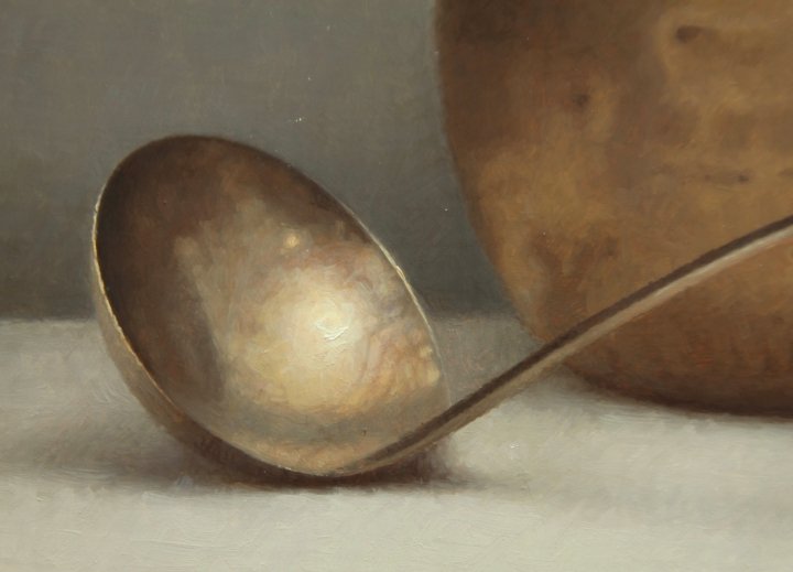
Never forget to stop drawing. Even in this stage I correct my drawing as necessary. I discovered that my spoon was a little “off” and fixed it as I finished it. Later you may notice I shortened the little glass goblet on the right. Keep your drawing chops working throughout the whole process…
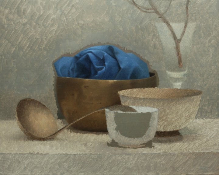
I usually paint the form first and then the background around it, but in the case of my glass goblet my decisions about the background color needed to be established before I painted it. I have made the mistake of painting my clear glass objects completely before nailing my background color choices.
Usually it leads me to have to do some corrective repainting on my glass objects.
That little strip of background I painted around each object really made it easy to come in behind and fill in the background. It looks like I did it all in one go instead of feeling “patchy”. The same will be true when I paint the table cloth on which the objects are sitting.
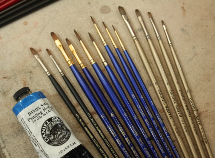
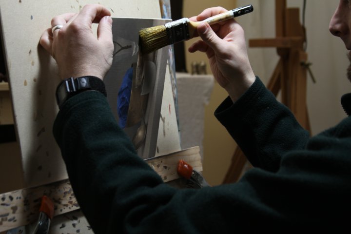
These are the brushes I’ve been using on this project. I started out using the Daniel Smith brushes, which are synthetic (“faux mongoose”, they call them) but switched to the Robert Simmons Sapphire (natural hair/synthetic blend) because they are a bit softer and can lay down the paint a little more delicately. I’ve been enjoying Blick masterstroke Red Sables lately also. For the price I don’t think you can beat them. But for my technique they are more suited to work on canvas (this project is on panel). The tube on the left is the alkyd gel medium I like to use. I just add a little to my mixes to help things dry faster. I also really like it because it doesn’t alter the character of my paint much, if at all. It also helps my colors not to “sink in” so much when dry. It’s also a fantastic glazing medium. It’s also virtually odorless and safe to use. So, basically, it’s perfect.

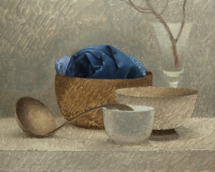
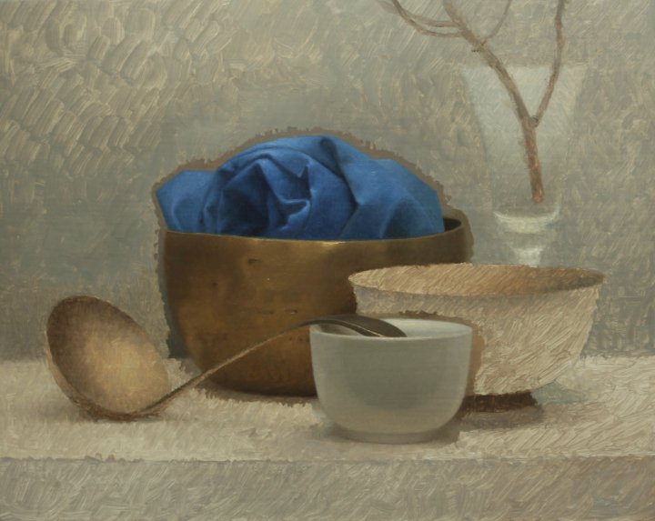
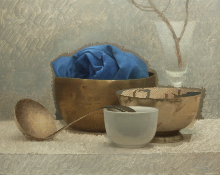
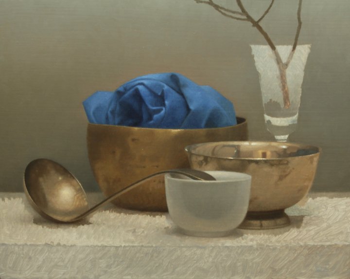
The overpainting is now complete. I will let this dry for a day or two and then do some final glazing and retouching as needed. It will be good to get a break from this piece and then come back and think about what it needs. …more to come…
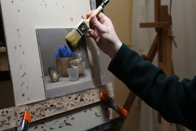
OK. Now I’m getting back to finish this sucker. This piece is dry to the touch. In preparation for oiling in and glazing the first thing I do is dust it off with a dry house painter’s brush.
I turn the piece and tilt it so the light rakes across the surface showing me all the dust particles. Turn the painting each way so as to see dust that catches the light differently.

Now I oil in using a soft brush with 1:1 walnut oil and odorless mineral spirits. The goal is to recover the freshness of the wet paint and create a “couch” in which to lay in the glazes or any other adjustments that need to be made.
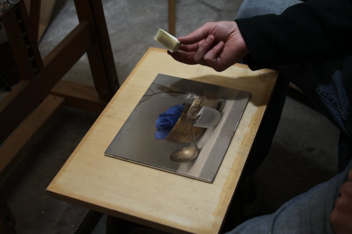
After brushing on my oil mixture I mop it up with one of these foam makeup wedges. I learned that from Douglas Flynt, a great painter and teacher.
I like to position the painting so I can see a light source bouncing off the piece. That way I can see how much I am mopping up. I try to leave just enough. This is a useful technique. Just be careful not to do it too many times or you will be adding too much oil to your paint film; not good for longevity.
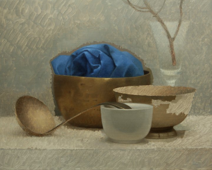
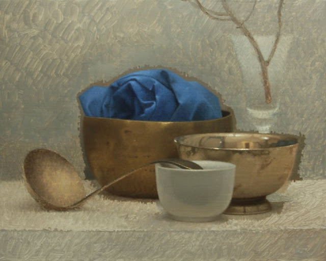
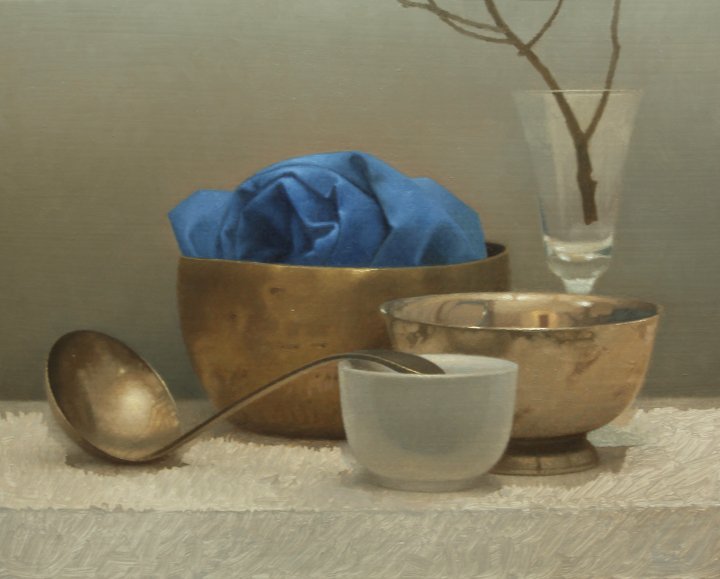
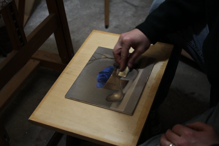
I just made some minor adjustments to most areas of the painting. Miniscule, really, but important to me in my communication. Once this is dry I will oil in and adjust one more time.
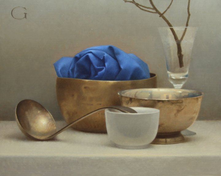
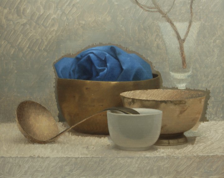
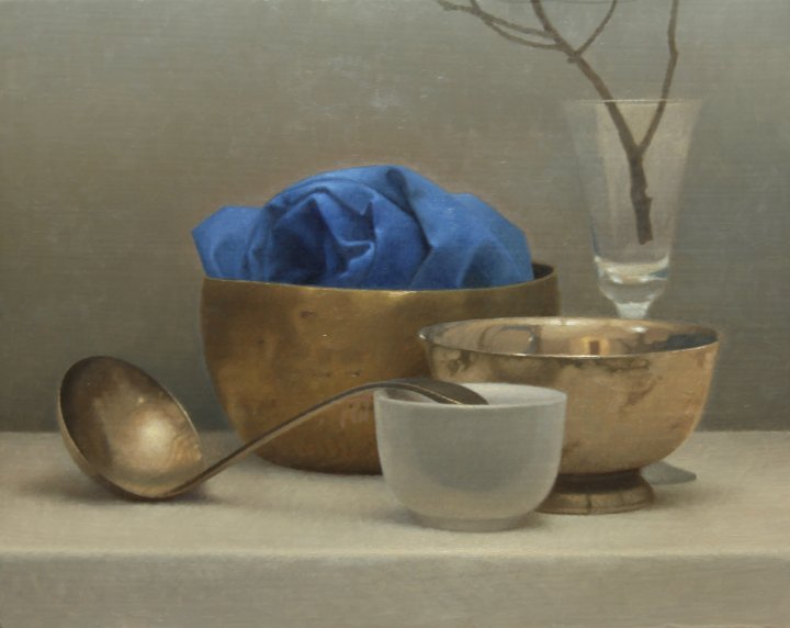
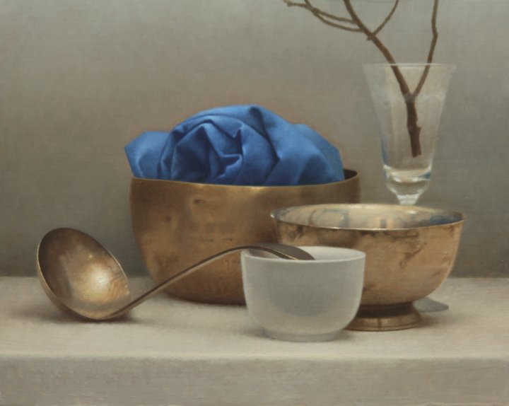
Final. I don’t see much change from this photo to the preceding one, but in real life there is a difference

I like to show these details because it shows the character of the paint more. The little jpegs can mislead one to think there is a photo-like quality to my work with no brushwork showing.
love, love this thank you
Thank you so much for sharing this.
Wow David gray this is awesome and just look so realistic 🙂 enjoyed each and every step and explanation .. in the midst of exploring painting and it’s fundamentals and ur blog really helps a lot 🙂 gonna do more of homework .. thanks for the share ?
Hello David, I’ve been stuck for a long while on my backgrounds. Your post has been very helpful to me and I’m looking forward to trying it. Painting the main objects first with the bit of background, I’d would have never thought to do it. You’ve given me much to think about. Backgrounds frustrate me and I’m always going back and having to repaint them, which almost always has me messing up any area. It’s very defeating and takes away from the joy of my hobby. Love, love, loved this. I love your grey wall and tablecloth which feels as cool and metaliic as your other objects without being so. Great work!
thanks, love it