About Julie Duell
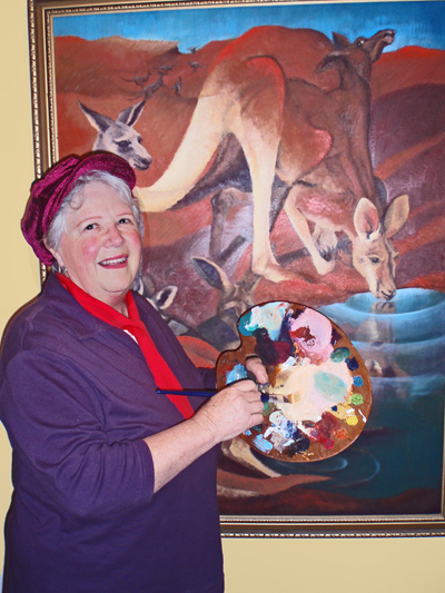
Julie Duell (nee Henderson) is a 6th generation Australian going back to the First Fleet of English convicts to arrive in Sydney cove in 1788. She also has a drop of American Shoshone Indian heritage for good measure! Julie was born in Sydney in 1941 and continued to reside in Sydney environs thereafter. Julie was named after the month of her birth, July.
Over many prolific artistic years, Julie has painted under the names Julie Ferguson and J. Ferguson-Duell before simply signing her works Julie Duell. As a child, she studied art at St. George Technical College, Kogarah and singing with a private teacher in Rockdale, entering numerous Eisteddfods as a soloist with some success.
Adult years saw Julie resume her art studies, once again at St. George Technical College and then numerous short courses on the Central Coast where she has been a prolific practising artist and art teacher since around 1970.
Inspiration: A deep love of nature, children and a fascination for human form, body language and portraiture. Also, the fairy realm.
Mediums of expression: Painting and drawing in charcoal, oils, pastels, inks, watercolour and acrylics with many works executed in mixed media. Her children’s book creations feature Australian fairies in the form of Sprites. Clay modelling and printmaking have been other strings to her bow.
Awards: Among a number of awards over the years, Julie’s Children’s book “Bush Sprites of Australia” attracted a special award from the Riso Educational Foundation of Japan in 1985, along with 3rd prize in an International Postcard Competition that year.
Visit Julie’s Websites:
http://artintegrity.wordpress.com/ – This is Julies main Website. This is a great site loaded with free art lessons. Make sure you stop by her Sales Gallery Here where you can purchase her beautiful artwork.
http://www.kidsfuncorner.com/ – Free site designed for children, teachers and parents. Julie has fun animating stories and creating learning aids that are fun, as well as giving kids an opportunity to showcase their work….
Landscape Painting Demonstration
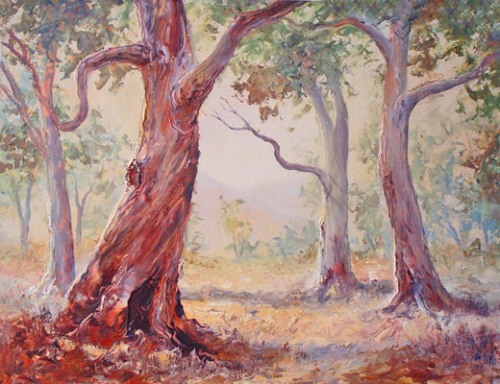
Ah! Here we are again…this time with a step by step demonstration for an Australian landscape featuring beautiful eucalypt (or gum) trees, which would have to be one of the most popular subjects for artists in Australia. I’m sorry but I can’t locate the original photographs I took for reference at the moment, (If they turn up I’ll insert them later) but here is the finished work and then we will look at the process followed in achieving it. The atmosphere was an early morning misty one on the old highway to Gosford from the Hawkesbury River. It was approaching mid-summer and the bark was shedding.
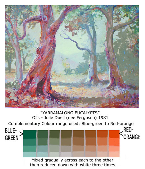
For a more detailed explanation of achieving this colour mix, please read the Post on Colour Mixing.
In the above mix, you can see a graduation from cool to warm as you go from left to right – then as each swatch of paint is gradually reduced with white downwards you come into the medium tones and finally the light tones.
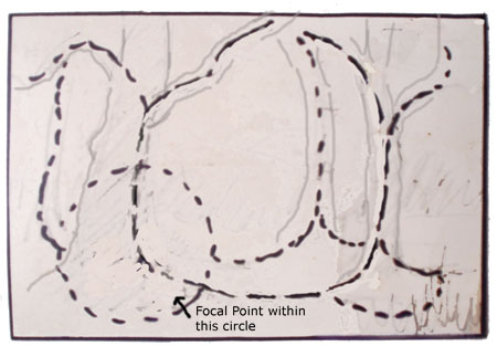
My first thought in developing this painting was to plan an eyepath for the viewer of the picture. It is so easy to lead the eye right off the edge, never to return … and a clever layout can help prevent this. It is all in the arrangement of the lighter and darker tones. This eyepath sketch is just a tiny planning thumbnail one on scrap paper.
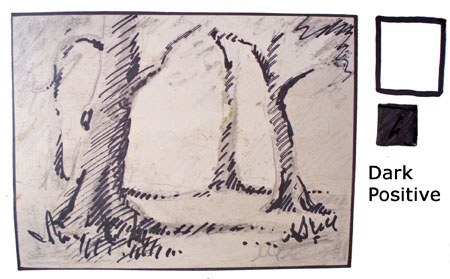
The subject is “Dark positive”. This means that most of the painting is light in tone and a smaller amount is tonally dark, so the viewer’s eye will be drawn to the darks. Following the eyepath plan above I now do another tiny thumbnail sketch, to map out where my darks (or shadowed) areas will be.
Whichever is the smaller in painting area (dark or light) is where the viewer’s eye will be drawn – so you can, as an artist, lead them on a little guided tour of your work. It takes a bit of thought initially, but most landscapes are dark positive so it becomes instinctive to arrange the positive areas in a pleasing manner and not have them shoot off the edges of the composition before the eye has explored the work. It is also helpful to decide on a main area as a focal point (usually where the strongest light meets the strongest dark). The focal point is what attracted you to the subject in the first place and it is this you want to convey to the viewer of the painting later.
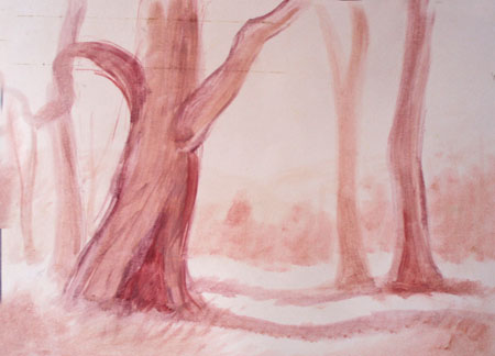
OK that is enough planning! I am keen to start on the canvas! First a minimal sketch to indicate the layout of the trees. For this I used a little acrylic paint thinned with water.
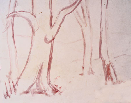
Next, quickly wash in those planned dark areas still with thinned acrylic paint, to be sure about where they are going to be – otherwise I might get side-tracked, which is so easy! Notice that the darks may form only part of the ‘named objects’ (in this case, the trees) and include caste shadows.
Time now to mix plenty of juicy paint, choosing two complementary colours – Redish-orange and blue-green mixed across gradually from one to the other and then reduced with white, as shown above. Complementary colour ranges are fully demonstrated in the Colour Mixing Post.
I dislike mixing colours along the way – for me it feels like having all the piano keys there ready to play to have a nice colour range laid out to choose from. I also like to mix as much of my range from just primary colours … it makes me feel like a MAGICIAN!
In this case I am using Oil Paints, but the same method can apply to acrylics. (If you use acrylics this way however, you need to keep them from drying out before you can use them e.g. mix in a shallow lidded container and spray lightly with water from time to time, putting the lid on whenever you are not using the paint.)
Now I paint quickly, confidently and with energy. It is common sense to me to work from the furthest thing away towards me in a landscape so that each stage working towards you is overlapping. Otherwise you may find yourself having to cut in around foliage with bits of sky. Some artists don’t mind this however, so it’s really up to you.
In this case, I laid down the pale non-blue ’sky’ colour smoothly with a brush (I am planning lots of texture later and texture against smooth is lovely) – then the distant hills (again smoothed out with a brush), next the distant foliage (starting to use knife texture now), then the tree trunks and finally the foliage and ground textures. I used a painting knife for added texture. This takes practise to handle but I love it as I can’t get too fussy and obtain effects I could never achieve with a brush. The greatest texture is in the foreground and the greatest contrast … around the base of the largest tree, where it was planned on that little scrap of paper in the beginning! Yea!
Leave a Reply