Colored Pencil Portrait Drawing Demonstration
[adinserter block=”68″]
The following steps show how I create a portrait in colored pencils. I call such drawings “imaginative portraits” because I create unique atmosphere in the picture set around the person’s face. I give myself liberties to interpret and change things around to fit my concept.
When I think of Stelli I often see her wearing bright lipstick, which is her ultimate color. Thus I’ve decided to play with red, subduing other colors. When I biked in town, I noticed beautiful red poppies growing in neighbor’s garden. The idea of juxtaposing her smile with bright red flowers came to my mind immediately.
Materials
I often use Prismacolor premier pencils and white drawing paper made by Strathmore or Stonehenge. The smoother the paper is, the better it is for colored pencil drawing. Besides Prismacolors, any soft pencils (Pablos, Luminance) will do just as fine to complete a portrait. Sometimes I add harder colored pencils (SOHO, Verithin,etc) to smooth out the surface.
Photo
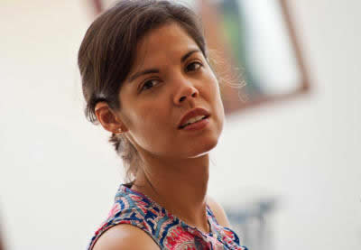
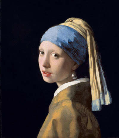
What I like about this photo is the whiteness and simplicity of the background space, making the beautiful face the focal point of the image. The rotation of her head, a half-open mouth and the play of light on Stelli’s face reminded me of Vermeer’s masterpiece “Girl with a Pearl Earring,” 1665.
Step 1: Develop a line drawing
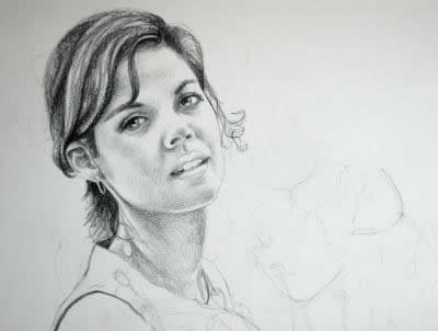
I worked on the actual pencil outline on a separate piece of thin, sketch paper. I transferred my lines using 2HB pencil and the window light. I secured paper’s corners with an artist tape to prevent it from sliding. You can also make a photo printout of the same size as your drawing paper and transfer the lines right from your photo. (However, I know that artists struggle with their drawing after that because they still need to understand the anatomy and how shapes emerge on paper. This skill comes from drawing people from life. This way of transferring the lines speeds up the drawing process but doesn’t help develop the skill of getting the shapes right).
[adinserter block=”68″]
Here I use a single colored pencil – Prismacolor’s dark umber to map out the darkest values in my drawing. The darkest values are in her hair, corners of her mouth, nostrils and the eyelashes. I always start drawing the face from the eyes. If they don’t come out just right, no matter how beautiful the rest of the drawing could be, it would still look wrong..
Step 2: Create an under-painting
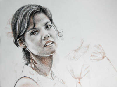
I used Prismacolor’s sienna brown in her eyes, forehead, cheeks, mouth and neck. I also added this color into poppies. When applied lightly, sienna brown falls into the category of medium to light tones. And thus this color allowed me to make soft transitions from the darkest values to the middle tones and the light.a
Step 3: Add red in halftones
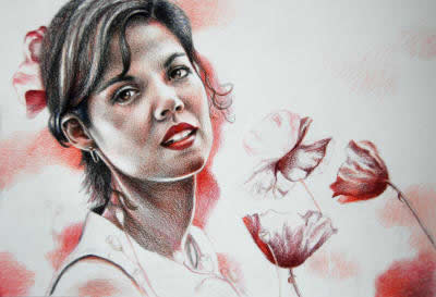
I started playing with reds. Prismacolor’s poppy red was applied throughout the mid tones. The darkest values of poppies were drawn with dark umber and Tuscan red. I wanted to bring Stelli’s face into focus more and thus I blurred the background and paid attention to soft edges found there. Soft, circular strokes helped me establish blurred shapes. I rotated the paper many times over in order not to create strokes going in one direction.
Step 4: Work in full-color
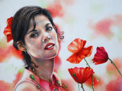
I varied reds by adding both warm and cool hues to poppies and her face. While poppy red is a warm hue, cool reds are –carmine red, magenta, and process red. Poppy red was also added into the greens. I added reds and sienna brown into the model’s hair as well.
[adinserter block=”68″]
I used cream in the lightest parts of the face (left side), while the lightest light (on the right) remained free of any shading!
I didn’t do any regular blending with turpenoid/gamsol as I knew it would make lines and values appear much darker and harsher. I did use Prismacolor colorless blender sparingly (in her hair for the most part) to blend the colors some.
I fix all my drawings with final fixative (spray) manufactured for dry media. It gives protection from the sun and humidity.
Veronica Winters

“The challenge of raising a child or cooking a healthy pot of food for a family was almost never as hard as painting a human being or mixing the right hues, evoking my emotions and thoughts onto canvases. It’s not enough to paint stories realistically, which is a long learning curve on its own, more struggles come from keeping myself breathe while painting, because I can’t live without the sensation, the action of painting. Painters paint themselves through their models, symbols, and stories. I paint the stillness and the quietness, the inner life and emotions-the beauty of life, expressed through the figurative, objects, and landscape. Painting after painting, I’m aiming to become better at examining the powerful marriage of feelings and thoughts in a more coherent way.”
Very nice.
Very nice.thank you
Hi Ralph, Hi Veronica,
thanks for sharing your art. I follow all your lessons , All are very interesting and well explained.
Watercolor pencils are great. It seems easy to use, but are not. .
It becomes much easier learning your classes on line.
Thanks again.
Beautiful and thank you for the lesson
Dear Mam Namasthai,
Fantastic explanation, Nice
pencil work.
Expecting more ……..
Thank you .
KRISHNADAS