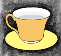
OK now – so far we have looked at straight lines in perspective – but what about curves? Take a look at this chart…then hold a coin in your hand, flat on to your eyelevel. Slowly turn it away from you and watch what happens to that circle…it becomes more and more elliptical – the side curves becoming more and more pointy… then see how this applies to the ovals in the teacup and saucer.
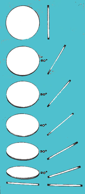
Thus it happens in nature – where the bend in a road or river, or the curve of a bay becomes more pointy or elliptical, the closer to the ground is your viewpoint…(it is so often we see a painting spoiled by a bay of water that appears to “stand up” and not “lay” properly in the landscape.) Now you will know why! Large rounded curves belong with a bird’s eye view.
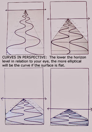
Can you see how the curves are more rounded the higher your viewpoint in relation to the horizon? As soon as you establish a horizon in a landscape you establish immediately where you are in viewing the scene..the closer to the ground you are the more elliptical or pointed the ovals become.
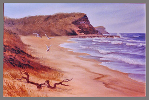
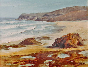
There may be only one curve in a picture but it needs to be “right”… here’s an example “North Avoca Beach” which was a painting commissions many years ago…notice I have had to do 2 things: get the overall scallop of the water edge right (each line of waves following suit) and slope the beach down to it (after all that is what is stopping the water from flowing further!) This was easier to assess because I painted it on location right at the scene…
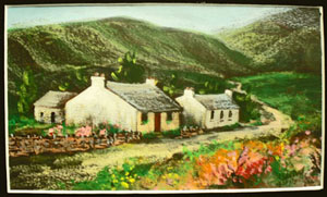
In this next painting the perspective is in a road and some houses and I have had to make allowances for the hilly terrain as the road snakes its way up into the hills. Very often the ground is not level and we have to make adjustments in the drawing through close observation. “Glengariff cottages” was a small study from our visit to Ireland .
As well as making things appearing smaller as they become further away from you, they become less distinct (less visible detail), making things in the distance become lighter in tone – so this is a way you can add to your illustion of perspective in a painting – graduating your darks from the foreground softer and softer into the distance. Here are some demonstrations from my collection, which I pushed a bit to indicate the hazy atmosphere of the day.
The difficulty of painting from photographs is that the camera tends not to give you this tonal softness or details within shadows (it makes them more black/dk grey) so we as artists, need to be aware of this and compensate where needed…
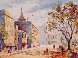
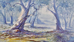
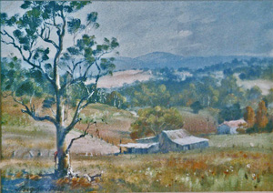
Another thing to realise is that as things become close to you they overlap what lies behind them, covering up part of the shape behind. Here is a landscape to show you what I mean. First the initial sketch…
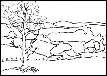
and now the finished painting…(Gloucester hills). Can you still see the overlapping?
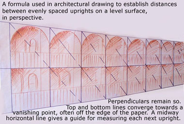
Now if you are need to do more precise architectural drawing, there is a formula for spacing uprights towards a vanishing point. It might be fence posts, poles, tenament buildings or similar. I haven’t had to use it much, but it might be useful for someone to include it here. My chart isn’t exact (my perpendicular lines shouldn’t lean over) but it should be enough to give you the idea. You have to judge or measure the first segment at left, then you can find a midway point and by drawing a diagonal line through it you will find where the next segment upright will be. It can apply to fence posts, telegraph poles, buildings – anything uniform. Of course the result wil vary depending on your first two lines top and bottom which converge to a vanishing point (in this case, outside the area of the drawing).
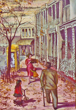
Without being too architecturally exact, I broadly used the above formula in the following painting of Sydney “Rocks” area in autumn…
Finally, there is the difficulty of placing figures in a landscape and getting them the right size for their positioning. This can be very tricky. To have some sort of “norm” from which to bounce is about the only way I know of to manage it. Since the height and shape of different people varies so much, I find it most helpful to establish first where their feet would be so that they are not ‘floating’ in the painting!
From there I like to put a mark where the top of their head would come to, imagining I were in the painting and how high I would be in relation to other things in the composition. e.g. a doorway of a building or a tree.
Having put down those two marks for the top of the head and the feet, I then place a midway mark for a standing figure which represents the half-way hip mark. I can then more easily sketchin the figure in the right proportions, being careful to avoid the common trap of making the head too big. Once figures are placed correctly, a shadow “anchoring” them to the ground level helps complete the illusion.
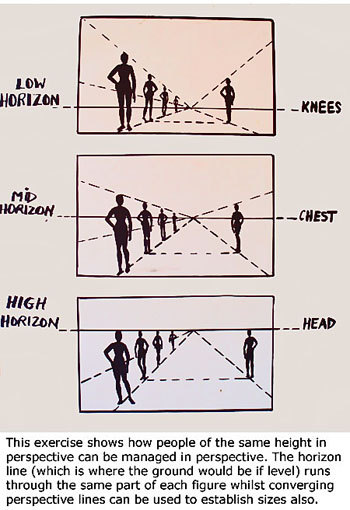
Of course, if you were sketching people of much the same height (e.g. soldiers marching etc.) you could use the chart below which puts the “horizon” line through the same part of each person’s body…
For those of you interested in methods the cartoonists use to achieve the illusion of huge towering buildings or massive chasms – there is 3 point perspective at play!
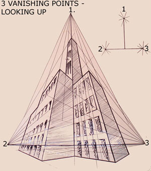
Actually the above example is even beginning to take in a 4th vanishing point below the horizon line from 2 to 3!
Here is is a ‘birdseye’ view looking down with 3 vanishing points:
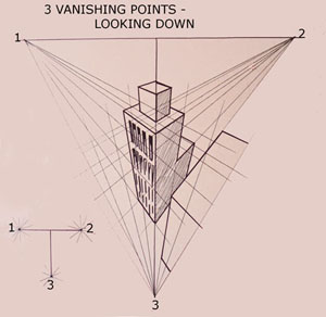
Now here’s a hard one – supposing you need to draw a pile of boxes all thrown higgled-piggly in a pile! Because they would not be flat a level surface, each would have its own different angles … therefore there could be multiple vanishing points & most of them out of the composition! What could you do then to draw such a subject?
Well, we can always fall back on the “clock hand” method shown earlier to assess each line as coming from the centre of a clock in relation to the sides of your paper. If complex and confusing, try segmenting the area into a grid of 4 and deal with each quarter on its own.
Whatever your need to use this illusion called perspective, I hope something in this Post has helped you.
One last tip:
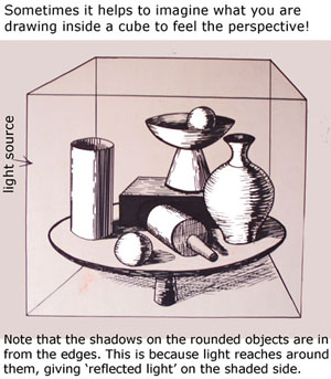
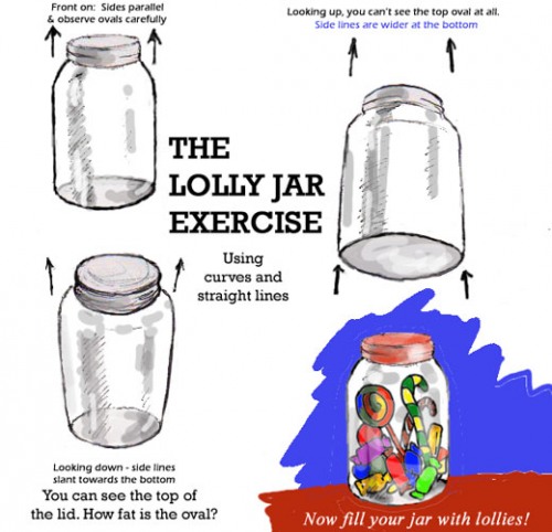
In response to a request, here is an example of drawing a Lolly Jar from 3 angles. Because it isn’t a huge object (like a high rise building) there is no need for 3 point perspective but because curves are involved as well as straight lines, it is a good exercise:
If you would really like to see the illusion of perspective in action, check out the miraculous 3D chalk art by Pavement Artists such as Julian Beever and Edgar Mueller.
I hope this Post has been helpful to you.
Cheers! Julie
<< Back to Part 1 Perspective Drawing Tutorial
Tutorial created by Julie Duell
Visit Julie’s Websites Today:
https://artintegrity.wordpress.com/ – This is Julies main Website. This is a great site loaded with free art lessons. Make sure you stop by her Sales Gallery Here where you can purchase her beautiful artwork.
https://www.kidsfuncorner.com/ – Free site designed for children, teachers and parents. Julie has fun animating stories and creating learning aids that are fun, as well as giving kids an opportunity to showcase their work….
Very nice job at explaining most issues with perspective. A good start.
Este foi o primeiro tutorial que encontrei na internet capaz de dar-me informações tão claras, possibilitando-me muita compreensão. Muito obrigada.
Thank you . Has given me a better understanding of perspective.