About Vincent
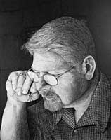 My life has been influenced over the years by many things. First is my fundamental belief in God and second my family and the rural up-bringing that I have had. These two basic values have guided me and given me a love for nature, history, and the country life style.
I have always loved to draw and paint but, in 1996, I decided that it was more than just a hobby for me. I was not happy with the occasional sketch or quick scribble. I began seriously considering the world around me and then working out the God given talent toward a perfecting of a personal style so that I could render the scenes that I so dearly love. It is that perfecting process that has guided me to where I am now. No, I have not arrived. Nor have I attained perfection. On the contrary, I believe my journey has merely served to push me on toward the mark. It has given me feelings of accomplishment and greatened my respect for God’s creation.
Follow this link to visit Vincent’s Website
Bark: Stumps and Trunks
Thank you for viewing my work and taking the time to look deeper into the way I go about doing my drawing work. Each artist will have their own methods of working but, they don’t all share them. It is my hope that by sharing my techniques that more people will become happier with their work and in turn will want to share what they enjoy with the people they come in contact with and promote my theme “Keep On Creating”!!
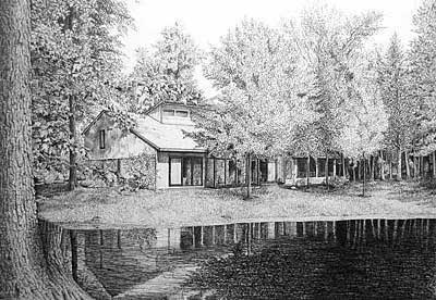
I have wanted to do this tutorial for a very long time now. I have had many opportunities to choose from in the past, but none quite like this. The tutorial I will do here is based mainly on trees from the “Gilbert Home” portrait that I completed in November 2006.
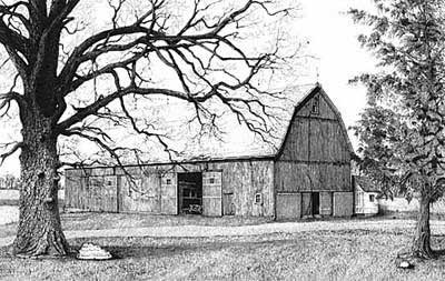
And on the large Oak tree from the Elwer barn drawing I completed in July 2005 called “Between Two Trees”.
I have done many home portraits in the past. Most of those have had trees in them of one kind or another. It is something that, as an artist, no matter what level of expertise you are at, you will have to do some time. You may be asked, or just decide, to do a tree in any season of the year, so you will need to know how to apply the techniques you learn to the various conditions of each season.
As you may know, I do my drawing work with Acid Free inks in ballpoint-style pens. I use Staedtler “Triplus” Fine and Medium Point pens for their archival properties. However, I have many drawings I’ve done in the past, with Bic or Pilot pens that are as old as 15 years and have not faded or yellowed. So, I would not be concerned with what type of ink or what brand name of pen you are using while practicing these techniques. I will only say that you should use the type of pens that you plan on doing your completed drawings with once you practice and get a handle on the techniques here. By doing this you will become more familiar with your normal tools, and will be better able to apply the techniques you learn here with them.
The techniques I will go through here are ones I have developed and adapted to my needs, but I would not go so far as too say that they are the only ones that work to get the results I am looking for. As a self-taught artist, I am always looking for new ways to improve my work. But, this is what I currently do and how I do it to render trees and foliage in my drawings. Keep in mind that you may want to change a step in the process as you go. That is all a part of your “artistic license”.
“The Blobs”
This is a term that refers to the ink that builds up on the ball tip of a ballpoint pen while in use. It can leave an unwanted ink spot on your paper. It happens when you use the pen in a motion that goes in more than one direction without the user lifting the ball from the surface. The ink builds up on the back side of the ball when moving it in one direction and then when you change direction the ball actually drags the ink back down and into the ball path depositing it on your surface creating an ink “blob”. To avoid this, you should clean the tip frequently. Try to get used to working your pen in one direction then lifting and returning it before placing it back down and working it in the same direction. It may sound more difficult than it is. With some practice you will get the hang of it. If in doubt, clean the tip. Better to be cleaning often than to wish you had and get the BLOB.
Getting started
There are two basic types of trees, Deciduous and Conifer. Deciduous trees have leaves, and Conifers have needles. Within these two basic types of trees there are many species, all of which have unique characteristics that should be considered when attempting to draw them. The best help I can be to you is to tell you that it takes a lot of time in observation of your subject in order to become familiar with the different characteristics of each type. Most of us don’t wake up and just know how to draw a tree. You may say that you’ve seen lots of trees in your time, but have you sat for hours looking at just one?
I mean get real acquainted with it. Pick a spot that you can come back to time and again for the same view. Do this at different times of the day, in different weather conditions, and in the different seasons of the year. See how the light and shadows affect your perspective of it. Make notes, do quick sketches, and photograph it.
Bark: Stumps and Trunks
For this tutorial I will be drawing mostly Maples, Oaks, and two different species of Pines. The main focus will be on the large, left foreground, Maple in the “Gilbert Home” portrait.
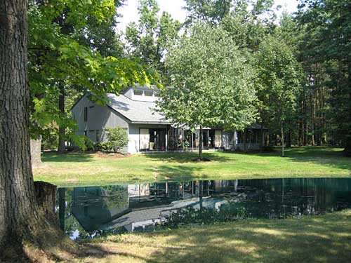
I start by making a light pencil sketch of the drawing taking into consideration what I have discussed with the home owner as to what is to be changed, eliminated or added to the drawing. In this drawing, the owner wanted the foreground of the pond edge to be removed, showing the water at the bottom edge of the drawing. I also made mention of opening the sky a bit and removing some of the foliage to give a less busy look to the image. I also intended to remove the shadow in the grass on the far bank that was being cast by the tree that was directly behind me when I took the photo. After taking these things into consideration, this is the sketch I ended up with.
This layout sketch is only a guide. It isn’t like what your mother used to tell you — “Now, stay in the lines, Dear.”
I don’t start in the same place on every tree I do. It depends on many things as to where I start. But in this one I knew that the base of the tree trunk, and the remaining stump from an earlier felling, would be the closest thing to the viewer, so that’s where I started.
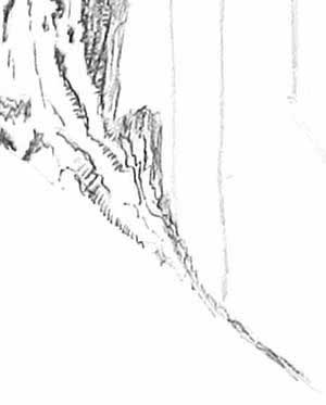
Taking my Fine point pen, I first insured I had good flow of ink on a scratch paper. Then, using my paper towel, I cleaned the ball tip. Using a very light touch, I begin by defining where the bark will be darkest and how it will run. I make light lines with my pen to give myself a line to follow or build on as I go.
*Remember — this is a layering process, so don’t attempt to go to the darkest of tones all in one stroke.
Note: I did not attempt to make an exact copy of the tree or the bark lines in the photograph for this drawing. The tree is NOT the main subject. As long as it is recognizable to the property owner/viewer as being the species of tree you are attempting to render, that will suffice. You don’t have to have every bark line or leaf drawn in exactly the same position as in the scene or reference photo. Just be careful to capture prominent identifiers in the tree and it will be seen and recognized as being what it is and where it belongs. That is where artistic license is put to practice.
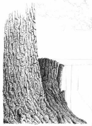
I started at the top of the cut edge of the stump and went down toward the ground. Be careful to follow the flow of the growth pattern of the tree. Bark starts out as a solid skin. As the tree grows the inner layers are forced toward the outside which forces the solid skin to age and split as it dries out and is weathered over time. You will need to consider the direction of your light source before trying to define the highlights too much. Getting the boundaries set for the bark lines allows you to see where the highlights will be. Consistency in light source and range in tonal value throughout the drawing will determine how believable the image is to the viewer.
After the defining lines are in I use a slightly angled line done in more of a scribble technique quickly and in short strokes to build depth behind the barks edge. Each line is drawn with a starting point just above where I want it to end, and drawn in a downward stroke that follows the contours of the bark section. This is where you want to avoid the blobs I discussed earlier. The stopping action of the pen stroke will build a more bold tone than where you started it due to the ink being heavier on the ball after it has been rolling a bit. This all happens in fractions of seconds without you thinking about it, but it is all a part of knowing your tools. Draw one and lift, place the tip, draw one and lift.
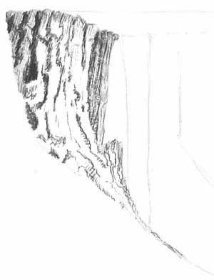 After just a few minutes you can see a basic line layout of where I intend the bark to be and where the darks and highlights will be. The results of two layers of the drag technique are also visible in this image at the outside edges of the stump.
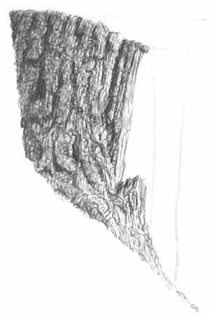
With the basic lines in place I proceed to build the textures of the bark in the stump. To do this I fall back on the time I’ve spent looking at trees. I look at the reference photo and note the general lines in the shape of the stump. Knowing the stump is rounded in shape and is narrower at the top than the bottom where the roots grow into the ground, I can use this in my texturing. I will follow the arch of the top to put in light, horizontal lines throughout the rest of the stump in each individual bark section. This helps build the belief that the subject is 3-D and not flat. Next I add light vertical lines in each individual bark section to show that the subject is growing out of the ground. In the bark sections that are at an angle, I use light lines that follow those angles to show continuance of the growth lines there. After I have completed these lines I go back and start over with the ‘drag’ technique to blend and build shadows where needed. These lines are very short and light but, come together to create textures that are seen as natural.
 |  |
| Section before stipple applied. | Section after application. |
| dggggggggggggggggg | |
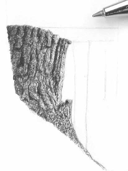 | The tree stump so far after stippling has been applied. |
Bark: Stumps and Trunks
Taking a Medium point pen, ensure you have good ink flow, and then clean the ball tip as before. With a light touch, begin to add darker tone layers by following the previous contour lines that were laid down with the Fine point pen. I start in the darkest area and work my way through to the area that will be the lightest.
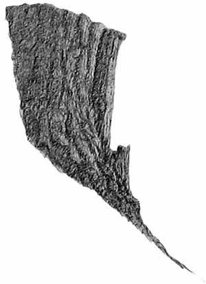 | Completed stump |
Moving on…
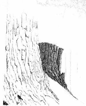
From here I moved to the full tree just to the left of the stump. It is a matter of repeating the process that we did on the stump with a few minor adjustments. Since the tree is not cut off and there are no limbs or leaves in front of it, I will start at the base and work my way up. Using the Fine-point pen again, I get the bark layout lines in.
Then put in the angled depth lines along the bark section edges.
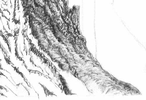
Now I want to focus on the section between the stump and the base of the tree. This is a portion of root section that is a bit different from the rest of the tree. It is a transition point between the two subjects. I don’t want it to be so different that it stands out, but I also don’t want it to merely be swallowed up by the rest of the image. I will define the bark lines lightly and then use the drag technique in an arched line stroke to show a slight roundness to the surface. Starting from the top of this section where the stump and the tree seem to come together and working my way down broadening the stroke as I come to the bottom.
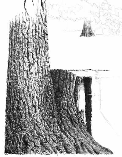
Once this area is defined and toned I moved to the tree trunk on the left. I used the layering directional lines as described in the stump portion to build the texture in the bark sections. Then using the drag technique I built the values in the section of the tree to where I wanted them. Then use the stipple technique to push the textures up.
In this next photo you see the results after adding 3 more layers of Medium-point work combining line strokes and the drag method. There are six layers in the darkest point of this image in the bark work. I constantly refer back to the reference photo to determine how dark I want to go in the shadowed areas. Those darks make the image go from flat to 3-D and make the image more believable or realistic.
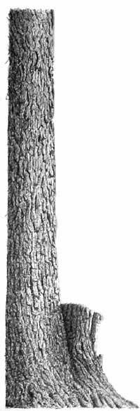 |
For the rest of the tree trunk in this image, since is not covered by any overlapping limbs or branches, it can be finished by using the techniques that we have already gone over. Refer back to the reference photo and put in the bark layout lines so that the rest of the tree trunk matches closely and follows the same growth patterns throughout. There will be some slightly darker shadows on the left side trunk edge. This shows that the trunk is rounded away from the viewer, and it gets naturally a bit darker as it goes up away from the viewer. Likewise, the details get smaller and less defined as it gets farther from view. The cropped image shows the tree trunk completed with all the tone layers in place.In tutorial 2 I will show you how the Leaf work is done, and how it is incorporated into the rest of the drawing in the Gilbert Home Portrait. Part three will be on mid-ground and distant trees. Part four will be on the Oak tree without leaves from the Elwer barn drawing called “Between Two Trees”. Then, part five will be on the North American Blue Spruce, from the same Elwer Barn drawing.
To see larger images of both the completed drawings that I am using as references for these tutorials please go the Gallery sections. Thank you and I hope that this information is helpful to you.
You can email me any questions and I will be happy to answer you.


Leave a Reply