ABOUT THE ARTIST
George Max is a Geologist, Fine Artist and Professional Translator from central Guatemala in Middle America. He was born in 1968 in a small town called of Cobán, 200 km north of Guatemala City. He traveled to the USA (Colorado State) in 1989 to study English under a one year scholarship program. He started getting acquainted with art since his first year in College in 1988. As an autodidact, he started his labor of art in 1992 making oil paintings on canvas. Nevertheless, it was until late 2004 when he began to produce formal artwork (oil paintings mainly) for exhibition and sale to date.
Artwork Website: http://www.georgemax.co.nr/
Translation Website: http://www.geodirect.co.nr/
Artist Email: georgemaxart@hotmail.com
Translator Email: geodirect07@hotmail.com
Pastel Portrait Drawing Demonstration by George Max
ABOUT THE SUBJECT
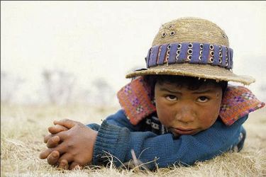
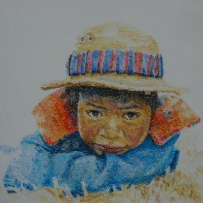
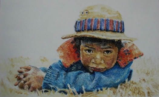
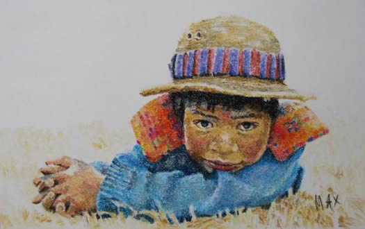
For this pastel drawing I used the portrait of a little fellow from the highlands of Western Guatemala. His skin is burnt brown because of the cold climate there. He is wearing typical clothes and a decorated hat from the region; Todos Santos Cuchumatan. Although I printed the picture in my Canon iP1300 the colors came out bright so I used the picture in my screen for better reference to the colors, hues and shades.
THE MATERIALS
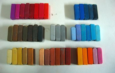
For this demonstration I used a 64-color set of Mungyo soft pastels (27 mm x 8 mm) and a sheet of Strathmore Pastel paper (11” x 14”) of the clearest color. I found out that this paper requires at least 5 mm sticks or pastel pencils to be able to fill the texture more efficiently and render details in realistic drawings.
The Palette: To the lower left are the yellow ochre colors I used to do the face. In the middle, the brick or maroon tones for the cheeks and lips. To the lower right are the orange and pink colors for the “neck warmer” of the kid’s shirt. In the middle row are the brown and dark colors I used to define, draw and shade the eyes and hair. Grays were used for the shines in the hair and other shades in the eyes and else. To the middle right are the pale blue colors I used for the sweater. And to the top left are other random purple, dark reds, and reds I used to strengthen some values in the neck warmer. To the top right are the dark blues I used for the dark areas and shades of the sweater.
THE DRAWING PROCESS
Although I have used oil pastels for head portraits before, my contact with soft pastels has been limited to sketches and a few drawings due to material unavailability. It is until this year (2008) that I began to make some formal pastel drawings and build my own collection.
In the following, I will go on describing the process or method I used to make a pastel portrait drawing. I would like to say that this is not an instructional demonstration rather my inventive approach to creating a portrait using soft pastels.
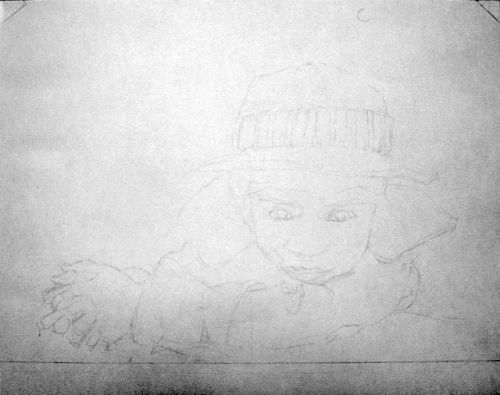
Base Drawing: A precise drawing is always required to begin a pastel drawing. For this case I made a nearly fainted drawing which I have enhanced for the purpose of viewing it on the web. The only thing I have modified is the eyes. The subject is now looking straight to the viewer. Notice that I have drawn a line at the bottom as the base for my drawing which I can later use to crop the drawing if framed. You can also notice that I have fitted and centered my subject horizontally as compared to how it is in the picture. In another demonstration I will show you how to create a pencil portrait over drawing paper.
STEP 1: Using the lightest yellow ochre I begin filling the lightest areas such as below the eyes, lower nose, above the upper lips area and on each side of the face. For this primary layer, it is important to just gently and slightly rub the pastel over the paper to avoid bloating it. This is just a reference to our coloring which we will later redefine and enhance. Square strokes are not good for any drawing so I just hover the pastel stick over the paper in circle patterns without applying much pressure.
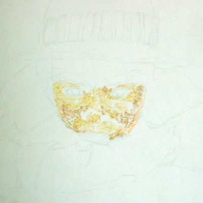
STEP 2: Using darker yellow ochre I continue filling the areas above the cheeks and below the sides of the nose. Some darkest yellow ocher is used to define the nose, and the areas below the cheeks and the eyebrows.
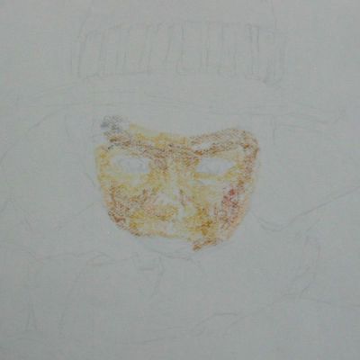
STEP 3: Here I have tentatively defined the eyes and the eyebrows. Not much filling is yet noticeable. This is just yet with the lightest brown color so that we can overwrite it later. The mouth has also been slightly defined with brick and dark red colors. Some gray is noticeable below the lower lip and left side of forehead.
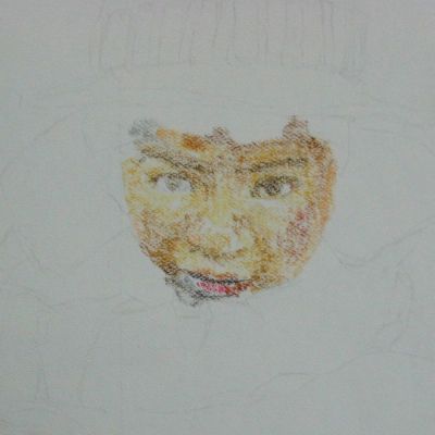
STEP 4: Most areas of the face have been filled and facial features are identifiable. Hair and cheek colors and some light brown on the right of the forehead have been added. Overall, this is just a thin layer which can be easily removed with a kneaded eraser if needed to correct color inconsistencies.
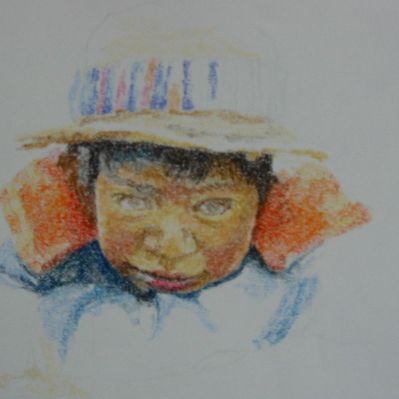
STEP 5: As soon as I have filled most of the face area, I begin to work on the adjacent elements to help me limit and redefine the shape and size of the face. I constrain and verify proportions and location of features at this stage. We don’t need to rush on filling or finishing an area at once, just pause your work as necessary and come back later when you feel like to continue your drawing.
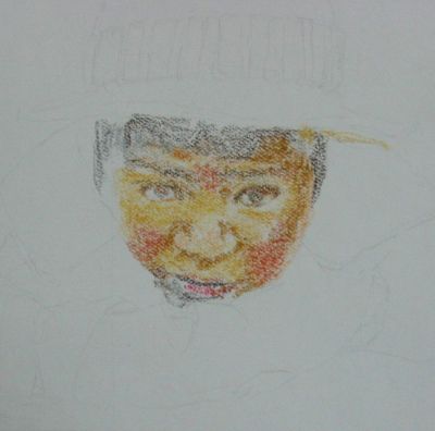
STEP 6: Once I have constrained proportions and progressively but slowly continued to fill more areas, I extend my drawing up and down. I start to define overall color balance and contrast at this stage. This is at the second day of the drawing I haven’t yet constructed the eyes.
STEP 7: At this time (2nd day, late night) I have carefully filled and defined the eyes and eyebrows. To produce a fine tracing and avoid making mistakes I use the corners of the sticks. I continue drawing the hat and sweater as I continue polishing and refining the face and features. This is a long process but it renders good results in soft pastel drawing. Dark shades in the cheeks are not yet added.
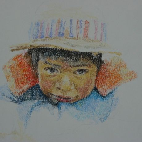
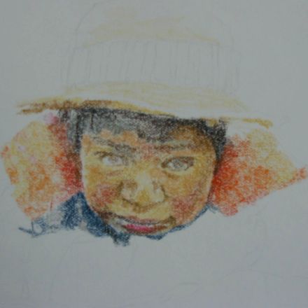
STEP 8: Here I continue filling adjacent areas and working on the hat as well. Also I start to add the dry grass on which the kid is resting. For this I use the lightest yellow ochre and the darkest hues to define strings and strips of the dry grass. Some details in the lappets are also visible.
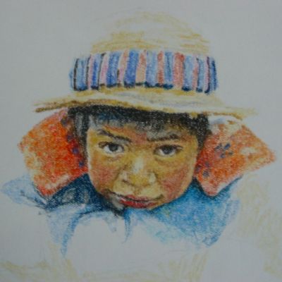
STEP 9: Now I have almost finished with all surrounding elements and continued drawing the sweater to the end of the arm. You can notice that I have at last added the darks in the cheeks that give them a burnt effect in the skin. Red hues are intermingled with the darks hues by rubbing pastel over the previous layer.
STEP 10: At this point only some details in the clothes are pending and then I continue with the drawing of the hand.
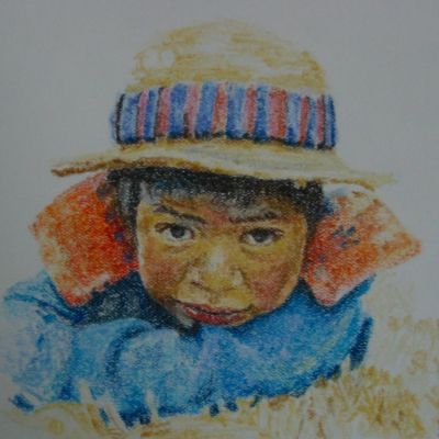
STEP 11: Almost at the final stage here. Some overall detailing is necessary for completion.
FINAL STATEMENT:
After our subject has been thoroughly and evenly covered with pastel I proceed to do a final refining and polishing as a final step. This will give chance to work on some final detailing, strengthening and enhancing color values and defining more contrast and color balance. Note that the overall coloring of the drawing is brighter than the reference image. Due to my limited palette I was not able to produce much of the original values and hues. Also my digital camera picks up much brighter colors that they really are in the drawing.
I hope you can grab something important and useful from this pastel portrait drawing demonstration. Please feel to contact me for any comments or questions you may have on this pastel drawing demonstration. Until another drawing demonstration I wish you all the best in the making of your artwork.
they say first you have to paint the surroundings and then the main picture.hear i have seen the picture is almost completed then the surroundings were made light. any specific reason.
other wise the portraiti is marvelous.i did not think with pastels it will be so nice.
Love this subject and your rendition, it is very natural.
Really like the site. pastel has always really fascinated me because there is something about the texture and warmth of the medium that is appealing.George Max and the step by step presentation has alot of merit to a beginner like myself.
I love this little kids picture . I love your work also.
this is one of the superb application of pastel
I like the way you work around the light and dark areas of the boy’s face. I wish you could draw my son too
.-= nomfundo´s last blog ..Oil Painting Art Course – Is Using Photographs OK? Edgar Degas and Norman Rockwell Thought So =-.
This picture is so realistic I at first thought it was a photo.
I use pencil and charcoal in my drawings but hope to expand and start using pastels, they seem so versatile and blend in really well.
Lovely pic…very nicely explained as well..please include more designs of soft pastels and the details regarding how to make it…
Simply stunning. The fact that it was done using only pastel really adds much value and complexity to the art. Great work Cheers
Fantastic! Do you sell your paintings online at all?
very,very good