About Faith
Graphite Pencil, Charcoal Pencil and Pastels Artist
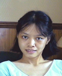
Hello! My name is Faith Te. When I was 16, a great desire to capture nature and the people around me started my passion for drawing. I began to look at drawing not just as a hobby but something which I wanted to do all my life.
I practiced every day and for many hours since. I taught myself to draw by experimenting with different techniques and materials and through helpful tips and advice from other artists.
Initially, charcoal and graphite pencils were the only mediums I used. When I began working in color, I used pastels, and more recently, oils. My main subjects are portraits but I also enjoy doing many other subjects including still life, landscapes and flowers, especially orchids.
I devote many hours and lots of attention to detail into each and every one of my drawings or paintings. My ultimate goal is not only to achieve detail and realism but also to capture the life and character of my subjects.
Thank you for your interest in my artwork. I sincerely hope you enjoy your stay here on our web site. Please visit again soon!
Please take a moment to visit Faith’s Website and Blog to learn more about her and her products and services.
Her Website: http://www.artisticrealism.com/
Her Blog: http://www.artisticrealism.com/artstudio/
Portrait of Ron Hontz
step-by-step pastel painting by faith te
Medium: Soft Pastels
Paper: Canson Mi-Teintes — Terre de Sienne
Size: 28 × 36 cm (11″ × 14″)
Stage 1
The outline was initially drawn on a separate sheet of paper until it was accurate.
Then I used a sheet of paper covered with Burnt Umber soft pastel powder to transfer the outline to my final pastel paper. I used the textured side of Canson Mi-Teintes.

Stage 2
Here, I started to work on the underpainting for the skin tones using light Yellow Ochre, Burnt Umber, Permanent Red, and white soft pastels. I then blended with my fingers to achieve soft and gradual tones.
Started to work on the hat. I used black for the general tones and light Ultramarine Deep and a little white for the highlights.
I am using Rembrandt soft pastels and, occassionally, the harder Van Gogh square pastels for some of the details and edges.

Stage 3
Worked on the hat some more.
I have now added some greens and blues to the darker areas of the skin.
I have also started painting in the shirt using Ultramarine Deep. Ultramarine Light and white were used for the lighter areas.
Black was used as underpainting for the background.

Stage 4
Continued working on the skin tones — darkening shadows and adding highlights. At this point, I am adding more detail and also paying closer attention to getting the likeness.
I have now darkened the eyes, added eyebrows, and worked a little on the lips and gums.
I decided to give the portrait a full background and randomly applied various greens.

Stage 5
Continued working on the head as well as the clothes. I have added folds to his shirt to give it a more natural look. Orange was used for the shirt’s shadow areas.
I wanted to give the portrait a more complex background, so I added more greens which I then blended lightly with my fingers to produce a “blurry trees” effect.

Stage 6: Finished
I worked some more on the teeth and lips. Also, some of the hightlights were further lightened and the shadows darkened to give the portrait more contrast. And after a few other finishing touches, the portrait is finished.

I hope you have enjoyed this pastel portrait study. Thank you for reading.
Faith,this a great pastel lesson/study.
this is awesome. you did a fabulous job… is this for commision?