By Elin Pendleton
This painting lesson will show you how I move from an original idea, through the entire process as I paint an equine subject in my studio.
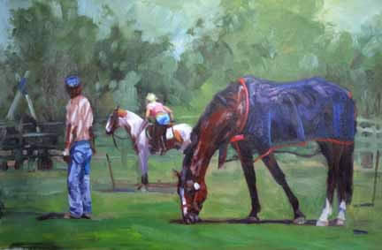
The reference photographs:
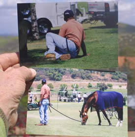
I liked the sitting position of the groom, but the light and shadow pattern on the standing figure just made me ache to paint him!
First off, I get an idea. Sometimes that comes from a photograph as this piece did, sometimes it comes as an idea in my head. For this painting I took these photographs at a horse event near San Juan Capistrano in the summertime of 2002.
And another thing about the standing figure–he was ‘way too large against the horse’s height. This was no jumping pony, but a huge warmblood. Photography will do that to a subject, and one must always be mindful of the relationships of scale.
The format required a 2:3 ratio (such as a 24 x 36 canvas) but that would be too large to ship easily to shows, so I took the 2:3 ratio down to 16 x 24…and I happen to have two frames already made up in this odd size! Next was to staple a piece of linen canvas to a board and mark out the rectangle. Usually I paint over the entire surface with a wash of oil thinned down, to prevent “holidays” (bits of canvas showing through) but just forgot. After the piece is done, I’ll trim it down and mount it on a pre-cut and primed board–I use 1/4 inch birch plywood right now. At about $18 for a 4 x 8 foot sheet, this is reasonable–more so than stretcher bars!
The colors used for this painting are the usual palette of five colors and white. I use this limited palette on location, because I can get any color I need and am not hauling around a lot of tubes.
The colors are: alizarin crimson, sap green, ultramarine blue, cadmium red light and cadmium yellow light. That plus white equal my palette.
The planning stages:
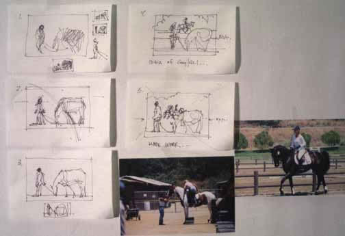
Normally I don’t do this many little plans, but I wanted you to see how I think through a plan to the finished idea and then begin to paint.
The image above shows five little sketches from a 3 x 5 sketchbook. Sizes are small because one can think and execute a sketch quickly without too much detail. The first one (upper left) is the rectangle (always show the edges of your work so you can design WITHIN the space) and the original idea of the groom and horse grazing. The little ones around the perimeter are less than one inch wide, but tell me a great deal about placement and value issues.
Number 2 in the series is working through the movement of the design–strengthened by the supporting front legs of the horse, and the backward look of the groom. There’s an “X” starting to show up, which is the strong abstract composition of this piece. It’s about design.
Number 3 is sorting through the placement of the figures in the ground, and starting to worry about eye-level lines (aka horison lines) and also the issue of size of the space around the figures.
#4 solves that issue with the placement of tree shapes, and then the brainstorm of an idea of adding something for the groom to be looking at–a girl on a horse maybe?
Then I started looking at my other photos from that day (light was the same, and direction the same) and came up with two possibles for the reason he is looking over his shoulder. I decided that the gal with the pinto and her derrierre would be a great, humorous thing for him to look at! And the title came to me then, “To Each His Own”.
So the fifth sketch lays in the eye-level line (also called a horizon line) and the position of the horse and rider.
Getting started on the canvas:
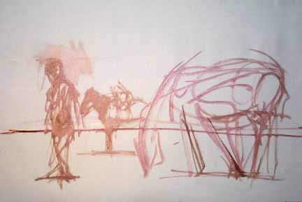
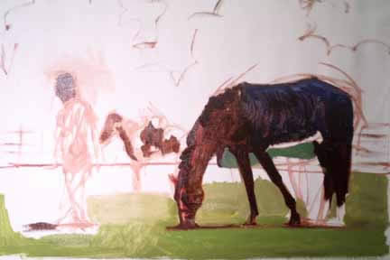
I’m heading to the canvas, now. Here you see the first drawing laid in with just gestures. No details! That’s about all I do before starting.
Placement is so important for my work, but the connection between the objects, the statement of the story in the painting, and the major shapes to be dealt with are all I’m concerned with at this point.
You can see how important the eye-level line is, as it is low in this painting. However the horses are in scale to each other because if you’ll draw a line through the hocks of these guys, you’ll see they are both in the same plane. The viewer is about at the eye level of the groom’s backside, which was very intentional.
The painting begins with the first applications of color:
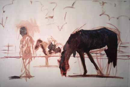
I always try to get the big shapes and the important story items laid in first. The horse and his big movement with that cooler, the groom’s head, and the horse and rider behind them.
You can also see how I sketched in the trees behind the figure and the horse, to compliment their placement and not compete with it. No trees yet, just the ouline to give me a “feel” for where they are going to be. These trees are bit players and will only provide a supporting role.
What’s important at this point is the movement of that LEANing horse grazing, that backward glance of the groom, and his mid stride position, and the horse and rider behind them.
I always start with thin darks, and linen canvas (this is primed with gesso) is just sumptuous with that thin paint! Such a feel…
The shadows under the figures are also made as a line, because this is part of the dark pattern of values that strengthens the layout.
Continuing:
Now it is time to start blocking in the middle values, and get this canvas covered, and start to pull some details into the central figures. I already see some need for changing some relationships of size, and this is easy to chisel out with the background paint making those changes… you’ll see in a while.
Here, you see I’ve blocked in the grass aound the horse’s front legs, and painted the blue color of the cooler as the underpainting for the highlights to come later. I mixed the color of the cooler that is in shadow, and painted it in, too. I added some sketchy details of what will be just above the eye-level line as well.
All this painting you see took about 15 mintues.
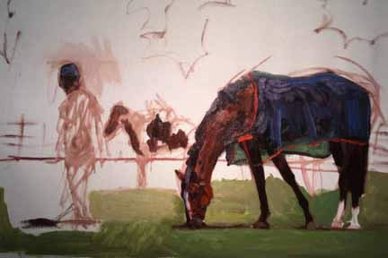
In the image above, you’ll see that I’ve moved from the grass up to the horse, spending about 20 minutes going from the large shapes I laid in first, to smaller shapes that define and show differences WITHIN those large shapes.
To explain further, the horse is made up of two major shapes–the dark reddish shape, which is a mixture of the alizerin and sap green, touched with cad red to warm it, and the blue cooler shape, made up of ultramarine blue and some of the alizerin on the lower side. Now my process is to go in and thickly lay on smaller shapes to give form to the horse and cooler. This is done with a minimum of fuss, and one brush mark to make the shapes. I put blue/white lighter shapes to define the folds of the cooler, purple/white shapes to define the top sides where the light goes through and bounces off the horse’s hide, and then took that cad red light and mixed it with some of the aliz. and blue to make the neck highlights and facial shapes of the horse.
I added purple white for the blaze, yet the canvas is still showing through on the nose, and on the back legs’ white area. On the near front leg, I used the background green to define the line of the leg and down to the hoof, which is just a grey mark with the brush and will need some further refining.
How do you keep from going to too much detail? My reply is to squint a lot, and stop looking for details. Squinting gives you a “hierarchy of edges” showing you which ones are important in your source material, and which ones you can toss out.
On the back rider, I also started to work on the shapes in the pinto, going from the darks of the brown parts, and laying in the light mid-values of the shadows on the horse.
Remember, I work generally from dark to light, laying in a dark abstract foundation to cement in the design of the piece. Everything is subordinate to that design, which is why (most) of my paintings are pleasant to look at and interesting to live with. I keep reiterating, it is all about design.
Detail of the horse’s cooler:
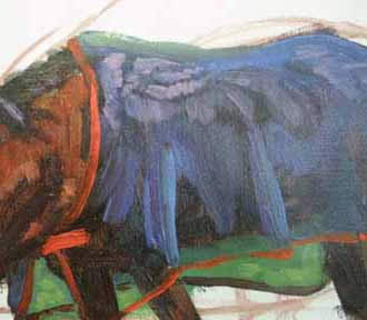
Here is a close up of the second layer of paint on the cooler.
If you recall that I said the horse was basically two shapes, you’ll then figure out that all that blue and blue-purple was done on top of those two shapes.
Look at the closeure of the cooler at the neck. See that one brush stroke that conveys the closing device? (Velcro) One brush mark. Decisive. I will do a little “edge losing” later on, but this is the “big picture ” of how those marks go down.
I feel strongly that my work is about more than the objects and their story (horse, groom, rider), but just as important is the amount and feel of the brushmarks. A “painterly” painting…
Covering the Canvas:
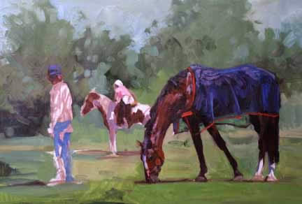
I quickly cover the canvas from top to bottom with the background. I put in the distant trees, keeping them both warm with some of the cadmium on the left, and blue-green elsewhere, and lighter on top of course! I use my fingers in places to blend the leaf shapes into the sky, which is a greyed mix of blue and white with the rest of the palette mess mixed in to keep the harmony going. I painted the trees first, then the sky, dipping and bouncing the brush back and forth between the two areas.
Note that near the gal getting on the horse, I made a far more interesting pattern of marks. Across the back, the rest of the trees are less contrasty, and less interesting. I want you, the viewer, to look at that lady getting on the horse, framed by the foreground horse and groom. If I made all those trees interesting to that level, you’d wander around… not good.
I also did some more work on the head, shoulder and cooler, front legs and hooves.
This shows how I made the background more interesting and started to seriously work on the distant pinto and rider.
The groom has some serious proportion problems as I didn’t plot his shapes and size relative to the rest of the painting, so I have to take out parts and fix the problem.
He was too long in the torso, so I just took my finger and pushed and lifted the excess paint and wiped it on a paper towel. Now I protect my hands with a barrier cream (Glove Cote, Invisible Glove–like hand lotion, but impermeable to solvents and pigment contamination. At your hardware store.)
Painting the rear end in place properly also allowed me to reshape some of his arm and shirt where it hits the pants. I also worked on his feet, and cropped his skull yet again.
Then I painted in more of his shirt, and gave him a teensy beer belly, using darker tones (always darkening with the alizerin crimson and sap green and/or the ultramarine).
I do change colors of things even when I use my own source material. If it makes the design better, it gets changed…
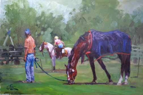
Ths is the finished painting.
Email Elin about this painting session here.
Order and find out information about Elin’s videos of horses here.
Be sure to check out Elin’s Lessons on Video and DVDs. Elin Pendleton’s instructional videos will show you how her positive attitude takes the”pain” out of “pain”ting!
Hi, nice post. Very helpful. I’m glad I stumbled upon your blog!
Hi, this is great. Ever since a kid I was fascinated with horses though todate never rode one. Western novels are my favourite reading pastime. And, the description of horses contained therein fascinates me even more Though I obtained a credit pass for art at o’levels I never got down to drawing horses. Now I’ve got the chance. Thanks a lot. This is a marvellous job. Thanka again.
Sincerely Vernon
Loved the freedom and the specifics. This is helpful in getting me out of my doldrums with detail.. Your painting technique is refreshing and motivating
Sincerely, G Burcham, Franklin, TN
Hello Everyone,
Thank you for visiting and for your wonderful comments.
I know that Elin would be delighted to hear from you.
Please take a moment to visit her website to learn more about her work and her wonderful instructional videos.
Visit her website below:
http://www.elinart.com/
Thanks!
– Ralph
if the horse is grey should you put a light glaze of brown over top indercating a tinge of brown on all horse paintings
very nice articles and painting you have posted i really liked it seeing and will love to see some more of this type of painting if have any one so please also pot them too.
It’s amazing to see a painting take shape, you make it look so easy and I’m quite sure it’s not. It would be great if you could add more frames of this process.
great post
Very nice piece of work! If i can do as half as good as this i will be very happy! With your tips hopefully i should be able to!
Heya i am for the first time here. I found this board and I find It
truly useful & it helped me out a lot. I hope to give something
back and help others like you aided me.