About Byron Pickering
The path to the beach was well worn in l971 when Byron Pickering made his home on the Oregon Coast. It seemed ordained that he would meet with this rugged coastline and its ever-changing surf.
As a child growing up among the lakes of Wisconsin, he found it was the water and the rocky shores of Lake Superior that enticed his childhood artistry – along with portraits of local friends.
It was only after completing study at New York’s Fashion Institute of Technology and Design and a stint in this fast-paced industry, that he made his way to Oregon as a ministerial student. A short move to the coast came naturally.
The combination of being near the ocean and in an artists’ community renewed the urge to paint. Byron watched the surf daily, trying to capture its force and fluidity. His easel became a permanent fixture in the corner of the living room. His understanding of surf action is the product of this time of observation, and is the mental resource from which he paints.
After a year of intense practice, Byron was given his first one-person showing in a coastal gallery. Many sold-out shows followed. The acceptance of his work by an enthusiastic public has been the most rewarding part of his art journey.
In 1981, he and his family opened “Pickering Studio,” a gallery of art and antiques. Painting for the gallery and an annual series of workshops occupied the following thirteen years.
Follow this link to reach Byron’s Website
“Painting the Breaking Wave”
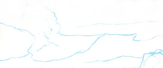
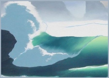
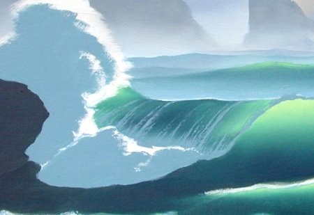
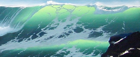
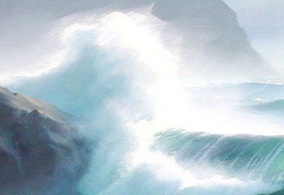
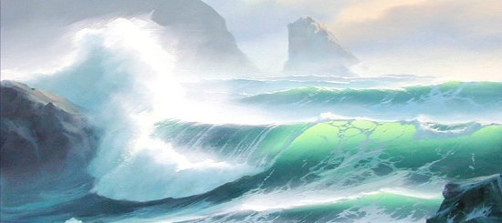
While the images in this article are part of a completed painting, this demonstration will center on the structure and contours of the basic breaking wave. The completed wave – including the breakover, transparencies, foam patterns and foamburst – is shown below as a guide to the finished composition.

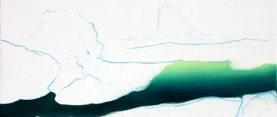
Now that I have my composition in mind, I use a liner brush and any light blue color to sketch the outline of the painting. I’ve found that sketching my idea with as much accuracy as possible will insure the best results. If time permits, I allow the sketch to dry before continuing with the next step. If the sketch is dry, I know that I can always return to it if I lose my original composition (something I seem to do all too often!) Mixing a small amount of thinner with the color will hasten the drying time.
Although there are many ways to begin a painting, I usually start with the center of interest. Establishing a strong “identity” here prevents other areas of the painting from becoming distractions. In this painting, I want to draw the eye to the transparency as the focal point of the painting, so I’ll begin by brushing in the colors on the face of the wave.
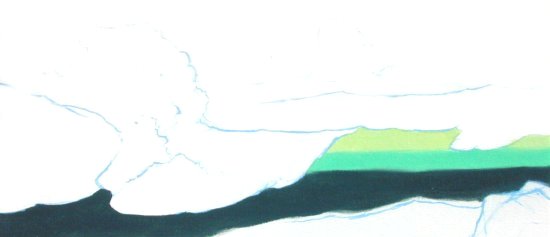
With my palette knife, I mix touches of Emerald Green and Lemon Yellow with a small amount of white. Using a flat sable brush, I lay on a thin band of color at the top of the wave. I want the lightest tint at the crest, where the wave is thin and translucent. Adding more Emerald Green to the mixture gives me the second band of color across the center of the wave. The color at the base of the wave is more difficult to achieve. Using Viridian as the base color, I add a touch of Alizarin, a complement, to gray the hue. Alizarin is a much stronger color and will rapidly dominate the mixture. I mix it into the Viridian cautiously, a little at a time, until the color is a balanced gray-green. If the color appears too dark, I add a trace amount of white to dull the intensity. When the color is satisfactory, I use it to fill in the area at the base of the wave. Now it’s time to blend the color bands.
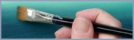
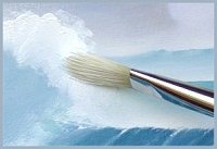
I use a #14 or #16 flat sable for blending the color bands. Laying the brush tip against the canvas as shown in the inset, I lightly brush back and forth across the canvas as if I were painting a board. As I paint, I move the brush up or down slightly to bring the colors together. It takes a little patience to blend the color bands evenly. I’ve found that controlling the pressure of the brush on the canvas is important. A heavy pressure will pick up too much paint on the brush tip and cut the color back to the canvas. A lighter pressure will allow the color to blend evenly. I also try to keep the brush clean and dry. After I’ve made several blending strokes, I wipe the brush tip gently on a dry cloth to remove excess color. The result should be an even blend from the lightest area at the crest to the darker color at the base of the wave.
For the shadowed areas in the foamburst I use Viridian and Alizarin Crimson with white as a base – this time with a touch of blue in the mixture. If the color appears too bright, a small amount of Burnt Sienna may be added to gray the mixture. I use a small filbert to fill in the color at the base of the foamburst and around the rock, leaving areas of canvas for bright and secondary highlights to be added later. I have also added some color at the base of the spill, just above the foamburst. Next, I used the flat sable to paint in the deeper undercolor at the center of the spill. A thin band of the transparency color is painted in at both sides of the spill. Again, the sable brush works well to blend the three areas uniformly.
A thin line of shadowed foam color rolled up the right edge of the spill and across the top of the transparency gives contrast to the break. Next, using the liner brush, I roll in lines of color from the bottom of the spill upwards to the top of the wave. I occasionally wipe the brush gently on a cloth to remove the residue before adding more of the lines. The lines curve as they reach toward the top of the wave, giving an appearance of roundness and depth. After completing several of the full lines, I add shorter strokes to break up the rigidity. Tiny u-shaped cross-strokes on the lines are added to show the fall of the water. Finally, the entire breakover and foamburst are softened with the blending brush.
Water below the foam patterns is roiling from the disturbance of the surge that has passed. As the patterns boil, the surface appears almost white from the aeration. When the water has quieted behind the passing wave, the foam begins to break apart and dissipate.
The animated example at left helps too better understand the shapes of the patterns on the breaking wave. The first view in the animation is the edge of the circle seen at eye level. No center color is visible. Likewise, openings in the foam at the base of the wave are not visible because they are less broken and we are viewing them at eye level. Next, the circle turns vertically and some of the color comes into view. The pattern has now become an elipse as the wave face lifts it up and it begins to stretch and break apart. As the circle turns into full view, the pattern would be on the vertical face of the wave. If the wave is breaking, as in the painting, the pattern image reverses and becomes even more broken as it moves up and under the curl.
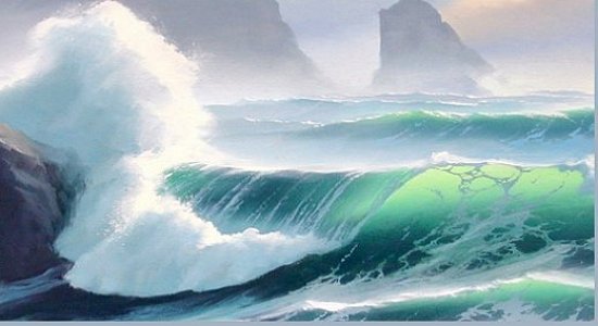
Perspective is also a consideration in shaping the patterns. In this painting the wave is breaking at a slight angle to the left, allowing us to view the “curl” or “pipeline” under the break. The foam patterns will be stretched vertically to mirror that perspective.
Now for the fun part! Using the liner brush and the shadow-gray, I begin to form the patterns on the face of the wave. The shapes of the patterns used on the breaking wave occur on more complex wave structures as well. Moving swells, crosscurrents, backwash, water breaking over rocks…all have their own dynamics and beauty.
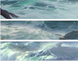
The small images demonstrate some of these dynamics. The shapes of the patterns show the water movement and enhance the depth of the image. The first shows foam patterns on quiet water. They appear to follow the gentle swell. The second image shows deep water off rocky shores. Because of backwash and obstructions, the water is in constant turmoil. In the third image the surf has broken against the headlands and is surging back against an incoming wave. Here the water is compelled by many opposing forces. I try to visualize the action of the water as I work, using the patterns to show direction and movement of the surf.
To finish the white highlight at the top of the wave, I load one side of the brush tip with the white highlight mixture, turning the loaded side of the brush down and holding it at the wave crest. “Squiggling” the brush away from the color and horizontally across the canvas leaves a heavier ridge of paint across the top of the foamburst. A smaller filbert works well for highlighting the foam in front of the break.
Glazing may be used to give depth to color, soften harsh areas of color, change a hue, or even create a different mood in the painting. Glazing is the application of trace amounts of color pigments in a transparent medium. In this article I’m using the glazing process to refine and soften the areas of foam. In the areas behind the wave crests and especially around the top of the foam burst, I’ve tinted the glaze with white and worked it into the foamburst with a larger blending brush. Loose, free strokes help to give the illusion of movement. The white has been blended to create the mists left behind the breaking wave, while the burst has sharper strokes left unblended.
Touching the tip of the large sable brush into combinations of pure colors such as Winsor Blue, Viridian, Alizarin, or Burnt Sienna, I mix them with enough of the glazing medium to make the color transparent. Now it can be easily smoothed over the patterns on the front of the wave, allowing the underpainting to show through. “Cutting” some of the glaze back to the undercolor can be an effective way of forming ripples in the water. I dip the tip of the flat sable brush into thinner and touch it lightly to a soft cloth. To create lines of lighter color, I turn the brush on edge, drawing it upwards and across the patterns. Color variations will occur. It may take several tries, but I repeat the process until I’m satisfied with the final image. Adding the background, rocks, and foreground, and it’s finished! Thank you for painting along with me.
Painting The Breaking Wave CD
FOR WINDOWS
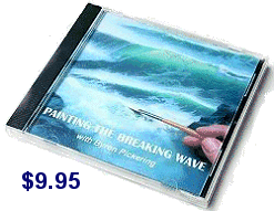
Over 30 pages of step-by-step instruction and close-up illustrations for viewing on your computer! This CD takes you through the equivalent of a five day workshop – to a completed painting of the sea.
Byron explains brush techniques and color mixing and answers questions students often ask. He shows you how he gets the iridescent light in the waves – gets the feeling of crashing surf, and more
What a wonderful article, and thank you so much for sharing it with us. Although I’m a (an aspiring) watercolourist your article has taught me a lot, particularly about perspective and how the foam is stretched, distorted and elongated as the wave rises up. I’ll never look at waves in the same way again!
Love this!! Beautifully done!! Great instructor given to sharing his gifts with us all. Thanks so much! Cl-Marie
Thanks so much for that beautiful wave! Great tips also, I use to teach airbrush and appreciate this.
Deb
Byron is a wonderful artist and someone I can call ‘friend’.
I followed one of his tutorial dvds recently and received a wonderful testimony in return from him. We are a fan of each others work.
If your just starting out on seascapes in oils or any medium, then Byrons course is a wonderful help.
Alan Minshull
Thankyou so much. I have been trying to find this information in this detail for months. Thankyou, Thankyou.
This is a question if you get the E-Book vs the CD are they both same presentation?
I am wondering if we get to hear Byron explaining, or is it strictly text?
Thanks very much,
Great Work!
Hi Jon,
I recommend emailing the Artist with your question. Follow this link to visit his site. On the left side of the page, click the link that says “Email Byron”.