By Philip Howe
The following oil painting demonstration is courtesy of Philip Howe . When you are finished viewing this demonstration, please take a moment to visit Philip’s site to view more of his artwork and to learn more about him.
You may also be interested in Philip’s New Book:
“Angels – The Artwork of Philip Howe”
This book is 134 full-color pages of the beautiful artwork of Philip Howe. The reproductions are from his spiritual and dream series of oil paintings, with dozens of images, exclusive close-up shots from the originals, and over 40 pages of demonstrations for artists and collectors. It is printed on soft matte paper, the same as our quality prints, so the color is rich and clean, with each spread designed to fit the images.
Follow this link for more details on the book.
The Old Conquistador – Oil Painting Portrait Demo
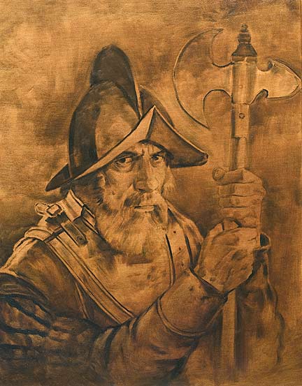
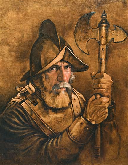
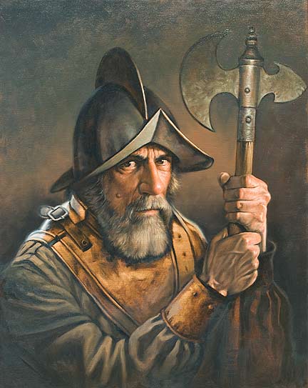
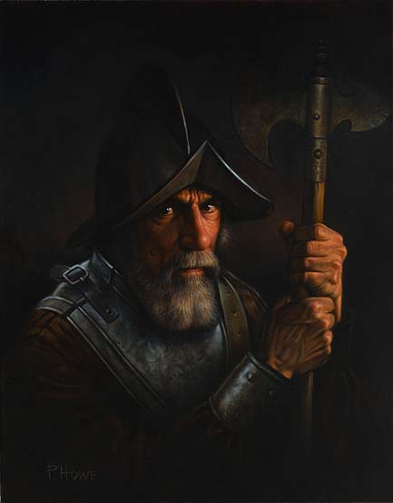
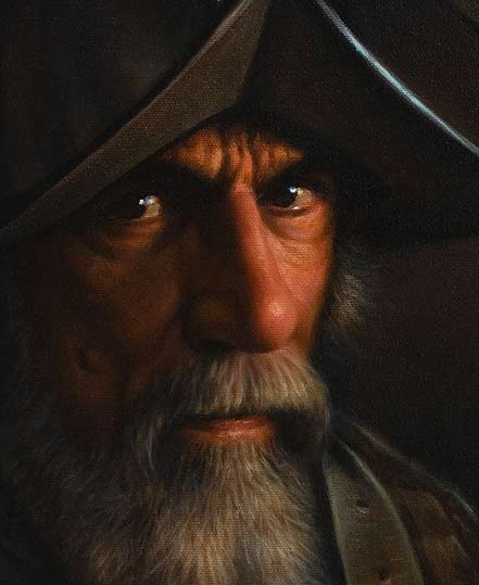
This portrait was done as more of an experiment to play with traditional techinques using a solid brown underpainting and a fairly tight painting style. My friend John posed for the piece and tried his best to look mean, but its just not in him. I hope this shows some expression of feeling for what the old soldiers must have felt in seeing a new world being torn apart yet knowing their own aging and destiny in troubled times. I may do more images of past figures, it was certainly fun to do.
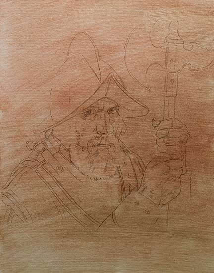
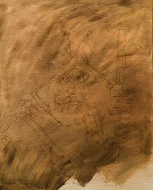
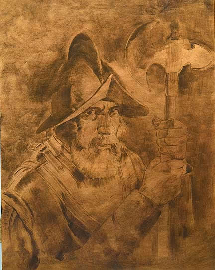
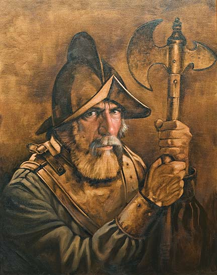
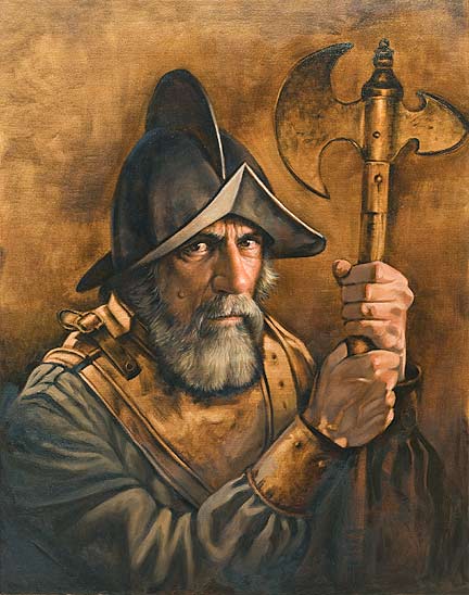
The first 3 images are really just about an hours worth of work, with an overnight drying time in between each stage. Basically I used an oil wash with mineral spirits to tone the raw canvas and seal the thin pencil drawing. This piece is only 20×30″ and I often do quick studies this size to break from larger paintings, so I am in a habit of doing them in a few quick stages. The second image uses liquin mixed with a heavier wash and the 3rd image, above, uses liquin medium with burnt umber to form a base value, both drying faster by the use of the medium and set in front of a fan overnight.
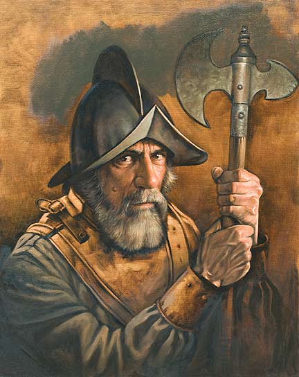
At this point most of the base values are in and I can begin to darken the painting. Since I don’t have to worry about the drawing any more, I can concentrate on the feeling and density of the next layers to enhance the realism overall. The difference between this stage and the final, below, is 4 or 5 layers of transparent paint, carefully built up to form a rich overall tone, especially in the skin and background areas. Browns work especially well to create a golden patina and there are several paint makers now offering a range of quality transparent hues. I especially like the ones from Dan Smith. If you have questions of specific colors used, I can list them here for future reference, although its the translucent combination of colors, red over brown over a golden ochre, even some transparent blue to deepen the shadows, that give the overall tone, not just brown on a white or gray base.

Truly amazing!!!!!
Is it the photograph that makes the painting look very dark, too dark to clearly see what is going on in the painting. To me this was a big disappointment after seeing the second last photo of the painting. I got so carried away by the teqnique explained here, that I completely forgot that I have already seen a picture of the final painting. I was expecting something really stunning, so the final picture was quite a let down. It is as if threequaters of the painting has disappeared. Surely it must be the photography?
But what is left to be seen, looks really amazing!
I believe it is supposed to be that dark.
Hi. I don’t get email notifications to reply to, sorry, but I just happened to see this site again and thought I would comment.
Yes, this looks somewhat darker than my painting so a lot of the final color is lost compared to the original. Please remember though, when doing anything for a site, not everyone’s screen is calibrated or consistent. Some are darker, some lighter, some images look washed out. Newer flat screens often have too much contrast. This looks dark on one of my screens, just right on my calibrated one that I use for prints, so its sort of a guessing game as to how it will look in the end on any site. The idea, though, is that glazing can enhance your work by darkening it down with subtle layers of color until you get that classic look. You can do this from a white or light gray base or, like I did on this piece, block it in first, then glaze back the areas you want to fill with more shadows. Think of it in translucent terms and its quite easy and fun to do.