Oil Painting Demonstration – Black Clydesdale – Classical Method
I’ve always loved the work of the Old Masters so when I discovered the seven layer method of the Flemish Masters, I knew I wanted to learn it.
This method involves developing a painting through seven stages:
- Drawing
- Inking the Drawing
- Imprimatura (or toning)
- Umber Layer
- Dead Layer
- First Color Layer
- Second Color Layer
If you look at the works of the Flemish Masters who used this method, they created a complete work of art at each stage from the initial drawing onward. While that is my goal when I use the same method, I’ve modified the process to fit my subjects and style.
[adinserter block=”84″]
The portrait for this demonstration is a 6×8 small format painting on Masonite. The Masonite was first prepared with three layers of acrylic gesso on all sides and edges. I sanded lightly before the first layer and after each layer. The finished surface was very smooth.
If you prefer a surface with a little texture, don’t sand between the layers and apply the gesso in alternating strokes. For the first layer, stroke lengthwise. When you apply the second layer, stroke cross-wise and for the third layer, stroke diagonally. Let the gesso dry completely between layers (usually about 30 to 60 minutes). The strokes dry in the gesso, producing a linen-like texture that you can make as coarse or fine as you like.
The subject for the painting is a black Clydesdale.
Step 1: Drawing
The first step in any painting of this type is developing a detailed drawing. I usually work from 8×10 enlargements and make the drawings full size from the start. I refine the drawing through three or four stages until it’s satisfactory. Most of my drawings are drawn on tracing paper so I can work on the front, then flip the paper over and work on the back (with the drawing in reverse). Two or three revisions on front and back are usually sufficient to produce a balanced, detailed drawing.
Once the drawing was finished, I transferred it to the painting surface using homemade graphite transfer paper.
To make the paper, I applied graphite to a sheet of ordinary ink jet paper using a soft lead pencil (4B or higher), heavy pressure, and multiple layers.
To transfer the drawing, I mount the drawing to the painting surface and slide the transfer paper between the drawing and the panel, graphite side down. I trace the lines of the drawing, usually with a colored pencil so I can see which lines have been transferred. Even so, it’s a good idea to lift a corner of the line drawing and transfer paper to make sure the lines have transferred and can be clearly seen before you remove the drawing.
Step 2: Inking the Drawing
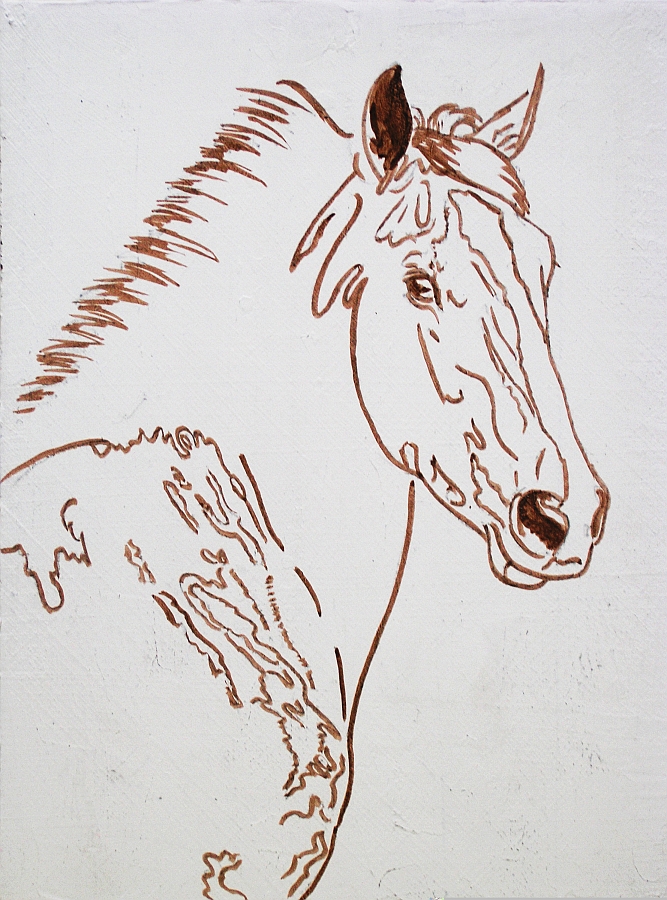
Since the first wash of color will obliterate the graphite drawing, it’s necessary to “fix” the drawing or make it permanent before painting begins. To do this, I painted over the lines with brown India Ink. The ink dries quickly and can be used with a small sable round brush or a drawing tool. I prefer a brush, but use the smallest one I have so the lines are crisp and clean.
You can also use burnt umber or another earth tone straight out of the tube to fix the drawing. The only drawback to using paint is that it takes longer to dry—usually overnight.
However you fix the drawing, when it’s fixed and dry, use a soft brush or clean rag to lightly remove any loose graphite.
Step 3: Imprimatura
The imprimatura is actually the final stage in preparation; toning the canvas. For many other methods, you would tone the canvas before transferring the drawing.
Before painting, rub the painting surface with either linseed oil or walnut oil. The oil prepares the surface so pigment is more easily absorbed.
Pour a small amount of oil into the palm of your hand, then rub it over the painting surface. The warmth of your hand and the rubbing motion helps “open the pores” of the painting surface so it forms a stronger bond with the paint.
Too much oil is detrimental, however, so after you’ve covered all of the surface with a thin layer of oil, use a paper towel or clean rag to wipe off the excess oil. You’re now ready to apply the imprimatura.
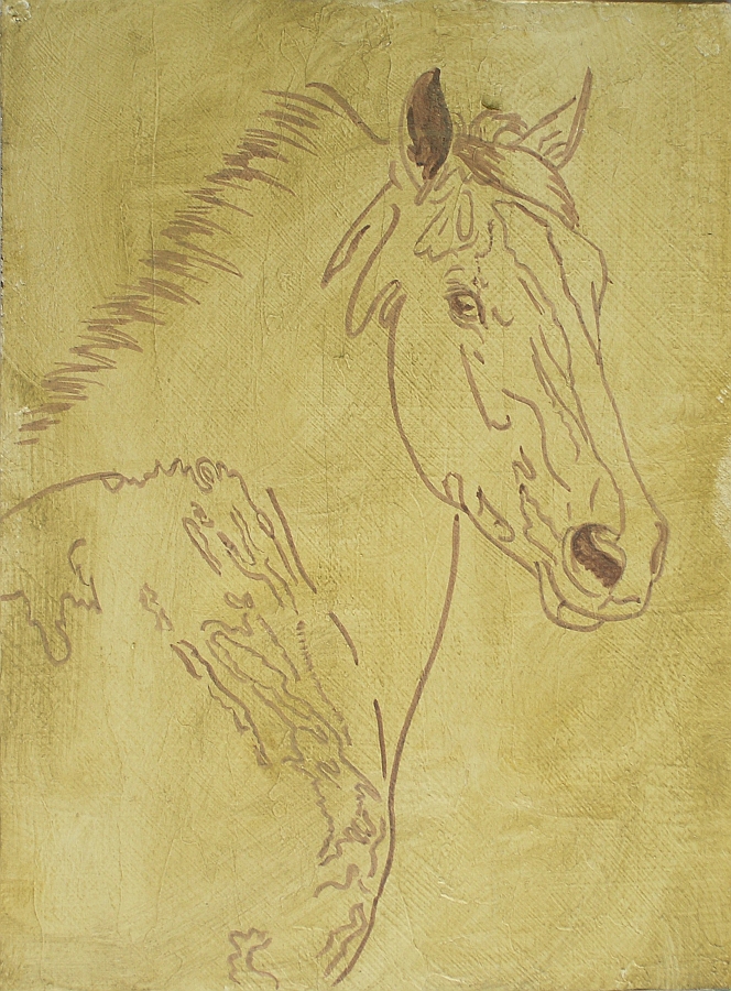
The colors used to mix the imprimatura are yellow ochre, lamp black, and a little titanium white. You want a neutral olive tone. Start with yellow ochre and add small amounts of lamp black until you have a medium value, neutral color. If it’s too dark, add a little titanium white.
Stroke color onto the canvas or panel, then brush it out so it covers all of the surface with a thin, transparent color.
I like to rub paint onto the painting surface with a clean cloth to avoid brush strokes. I can also apply paint without thinner or medium by rubbing it on the panel, but the method isn’t as important as the imprimatura itself.
By the way, I’m using M. Graham Oils. They’re ground with walnut oil as a vehicle, so I use walnut oil to oil the painting before each session. You can use walnut oil or linseed oil.
This is the finished imprimatura with the drawing showing through. The imprimatura is allowed to dry for one week.
Testing the Paint Film
After each step in the Flemish method, the painting needs to dry all the way through. It can be dry to the touch and still not be ready for the next step.
To determine whether or not the paint is dry all the way through, scrape it lightly with a razor blade. Hold the razor blade nearly perpendicular to the painting surface and draw it across the surface with light pressure.
If paint comes off in a roll along the edge of the razor blade, it’s still too wet to paint over. Let it dry another week and test it again.
If paint comes off as dust or powder, it’s dry all the way through and you’re ready to paint.
You should perform this test before each new step in the process. I generally give paintings four weeks to dry before I test them. Sometimes, they’re ready after four weeks. Sometimes, it takes one or two additional weeks to dry completely. A lot depends on the colors you used in the previous work and the amount of painting medium. Some colors dry very slowly. If you add painting medium, drying is further slowed.
Be patient. If you paint over a layer that’s not completely dry, you run the risk of damaging previous work and having to do it over.
Step 4: The Umber Layer
The umber layer is the first step in painting. At this stage, the goal is to create a complete image in half tones using only burnt umber thinned almost to watercolor consistency. Darks are created with multiple layers or slightly thicker paint. Highlights are created either by working around them or lifting color after painting over them.
The umber layer can be painted in a single session, but I generally develop it slowly, working through several successive days and letting it dry between sessions.
Remember to oil the painting before this session (and every session) just as you did in preparing for the imprimatura.
I thin color with walnut oil to make a thin, brushable color. I also rub color into larger areas with a clean cloth so I don’t have to use oil.
Since my goal is a painting that shows few brushstrokes, my preference is rubbing paint onto the surface. But it’s difficult to paint small areas or tight detail with a cloth, no matter how small you fold it, so I also use brushes. The brushes I use most are small sable rounds.
For the initial umber layer work, I rubbed burnt umber into the background, then worked it around with the same cloth to get the right combination of lights and darks.
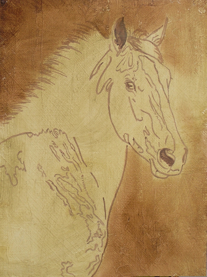
To paint the horse, I mixed painting medium (2 parts solvent, 1 part walnut oil) then thinned burnt umber to watercolor consistency. A basic wash was applied with a large, soft brush. Only the brightest highlights and the white blaze were left alone.
That was followed by darkening the shadows and mid tones by painting into them with thicker paint. I did a little detail work with reflected light in the shadows and around the eye.
When the umber layer was finished, the painting was allowed to dry for three weeks.
Step 5: The Dead Layer
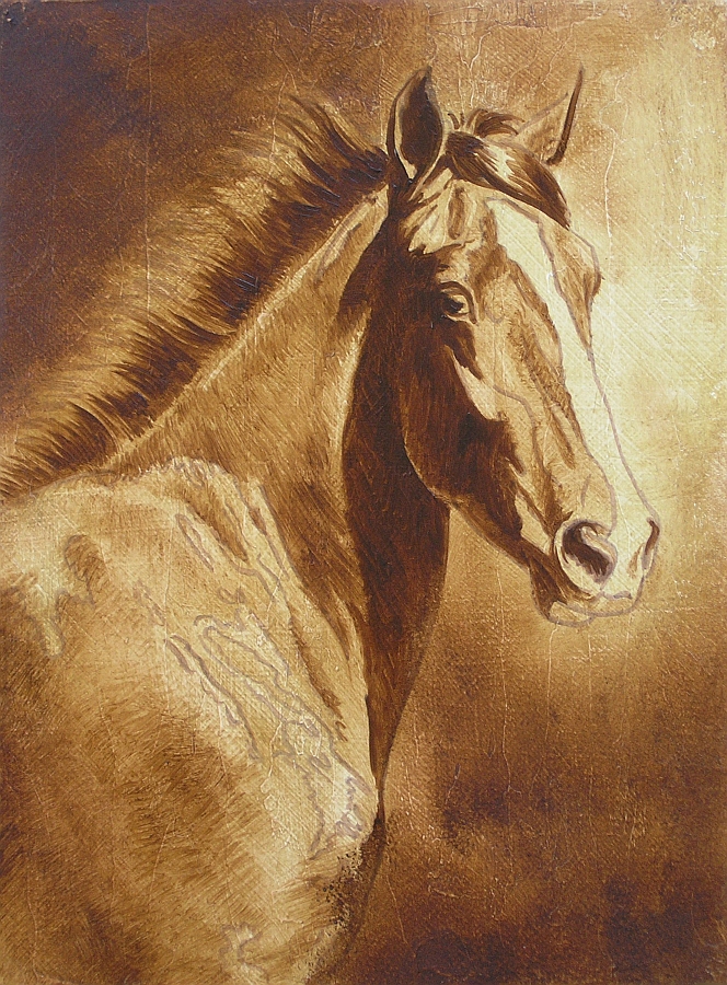
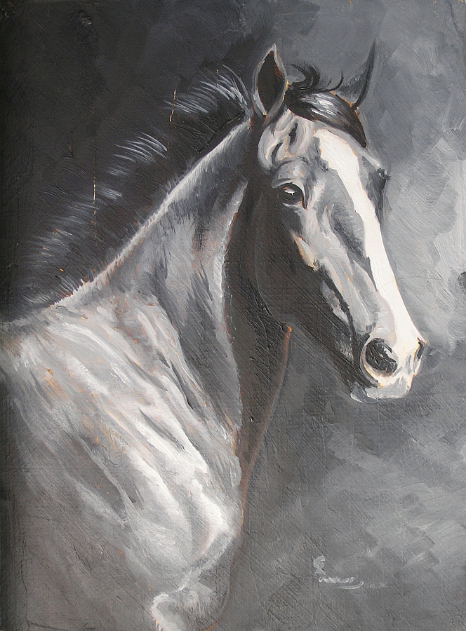
The finished dead layer should look as if seen in the light of full moon. It should be as fully detailed as possible—depending on your preferences—because color will be layered over it in transparent glazes.
[adinserter block=”84″]
The colors used for the dead layer are lamp black and titanium white with just a hint of Prussian blue and burnt umber. While the overall tone should be neutral, you can adjust the color temperature by adding more Prussian blue for a cooler tone or burnt umber for a warmer tone. Use a cooler dead layer if the final colors are warm and use a warmer dead layer if the final colors are cool. My subject is black, so I warmed my dead layer with burnt umber.
Make the darkest mixture with very little or no white. Make the lightest mixture with mostly white and just a tint of the dark.
Next, make a middle value by mixing equal parts of the light and dark color. You can paint the dead layer from those three values, but it’s often easier to mix additional gradations. The recommended number is ten ranging from darkest to lightest, but if you do a lot of blending on the painting—as I do—you don’t need to mix that many values. I started with the light and dark values and four to six intermediate values.
On the first day, I painted basic values and details.
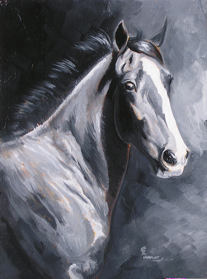
On the second day, I continued developing details and fine tuning the value range. Because black and white are naturally slow-drying colors, I was able to work on the painting from one day to the next and still have wet paint on the panel. I worked through the entire dead layer before the first day’s work began to dry.
When it was finished to my satisfaction, I let the painting dry for four weeks.
Step 6: First Color Layers
I had been pondering how to finish the background for a few days. The horse is black and I wanted to keep it as simple, so I considered leaving the background as it was. In the end, I decided to rub a little color over the background with a clean cloth.
I began by rubbing Manganese blue over the entire painting, except for the white blaze. I used small, circular strokes for the most part, but also followed the contours of the horse’s muscles and body. I didn’t thin the paint with either medium or oil.
Prussian blue was then rubbed into the dark areas with the same method and using the same cloth. I worked wet-into-wet here to get a good blend of colors. Rubbing with the rag also created random variations in colors as the two blues blended more completely in some areas than others.
Even though the layers of color were very transparent, they added the depth and color I wanted in the background. Rubbing the same colors over the horse also established the basic coat color.
When the work was done, the painting was put up to dry.
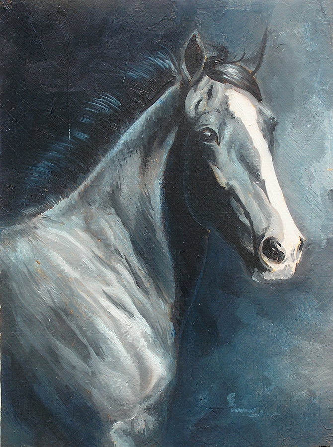
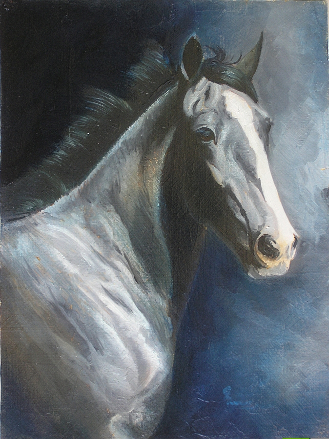
In the next session, I darkened the darkest parts of the background with an application of Prussian blue. I also rubbed Prussian blue into the shadows on the horse, using a rag for both areas.
I then used two small sable rounds to begin painting the horse, starting with the mane. To create a strong black, I mixed Prussian blue and transparent red iron oxide, stroking one onto the panel, then blending the other into it. Titanium white was used to create highlights.
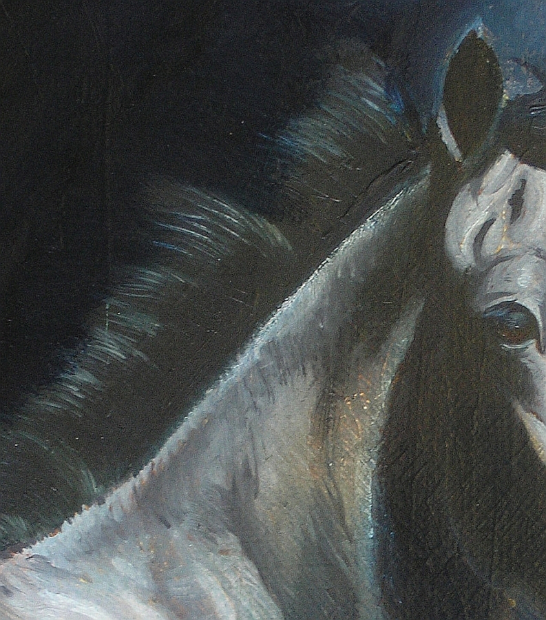
The mane and forelock and both ears received attention, though only the mane and off side ear are anywhere near finished.
I also painted the eye to give it a little more life, then darkened the cast shadows on the neck and the shadowed side of the face.
Step 7: Final Color Phase
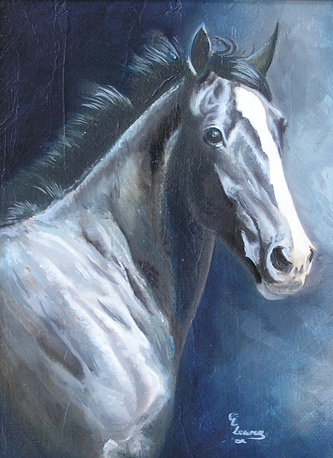
It didn’t take much time to finish the painting. Thirty minutes to add highlights and details to the mane, forelock and face and to work on the shoulder a little bit.
In the previous work session, I toyed with the idea of adjusting the background, too, but when I finished with the horse, I was satisfied with everything else, too, and simply signed the painting and put it up to dry for the last time.
Conclusion
The important thing to remember with this method of painting is that the method is designed so that each layer builds on previous work. The dead layer isn’t supposed to cover up the mistakes in the umber layer, for example. It can be used that way, but ideally, you want your painting to look complete at each stage.
Of course what looks complete depends entirely on your style. For me, complete means each phase is as fully detailed as I can make it. My goal is to reach the color layers and need only to glaze color over the painting and add the final details.
That doesn’t happen very often, but the paintings I paint with this method now are far more detailed at each stage than when I was first learning the technique.
You also need a lot of patience with this method because of the amount of drying time between steps and, toward the end of the process, between glazes. If you want to dry it without all the waiting, I suggest acrylic paint. You can use all the same methods and techniques, but the acrylic dries much more quickly. A painting that would take months with oils might be completed in weeks with acrylics.
Whether you make this your favorite method or just try it once, it is worth experimenting with.
About the Artist
Carrie L. Lewis has been drawing and painting for over 35 years. Her interest in art began very early, with parents providing crayons and paper. She sold her first horse portrait at the age of seventeen and has been painting beautifully detailed portraits of horses for clients all over the United States ever since.
Her oil painting technique draws from the work Johannes Vermeer (1632-1675) and William Bouguereau (1825-1905). In addition to borrowing their techniques, she uses as many classical materials as possible, including best possible oil paints.
Carrie also works in colored pencil using many of the same techniques used for oil painting.
Carrie has participated in exhibits in such locations as Lone Star Park Race Track, Grand Prairie, Texas and Remington Park Race Track, Oklahoma City, Oklahoma. In 2003, she participated in Village Place, a one-time show in Louisville, Kentucky during Kentucky Derby weekend.
Since the early 90s, she has worked with the Michigan Harness Horseman’s Association, donating custom portraits to their annual benefit auction. Monies raised during this annual art auction help fund a scholarship for the son or daughter of a member horseman.
In 2007, Carrie’s painting, “A New Day”, was short listed in the Shadwell Estates Ltd. 2007-08 Stallion Brochure Competition.
“I have always loved horses. It is a joy born within, placed deep inside by God above.
“Classical art has been a love since my first encounter with it. The works of such Great Masters as Rembrandt, Vermeer and Bouguereau have the ability to stir the soul and inspire my own creativity like no other art form.
“I suppose, given those two passions, it was natural that I should eventually learn and adapt the techniques of those Old Masters to my own attempts at capturing the spirit of the horse in oils.”
Carrie’s art instruction books are as detailed as her artwork. Her goal is to pass on her love for art and for drawing horses and the landscape to others.
Visit Carrie’s website at Carrie L. Lewis Horse Painter
I just came across your fabulous site, and was thrilled to see that someone else is SO inspired by the work of Bouguereau. I took a mural class years ago with a French master atelier, who was heavily influenced by Bouguereau in his work.
Thanks so much for sharing!
Debbie Viola
This is a beautiful painting!! I’ve always thought I might try painting with watercolor, I think it’s so interesting and beautiful.
However right now my focus is to learn more about painting with oil. I’d love to see some titorials that give really technique tips, and show artists painting, but not speed painting. For someone like me speed painting, interesting as it is, it’s just too fast and imposable for me to actually learn anything from.
Having said all this, I did love this beautiful and enjoy paintings created from all mediums. Thank you Ralph for sending me this link. Please keep them coming.
good demonstration of painting
Thanks so much for sharing. 🙂
Excelente DIY muy detallado y explicado, ojalá cuando lo realice me quedé igual de bello.
Estoy encantada con este sitio muchas gracias a ustedes y a la autora de este post.
This painting is very nice but I do not have the patience for this technique (I do, however LOVE the small of oil paints). My pen and ink work, generally just black and white, is so much faster and I get lots of satisfaction in a lesser time doing each piece. In the progression of the steps used for this horse, I would’ve stopped at the completed sepia-toned horse as I find it so much more appealing.
Thanks for sharing, I did enjoy the discussion of this artist’s technique.