About Karin
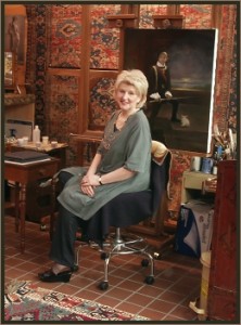 Karin Wells is an artist of amazing versatility. She graduated with honors from both the New England School of Art and Design, Boston, 1965, and the Butera School of Art, Boston, 1986. Karin has enjoyed a career as an award-winning graphic designer, illustrator and sign painter. She also taught Life Drawing and Painting for many years. She has most recently studied for three years at The New England School of Classical Painting in Greenfield, New Hampshire, under the direction of Numael Pulido.
To expand her craft, Karin has traveled throughout Europe studying the Old Masters. Her art reflects the deep influence of these great works. Karin demonstrates a remarkable facility for likeness and for the use of light.
The artist is a member of The American Society of Portrait Artists, Portrait Society of America, The Portrait Society of Atlanta, and The Copley Society of Boston.
To learn more about Karin and to view more of her amazing work, be sure to visit her website and blog by following the links below:
Website: https://www.karinwells.com/
Blog: https://karinwells.blogspot.com/
If you would like to be notified when Karin updates her blog, be sure to click the “Follow” link in the upper left hand corner of her blog.
Losing a Likeness and Finding It – Again and Again
It’s not rocket science but if you “lose it” as often as I do, you’ll need a sure-fire way to get it back with a minimum of fuss and bother.
(Click Image For Larger View)
I work in many layers – building light and skin tone as I go. It is all too easy for my lines to take a hike and this is when I “lose the likeness.” But you don’t have to work in layers to adapt this method.
It is not that hard to get your likeness back, but it is important to do it when you first notice so that the corrections will be small and relatively easy.
(Click Image For Larger View)
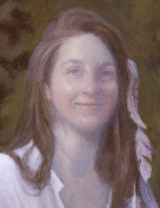
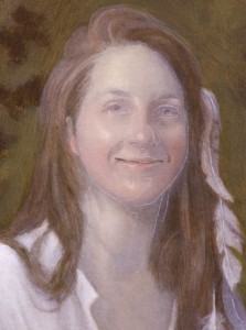
In another post I explained color banding. After I was done with that, I saw that my likeness was gone.
Drat.
So here’s what happens next:
(Click Image For Larger View)
Since I correct with raw umber, I put a thin glaze of that (with Liquin as my medium) on the dry surface to “warm it up” a little.
And then I let this glaze dry before moving on. (If it isn’t dry you’ll have a real mess to deal with.)
(Click Image For Larger View)
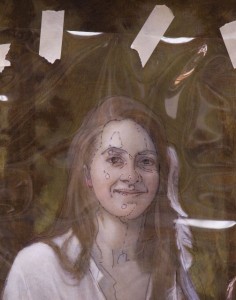
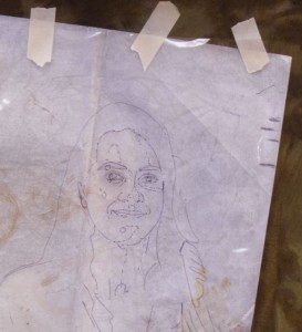
Above is the acetate with my original drawing. It is positioned over the painted face that needs correcting. I will reuse the acetate in this manner each time I “lose it.”
By using clear acetate instead of tracing paper to transfer a drawing, I am able to see through it. So whenever I wish, I can always easily reposition the acetate accurately in order to make a correction.
Note: I only use “Prepared Acetate” – meaning that you can draw on the surface. I always use an “Ultra Fine Point Sharpie” permanent marker to draw on the acetate because that brand won’t bead or smear.
(Click Image For Larger View)
I rub a pastel (this one is white) into one side of a sheet of tracing paper and use it like old fashioned “carbon paper” to transfer my drawing.
I have several sheets of different (neutral) colors and values handy – If you’re careful, they’ll last for years.
(Click Image For Larger View)
I correct with thinned raw umber if I need a darker line or area. And use a thicker raw umber/titanium white mixture if I need to lighten an area or cover up something.
Value matters much more than color in correcting.
In the picture above you can still see the transferred pastel lines. The pastel will simply “melt” into the wet paint as you correct.
Since highlights help define form, I am careful to check their location and reposition them if necessary.
(Click Image For Larger View)
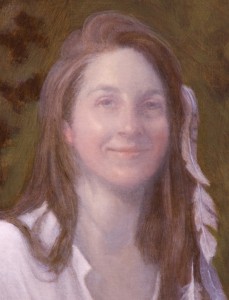
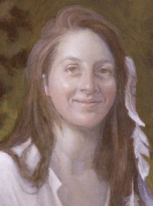
The corrections are done (above) and I have brought back the likeness.
Whew.
This layer must be dry before moving on.
(Click Image For Larger View)
To eliminate that “chalky” look, I have “tapped in” a burnt umber glaze over all the skin tones.
I use the term “tap in” to describe how I apply a glaze. I use a tapping motion with my brush as I do not want any brushstrokes show. By the way, please note that ALL glazes are transparent (and sometimes translucent) colors. Glazes are not ever meant to be opaque (think of looking through a stained glass window).
TA DA! I’m back on track.
When this is dry, I’ll begin yet the next layer of skintone scumbles, building light, color banding – and correcting yet again if I have messed up.
Working in layers give my portraits that Old Master lighting and glow….it takes time and I paint other things (and blog) while I wait for my paint to dry.
 | Grab a cup of virtual coffee and stop by my Painting Studio to see what’s happening. Also come visit my Portrait & Landscape Galleries. |


Your paintings is good
Karin, Thank you for sharing your tip about keeping the drawing from changing while your painting. I have encountered this problem allot. I’m going to try your method and see if it helps. I’m going to reference you and this helpful video on my blog that is attached to my website. I’ll let you know if it works for me.
Best regards,
Linda Anderson