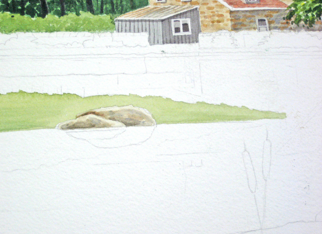
Now we rough in the grassy areas using an initial wash of Aurolin Yellow, Sap Green and a touch of our shadow colour. Our middle-ground rocks are finished for now, and we may come back to them later once our water reflection are painted in. We may need more contrast.
Step 35
An extreme close-up show our rocks with various colours and textures. You can achieve various effects using wet-in-wet or dry brush. Although only a small portion of this painting, it’s a secondary centre of interest so it deserves special attention. I used mostly #4 and #6 round brushes on this.
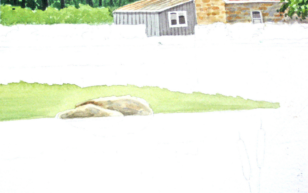
Step 36
You will notice the grass is incomplete, although the negative painting technique has been used to create a rather unkempt and wild appearance. (Nobody is going to row out there and cut the grass). I have avoided painting any grass that shows above, in the water area, to avoid “runs” when we begin our water reflections. We will tackle this later. Note also I’ve complete that background hedge area.
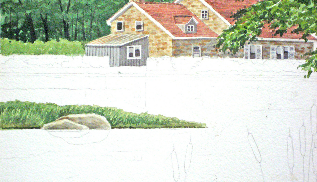
Step 37
I’ve completed the hedge that runs along the wall and pencilled in the reflection area again. I left this until now as too many pencil guidelines can be confusing in this sort of subject.
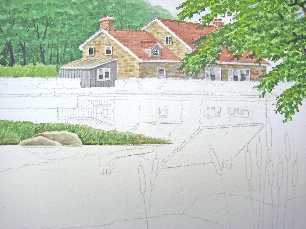
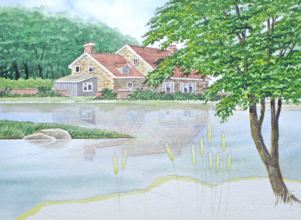
Step 38
Here’s how it should look at this stage as we prepare to tackle the reflections. I’ve also used liquid masking to protect the tops of the foreground bull-rushes so our water texture can run right across as we paint it in.Here’s how it should look at this stage as we prepare to tackle the reflections. I’ve also used liquid masking to protect the tops of the foreground bull-rushes so our water texture can run right across as we paint it in.
Step 39
I often turn my painting upside down when putting in reflections as it seems to lessen the confusion when sorting out the colours and tones. We are, in effect, painting our cottage and some other parts in reverse and in watery colours and tones. We’re moving into unknown territory here, as the exact colour and tone will depend on the quality of the water and how still it is. Dirty water gives fewer reflections. Moving water will distort the reflections. I’ve chosen a nice clean lake in calm weather. No matter how calm, water usually has some movement or ripples, so we must indicate this by making the edges wobbly and irregular. Our colours and tones must also be watery and fairly loose. Lots of room here for personal style and experiment. You might want to try this out on some scrap paper before venturing onto the actual painting.
Step 40
In this extreme close-up I’m roughly indicating the tiles on the roof in an appropriately watery colour and tone.
Step 41
Having completed my watery rendering of the cottage I turn my painting back to its original position and blend in the results with a 1/2″ flat brush, turning it on its edge in places to imitate ripples or waves.
Step 42
Here’s how it should look at this stage. Once we start putting in the colour and texture of the water, we can blend this in until it’s less dominant. There’s plenty of room for error here as long as you don’t start off with strong dominant and staining colours in your first reflections. You can always add some colour at a later stage.You will notice a long thin line of almost white paper where the shoreline meets the water – it usually pays to put this in even if it doesn’t exist in the reference photograph or while your painting outdoors. It helps the optical illusion of shoreline difference.
Step 43
Our reflections begin with a clear wash of water over the whole area. Use a 1/2″ flat brush and soak up to the protected edges leaving that narrow edge where the shoreline meets the water, and the same with the middle ground grass and rocks. While this is still wet (at the glisten stage) block in a wash of Cobalt Blue with a touch of Antwerp blue. As you will be applying this to wet paper the colour will be diluted, so make it stronger than usual. Try it out first. Apply this with horizontal strokes so if any brush marks show they will look like water reflections. From now on all our additions must be in horizontal strokes. Notice I’ve also added some horizontal strokes of colour using our basic wash with added blue, green and gray. Lots of room here for personal style. Stand back and look – if it looks like water, it is!
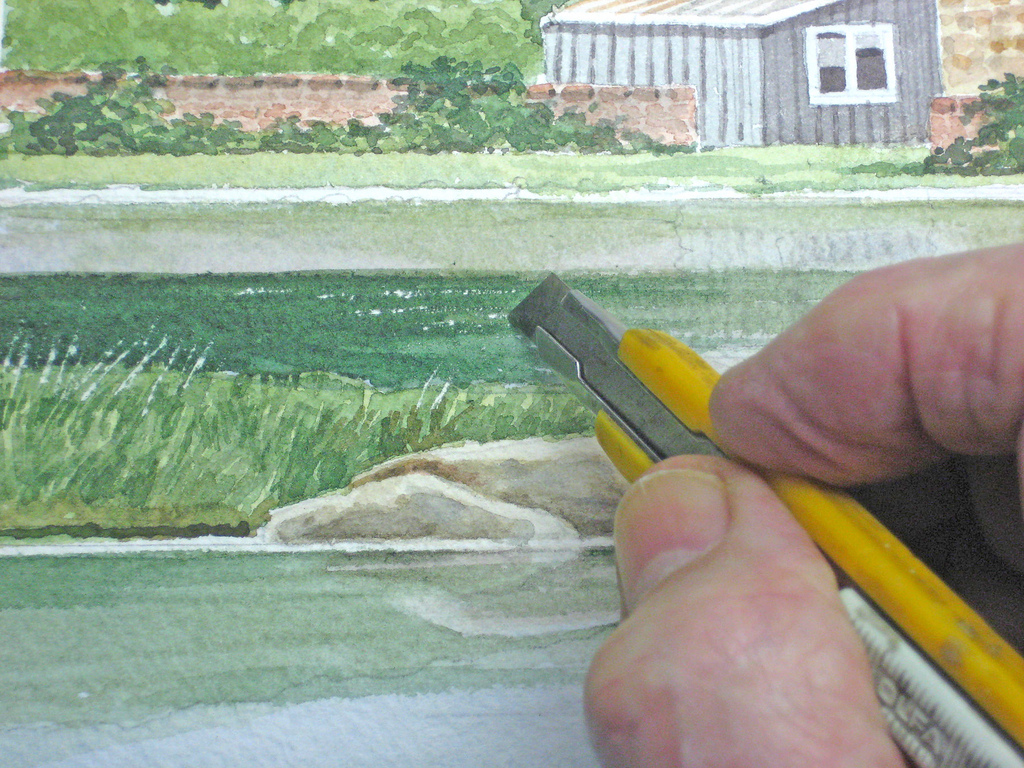
Step 44
In this extreme close-up I’ve added some dark green/blue above the rock area and I’m lifting out some grass and water sparkle with a knife. Your paper must be dry when you do this, and don’t overdo this technique or it will look obvious. Knife strokes must be horizontal in the water, but follow the grass when doing that area.
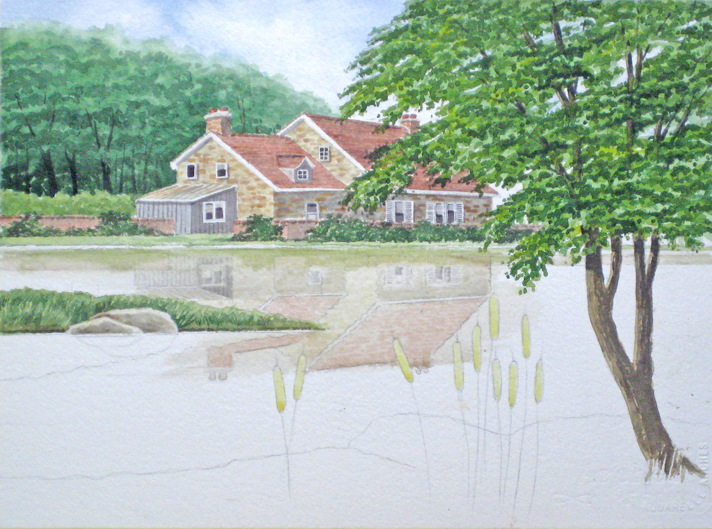
Step 45
Here is how it should look at this stage. No two painters will achieve the same results from this sort of subject, and that’s good. You can begin to develop your own style and brush strokes. As long as you keep your additional colours and strokes horizontal and don’t overdo it the water and reflections will be fine.
Step 45
Occasionally turn your painting upside down and step back. See if anything looks out of place and in need of modification.
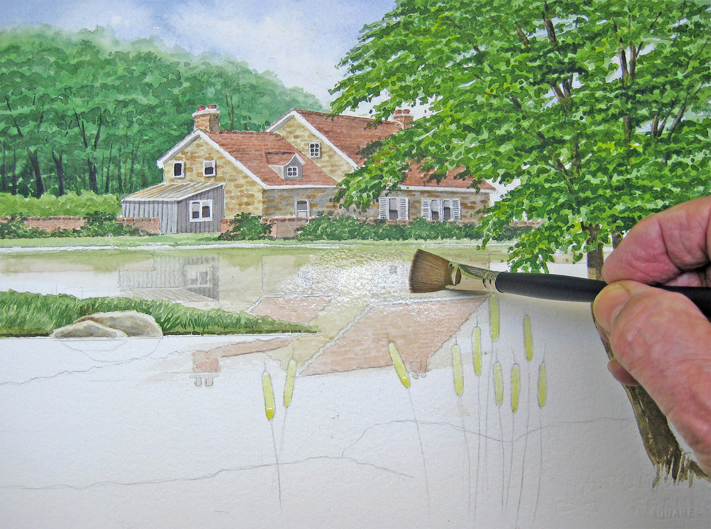
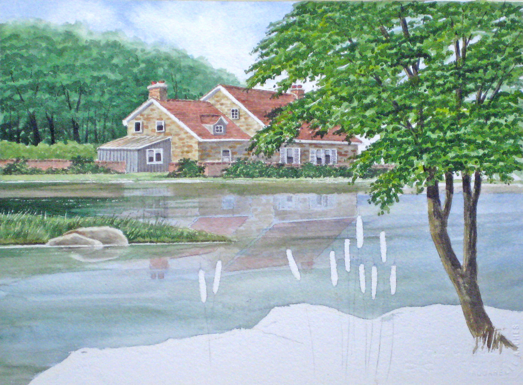
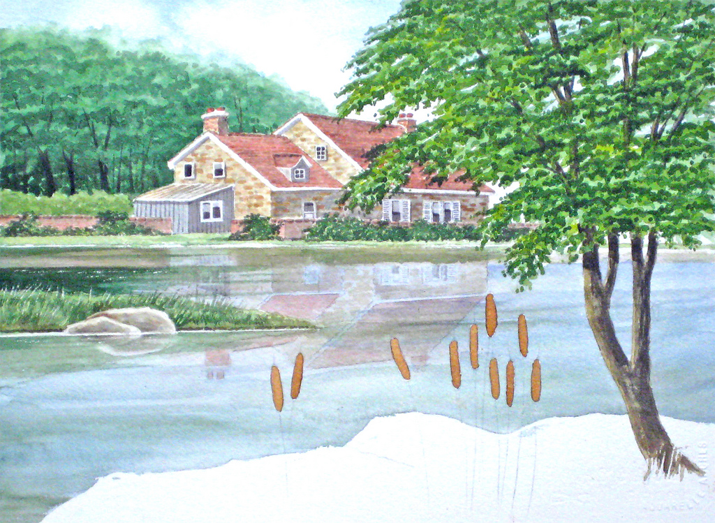
Step 46
Next we remove all the liquid masking and begin painting the bull rushes. Notice I have modified the reflections by adding more colours to the water and increased the depth of colour in the roof reflection and some shadow areas. As each of your paintings will differ in colour and tone, this modification will allow you scope to use your own style.
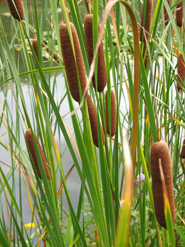
Step 47
Here is a photo reference of a typical clump of bull rushes.
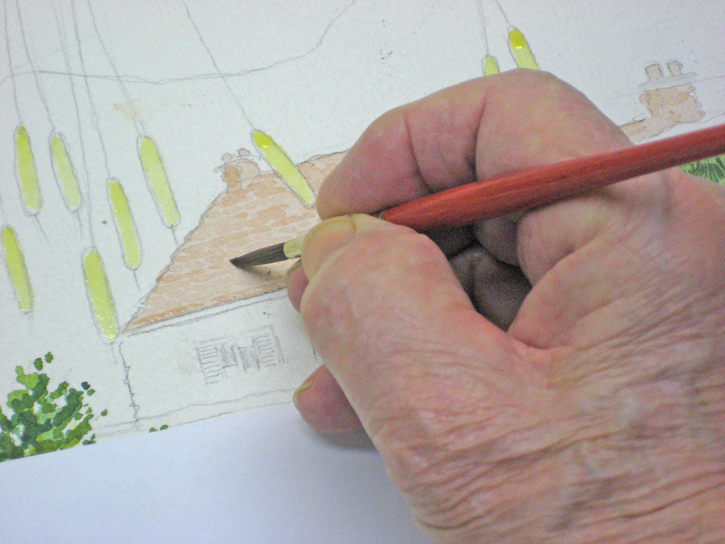
Step 48
Begin with a wash of Raw Sienna and a touch of Burnt Sienna to get that rusty brown look.
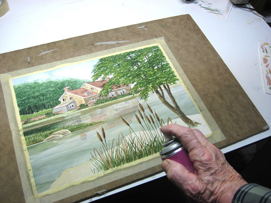
Step 49
Here I’m using a few passes of a hair spray substituting for a professional fixative after I completed my under-painting of the bull rushes. This will prevent the background rock colour from running when I complete those rocks. If I put the rocks in first it would be difficult to cover the darker colours and texture, and to paint in all that undergrowth with liquid masking would be too tiresome and look clumsy.
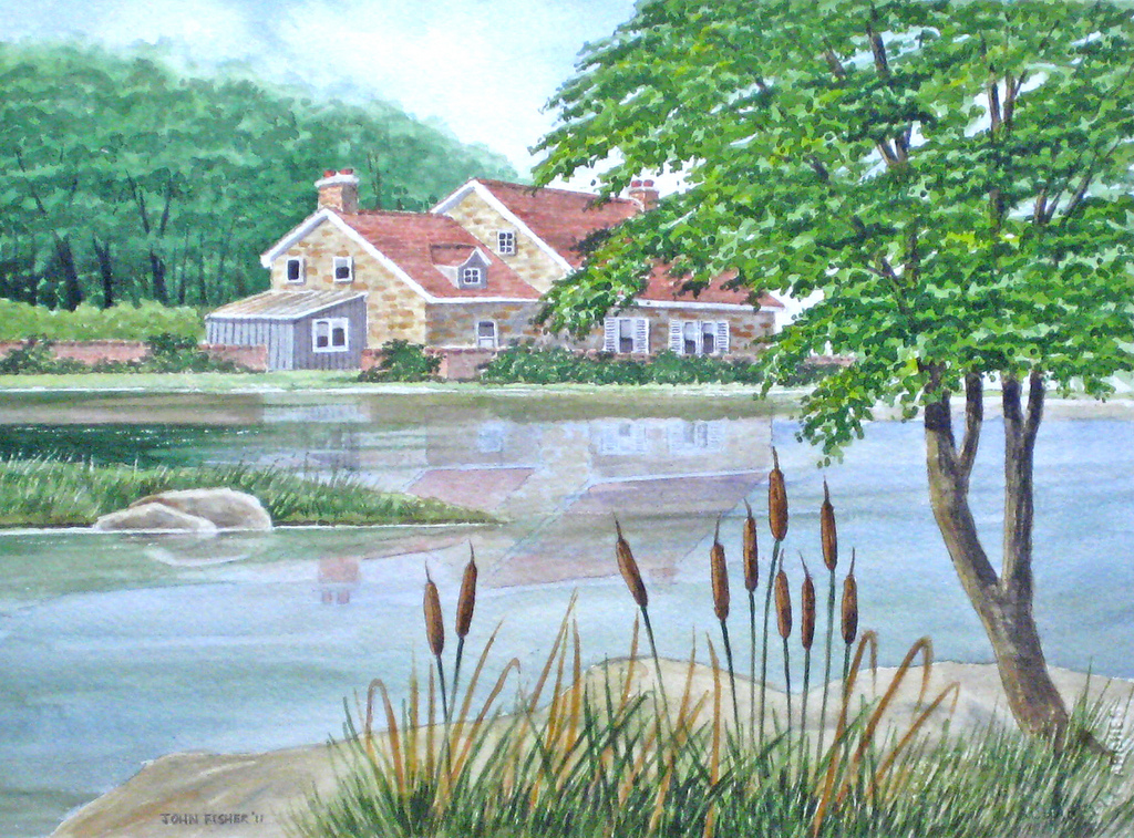
Step 50
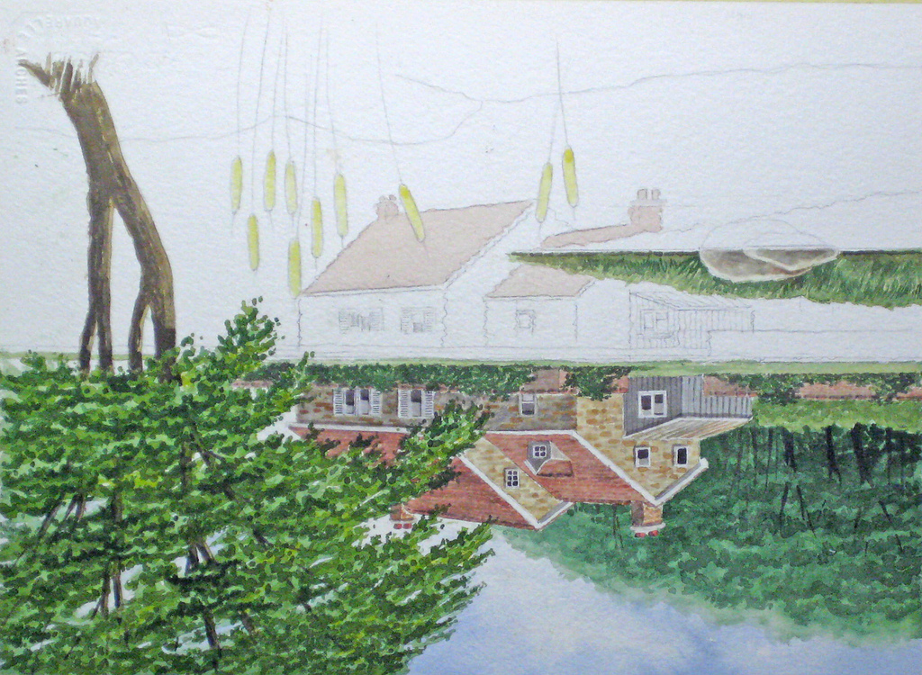
All done. I’ve added some more foreground foliage using our negative painting technique and put in a few finishing touches here and there. I usually let completed painting stand around in my studio for a few days so I can walk by and note any last minute touches I feel should be done. Students often ask me “How do I know when my painting is finished?” My answer is usually evasive as in “It all depends”. Beginners (and some of us who should know better) often overwork a painting. Learn when to leave well enough alone. After all, it’s the NEXT painting that really counts, isn’t it?


Nice website and tutorial, great tips. I enjoyed and learn a lot just by reading and looking. Love the final result.
Very useful tips …. Thank you very much
I thoroughly enjoyed your lesson. Many thanks
Sir, you are amazing 🙂 Let your passion continue to teach others to be passionate as well !
May you be blessed with good health and divine passion to continue teaching others. Thanks, My children will learn a lot from this.