About Beatriz
Beatriz Socorro began her formal art training at age 10. During 5 years, she studied art with the Sisters of the Holy Names of Jesus and Mary in Montreal, Canada, where she learned drawing, perspective, the use of light and shadow to obtain depth and likeness as well as clay sculpture.
Professionally, she worked as a photographer and today uses her own photos as subjects for her colorful oil paintings which are characterized by their vividness and visual impact.
Her art falls under the category of Contemporary Expressionism. She definitely considers her work to be an expression of her own spirit.
To put it in her own words: “I only paint when spirit-within leads me and only paint what spirits wants. I myself don´t know what I am going to paint or what the end result will be. I work mostly through the night and sleep during the day. This way I can work without distractions. Sometimes I´ll wake up in the middle of my sleep with the desire to paint and so I do.”
Beatriz Socorro’s Websites:
http://artinstructiondemos.blogspot.com/
http://beatrizsocorrofineart.blogspot.com/
How to Paint a Lily Step by Step
STEP 1
After transferring the sketch onto the canvas, fill in the background with a purple wash.
For this painting I used violet.
After applying the wash to your canvas, wait for it to dry well to the touch before going any further…unless, of course, you´re in the mood to experiment.
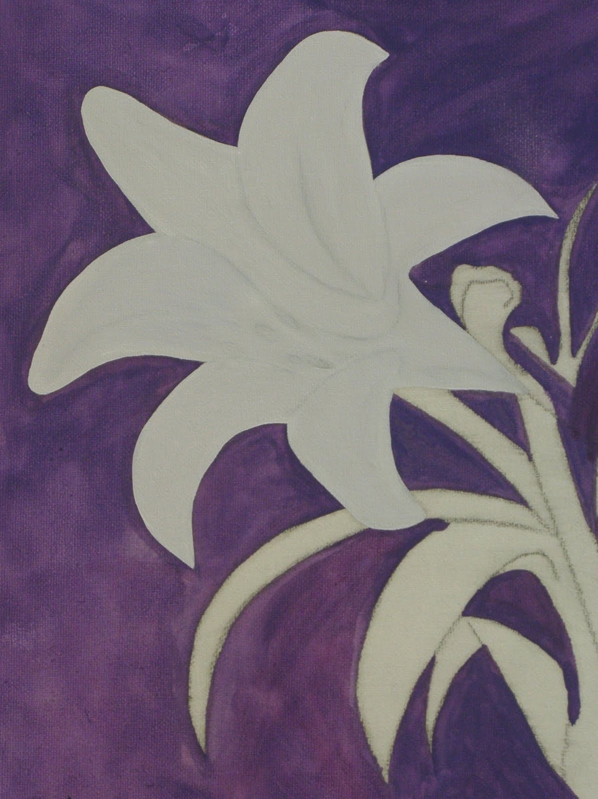
NOW LET IT DRY WELL TO THE TOUCH BEFORE GOING ANY FURTHER.
STEP 2
Remember we´re painting with layers in these first demos. So, unless you purposely want the “cracked look”, be sure to use the medium mixtures as described in theTULIP DEMO.
If this is your first visit, I suggest you copy the medium mixtures so that you don´t have to be going back and forth.
For this step, I start with the flower. Since this is the first coat for the flower, I used the corresponding medium mixture.
Flower: Mix Carmin + barely a touch of Prussian Blue + lots of White to get a very light lavender color. Apply this to the darker areas of the flower.
For the lighter areas, use White + barely a pinch of the lavender mixture.
If you look again at the TULIP DEMO and the POPPY DEMO you will notice that I only paint the darkest and lightest areas. It looks like painting by numbers. I leave a very small space between the two tones of color.
Then very softly and gently blend-in the two. This gives the middle tone.
Leaves: To obtain the Blue for the leaves use a mixture of Cobalt Blue + White + a pinch of Prussian Blue.
If you don´t have these colors in your palette experiment with what you do have.
For Green, mix Chrome Green + Cobalt Blue + White
Using the same technique as the flower. fill in the leaves.
Background: Notice, that I start to paint from the center of the canvas and work my way out. This way, if I accidentally lay my hand on the canvas, I won´t smear the paint all over the place. Constantly check your arm and hands to be sure you don´t have paint on them.
For the background, use different tones of Cadmium Red Deep + Light Yellow.
Now fill in the background.
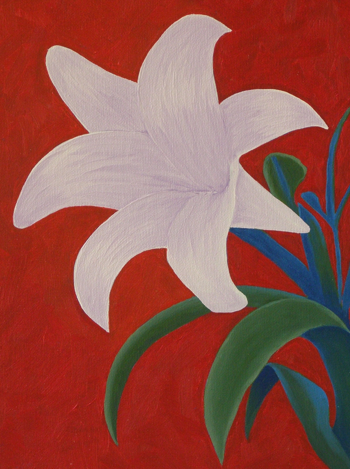
It is important to remember that you have to use different medium mixtures for each layer. For example, at this stage the background already has 2 layers, whereas the flower and the leaves only have one. Be sure to keep track of your layers. Write them down, if need be.
NOW LET IT DRY WELL TO THE TOUCH BEFORE GOING ANY FURTHER.
STEP 3
To further define the shadow areas in the flower, mix Light Yellow + White + barely a pinch of Cadmium Red Deep.
This time, for the lighter areas, use pure white.
Remember to add the right medium mixture for each layer.
Now apply the paint to the parts that you want to be the lightest and then do the same for the darker areas.
Next, gently and softly blend in the edges of the two colors to obtain the midlle tone.
Remember that (if you mess up or don´t like something) since the underlying paint is already dry, you can remove the fresh paint with a dab of turpentine on a paper towel. However, do not rub hard or you could damage the previous layer.
Leaves: Use darker and lighter tones of the same color mixtures as in the previous layer but this time add Light Yellow to the color mixture that you will use for the lighter areas.
Using the same technique as with the the flower, define the light and then the dark areas of the leaves.
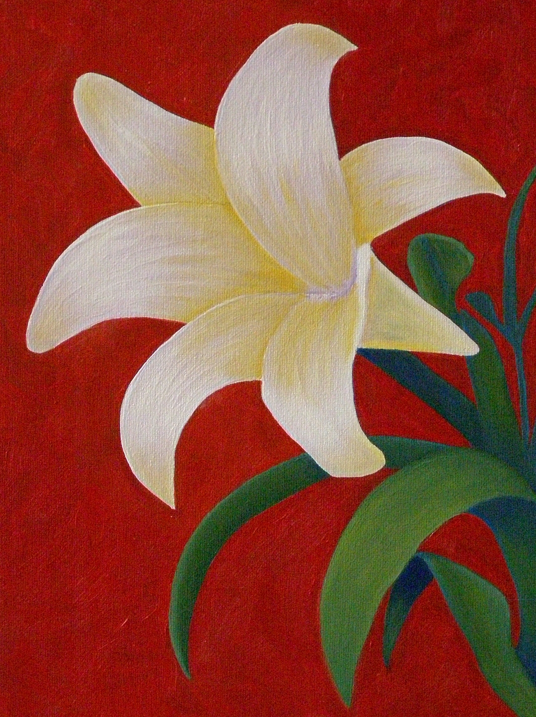
NOW LET IT DRY WELL TO THE TOUCH.
Step 4
Flower: Add a thin glaze of Green to the areas where the shadows are the deepest. For this, use pure linseed oil as a medium. Remember, the more layers the more oil you need.
Leaves: Using the same colors as the previous layer (but in deeper and lighter tones) add a glaze to the lights and darks.
To give a feeling of depth, make the leaf in the foreground slightly lighter than the rest. This makes the leaf come forward, while the rest recede.
The down-side is that linseed oil takes longer to dry and has a tendency for yellowing with time. But for this painting. a little bit of yellowing in the white will do just fine.
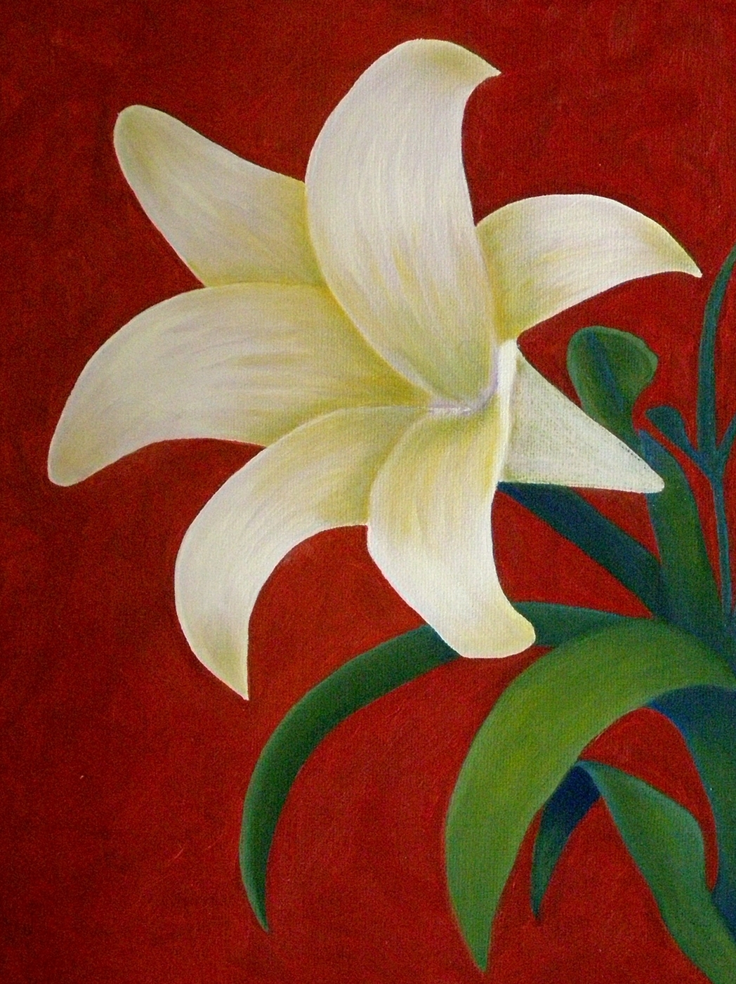
BE CERTAIN THAT IT IS VERY DRY TO THE TOUCH BEFORE ADDING IN THE FLOWER STAMENS.
STEP 5
Before you paint-in the stamens, lightly outline them directly on your painting with a charcoal stick. Don´t press hard, try not to press at all.
Very lightly sketch where you want the stamens to be. If you don’t like the way it looks, wash off the charcoal with a paper towel dipped in very diluted dish-soap. Gently dry with a clean paper towel and try again.
Once you´re satisfied with the results, use a a glaze of the same Green color you have been using all along and with a very thin brush, paint the stamens.
CONGRATULATIONS! YOU´RE DONE!
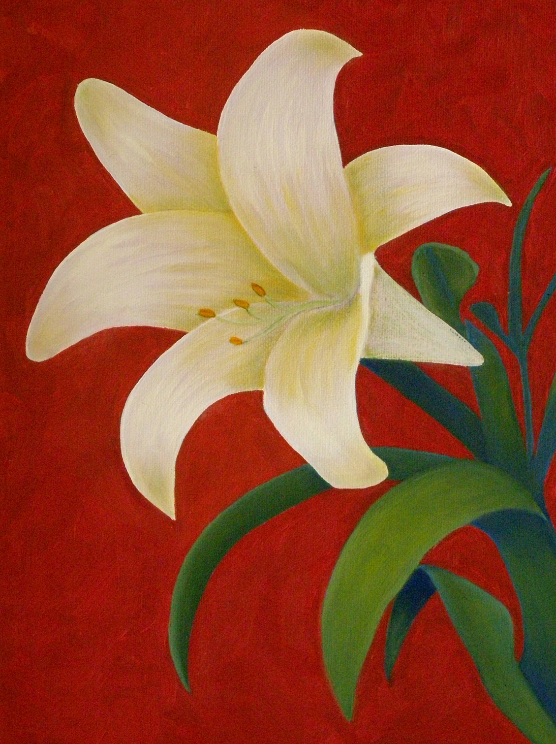
I hope you enjoyed it. God Bless!!
Beatriz Socorro
I found this tutorial very helpful and easy to follow. Thanks a lot!