About Barbara Fox
Barbara has achieved a tremendous following on both the national and international level as a watercolor painter with a vivid and unique style.
Her paintings have been featured in solo and group exhibitions in museums and galleries throughout the United States, including the Phillips Museum of Art in Lancaster, Pennsylvania; the Millicent Rogers Museum in Taos, Mexico; the Salmagundi Club New York City; The Neville Museum in Green Bay Wisconsin; and the Pittsburgh Center for the Arts
Barbara is a signature member of the National Watercolor Society, the International Guild of Realism, the Pennsylvania Watercolor Society, and the Northeast Watercolor Society, among others.
She has been published in the major watercolor publications Splash: the Best of Watercolor Painting, and Secrets of Watercolor Masters. Barbara has been a featured artist in the leading national art magazines American Artist and Watercolor Magic.
Barbara is represented by the Oxford Gallery, 267 Oxford Street, Rochester, NY 14607
Visit Barbara’s Websites Today:
Golden Blush Rose – How to Paint a Flower in Watercolour

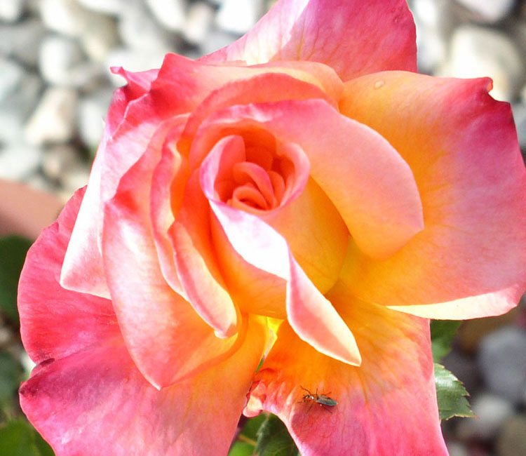
Here’s the photograph I used
Paints used for this painting( Winsor Newton and M. Graham and Holbein Brands):
- Sap Green
- Hookers Green
- Peacock Blue (Holbein)
- Cobalt Blue
- Ultramarine Blue or French Ultramarine
- Winsor Violet Dioxazine
- Permanent Rose
- Quinacridone Violet
- Quinacridone Red
- New Gamboge
- Lamp Black
Paper is Jack Richeson 300 lb cold press watercolor paper
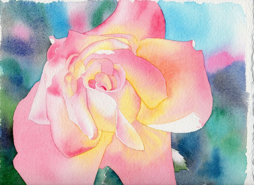
Step 1 -the color field
I paint in layers, so step one is laying in the first layer. I call this my “base layer”, because I am painting the color of the subject, albeit with some variety. This is done in sections, painting every other petal, for the rose. Let each section dry completely before painting the section next to it.
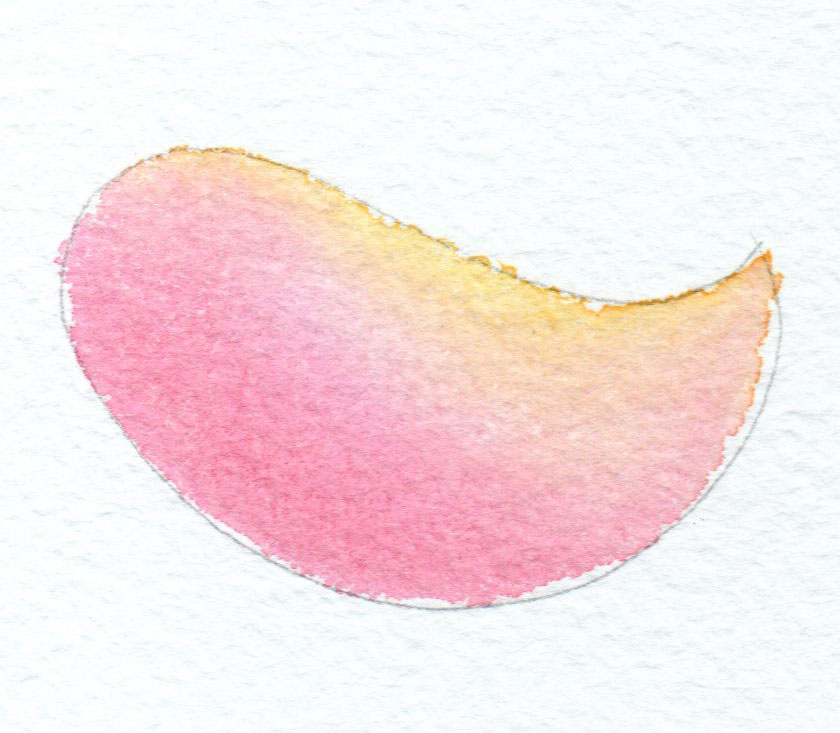
I let the colors blend with a wet-on-wet technique, either
A. wetting an area with water, then touching the colors on it,
OR
B. laying in a colored wash, then adding the second and third colors.
I use both techniques.
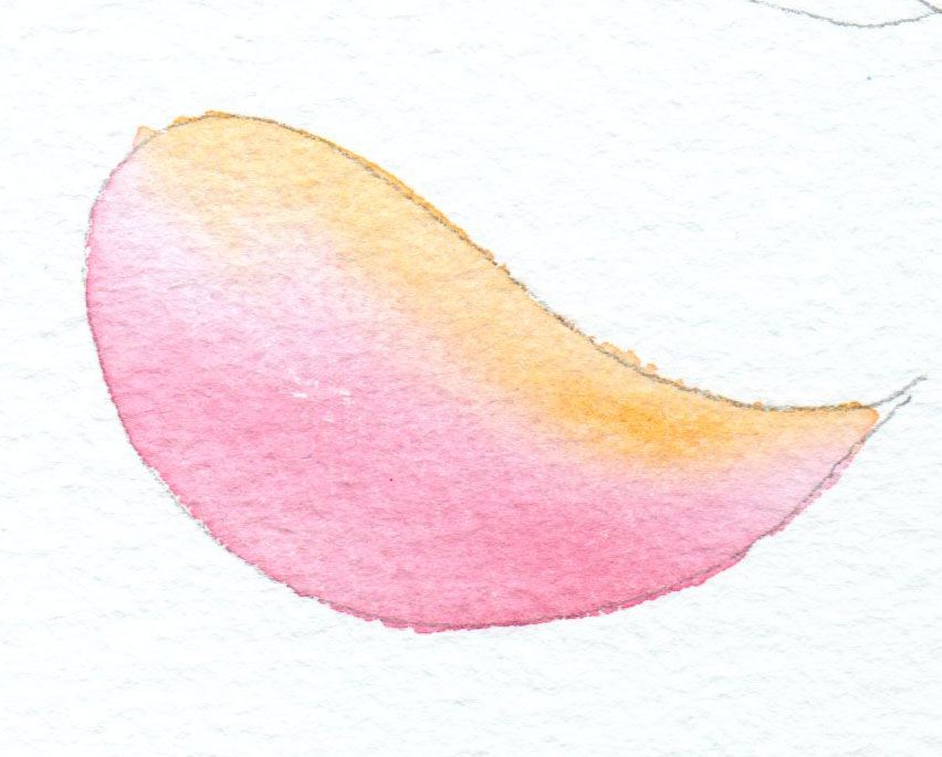
Remember, the pigments flow with the water, so let the water do the work!
When the rose is completely painted with the first layer, and dry, I paint the background, in this case a spotty color field, again painted wet-on-wet. I used Hookers green, Peacock Blue, Sap Green, Ultramarine Blue, Permanent Rose, and Prussian Blue.
Step 2 – shadows
Once the color is laid down, I proceed to paint the shadows. I don’t use a “shadow color” but paint what colors I see. Usually the shadows on a flower are the same colors I’ve been using, only darker, and sometimes with a bit of purple (to grey the color) or cobalt blue (to cool the color) put in.
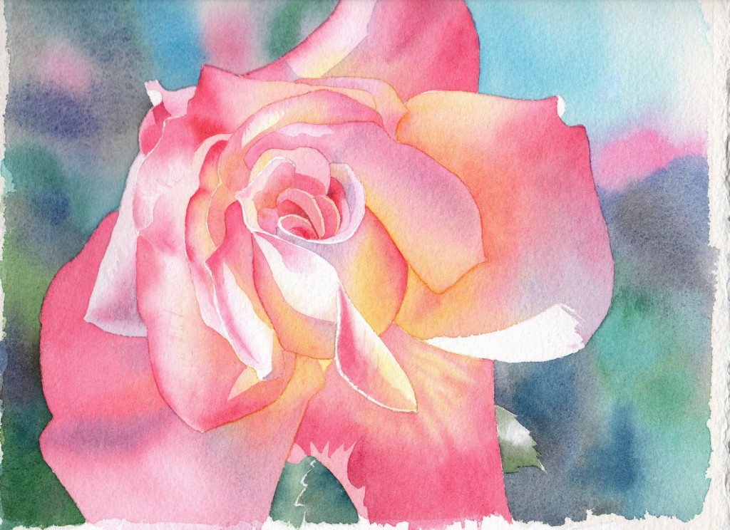
Just as I painted step 1, I paint the shadows wet-on-wet, letting the pigments mix on the page.
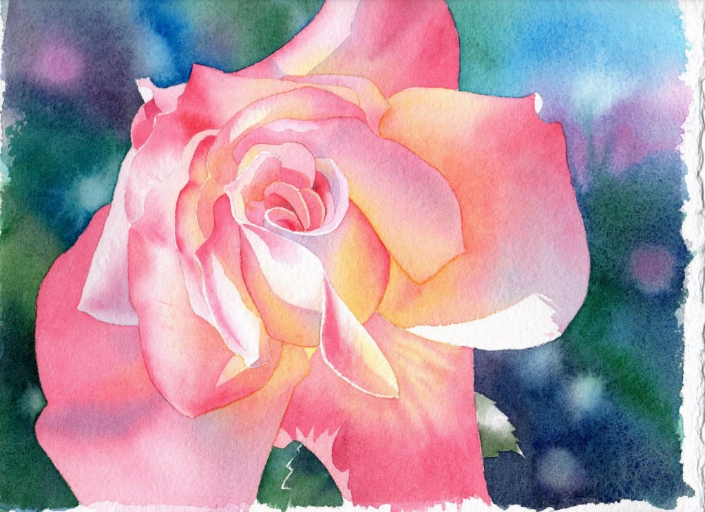
Step 3- deeper colors
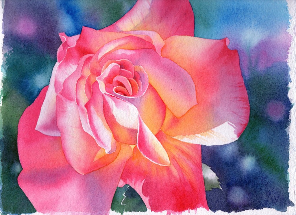
Background: I use black when painting the second layer of the background. I feel like it “anchors” all the other colors used in the background, and because it is so dark, I don’t have to paint multiple layers just to get a good dark. I avoided black for a long time, but appreciate that it saves me a lot of time.
The lighter areas are made by touching the wet colored area with a dry paper towel, then adding a drop or 2 of water. The water pushes the pigment back.
This technique makes very different effects depending on how wet the paper is, so practice it a bit. Pigments also react differently; the staining color pigments like to stay put.
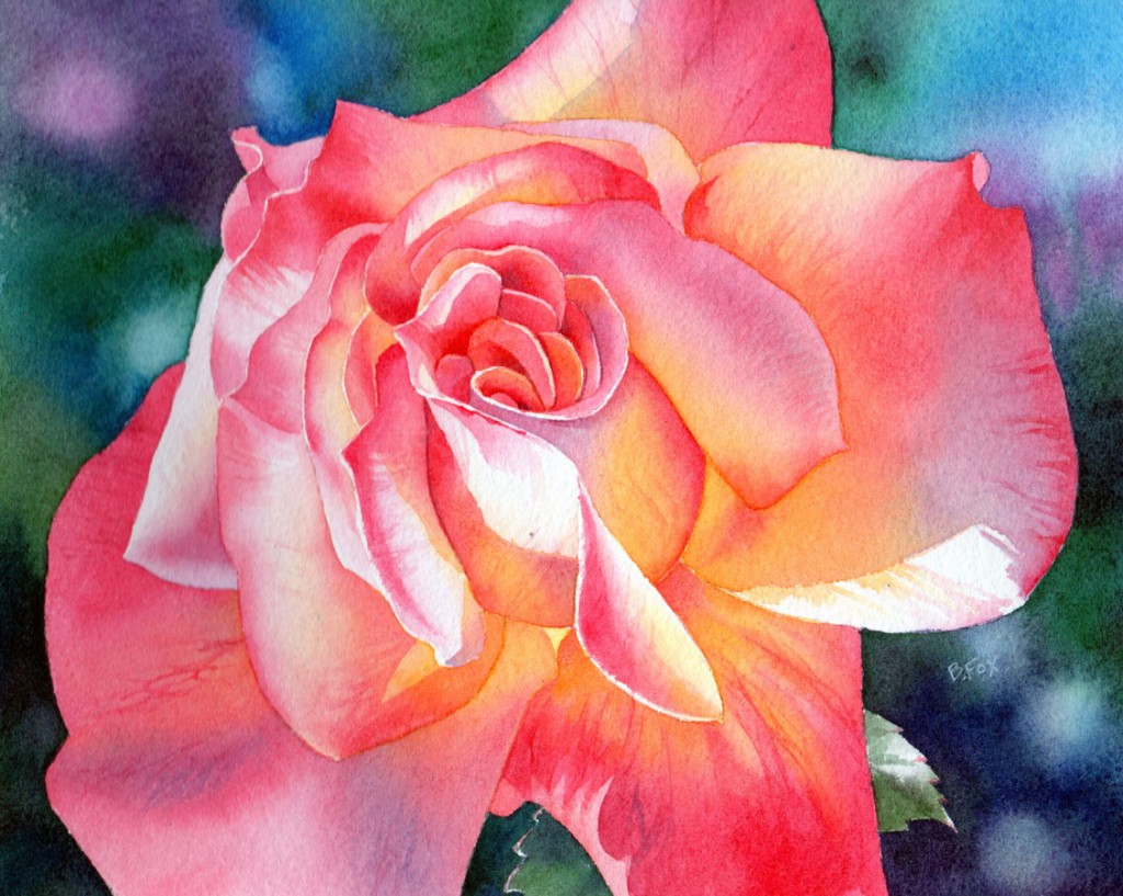
I use another layer of paint (the same colors) to enhance the colors, still painting wet-on-wet. People ask “doesn’t the paint on the paper come up when you paint over it?”.
It shouldn’t, if:
You use good quality paper
And
You don’t push the water around too much with your brush. You can guide it with the brush, but too much brushing will loosen the dried paint.
I got a little carried away and began painting some veining and other textural details on some of the petals. See how much more vibrant the flower looks with richer color?
I also added a bit more black to the background. As the values and color deepen in one area, it may make the colors and values in other areas look weak. That is why I like this layered process, and like to work the whole painting; I can constantly adjust colors and values as I’m working

Finally, I add some textures and veining, and make the dark red areas really dark.
It now looks luminous, colorful, and realistically 3 dimensional.
Dear Barbara,
I am very blessed to see the picture of the rose and the techniques you have used in your busy days. I would like to request you to give more pictures and the basic techniques. I am Indian and I am not sure if I get same brand items which you have mentioned but still it gave me the pleasure to see the picture. After a long time I will start to paint again.
With regards,
Shwetha
Fabulous, thank you.
Absolutely beautiful!
Thank you.. You made it seem easy. Question: What brush(es) did you use? … can you suggest size and manufacturer. Thx.