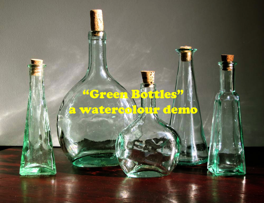
Green Bottles – Step by Step Watercolor Painting Demonstration
Our next class project at the Testa Heights Art Club, in Uxbridge, Ontario.
If you don’t have an eye for detail this demo will irritate the hell out of you, so move on and save yourself some irritation! If you enjoy the challenge of watercolour realism as I do, then walk along with me as we look at how this watercolour was achieved. Sometimes a demo goes wrong and you wish you’d done things differently. This is one of them, but I’m going to post it anyway if only to prove even the most experienced watercolour lovers come a cropper once in a while!
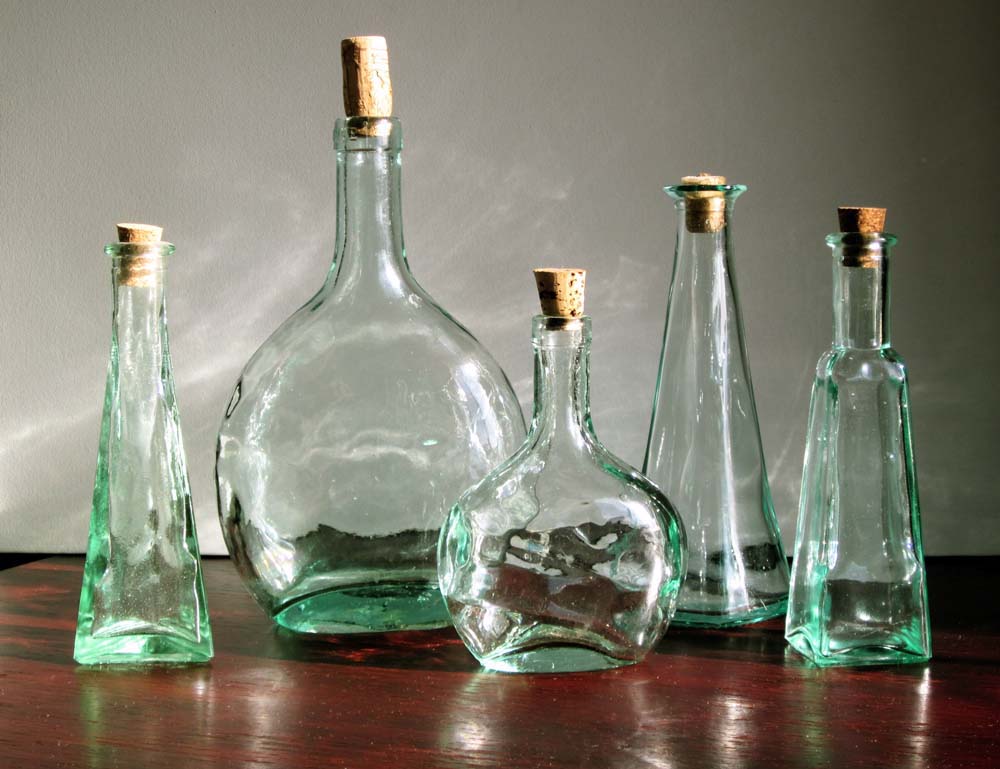
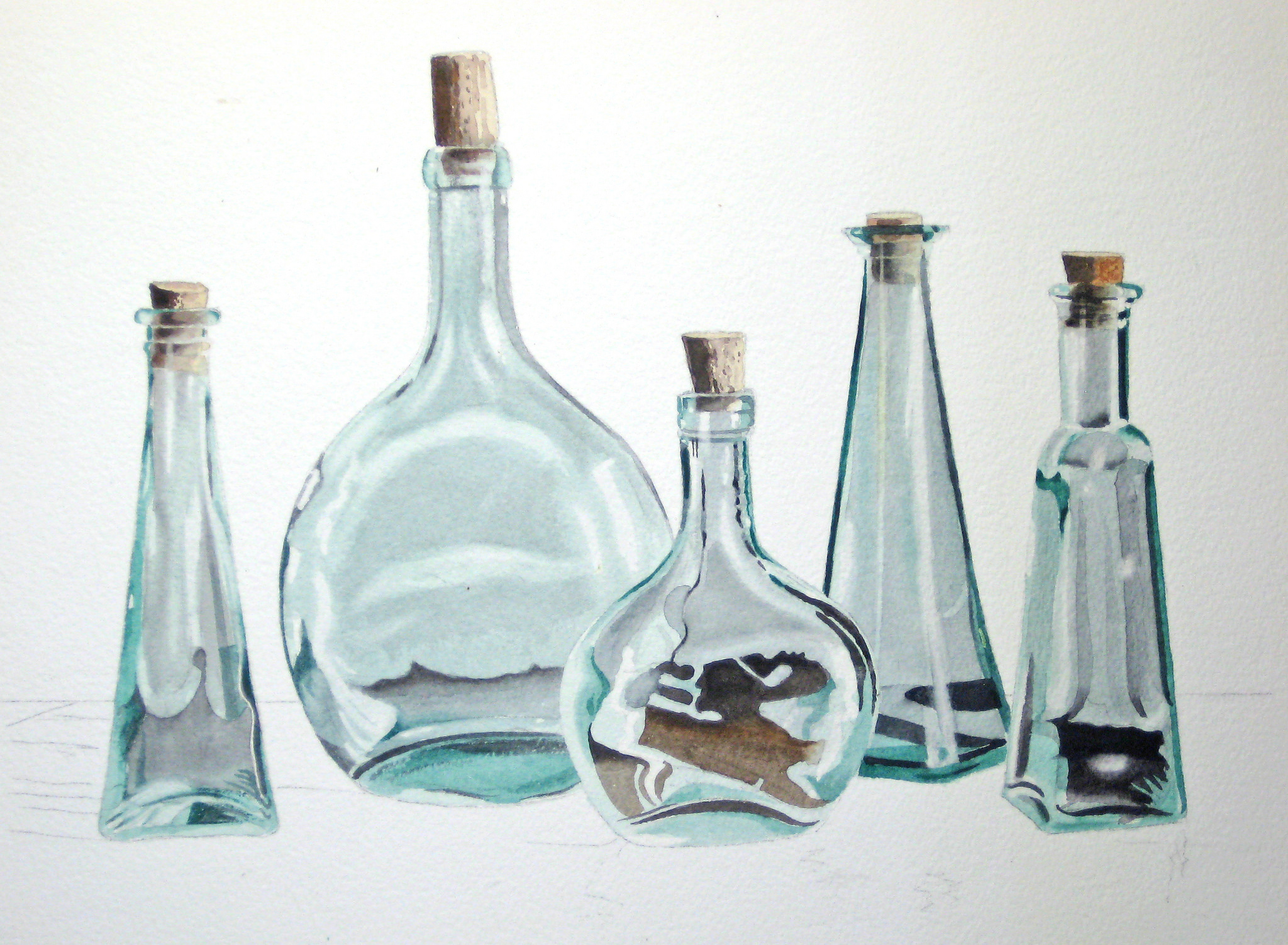
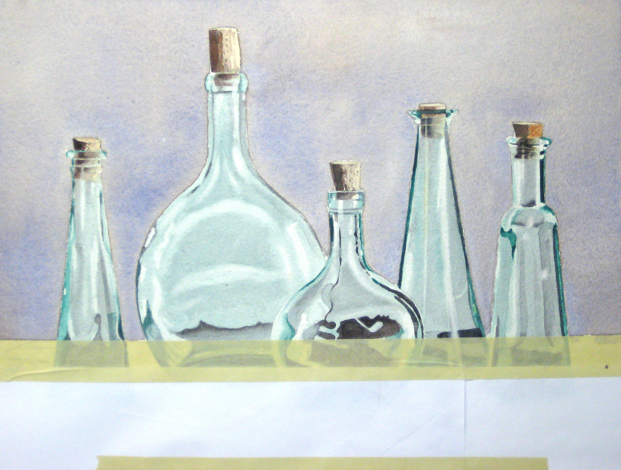
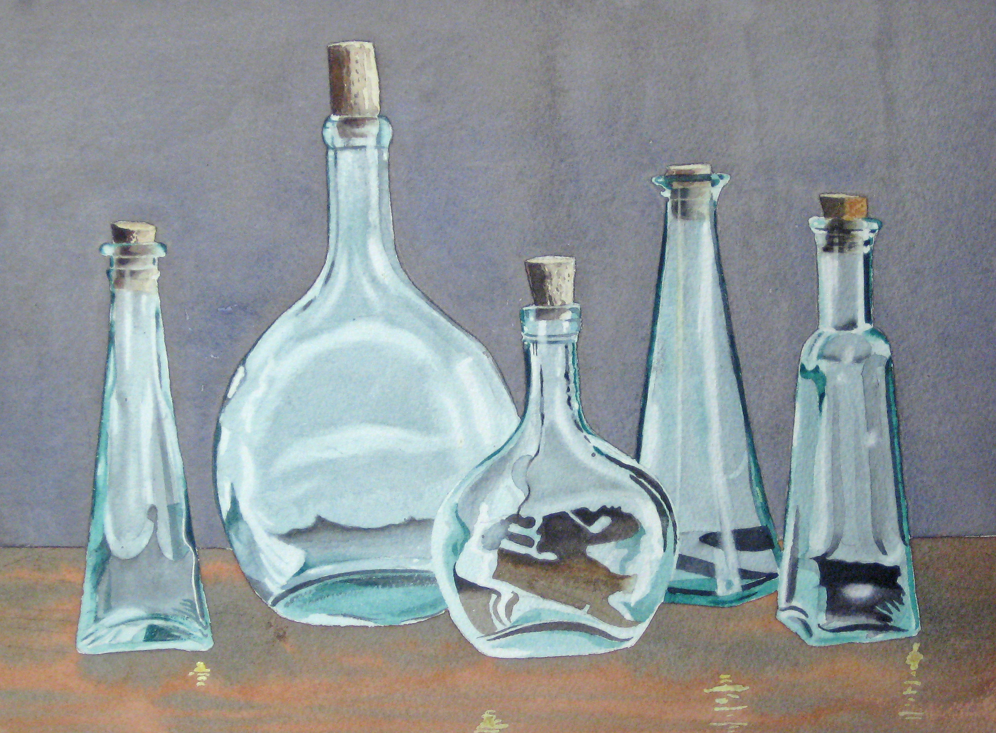
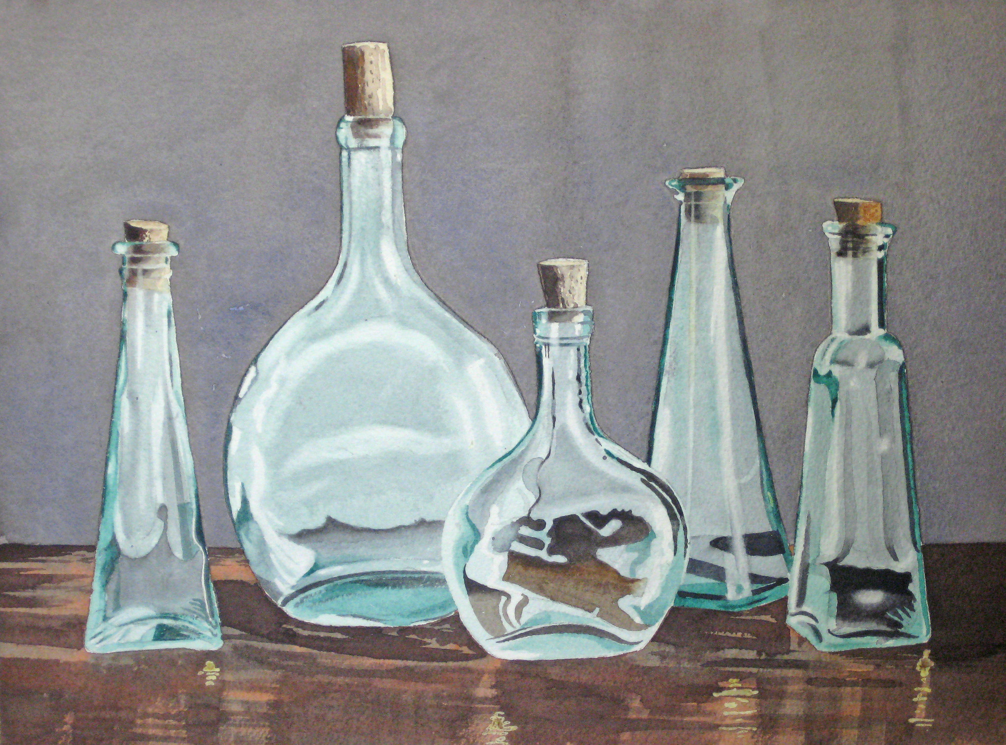
Credit for this photographic image must go to “Green Bottles” by Lillian Bell found here.
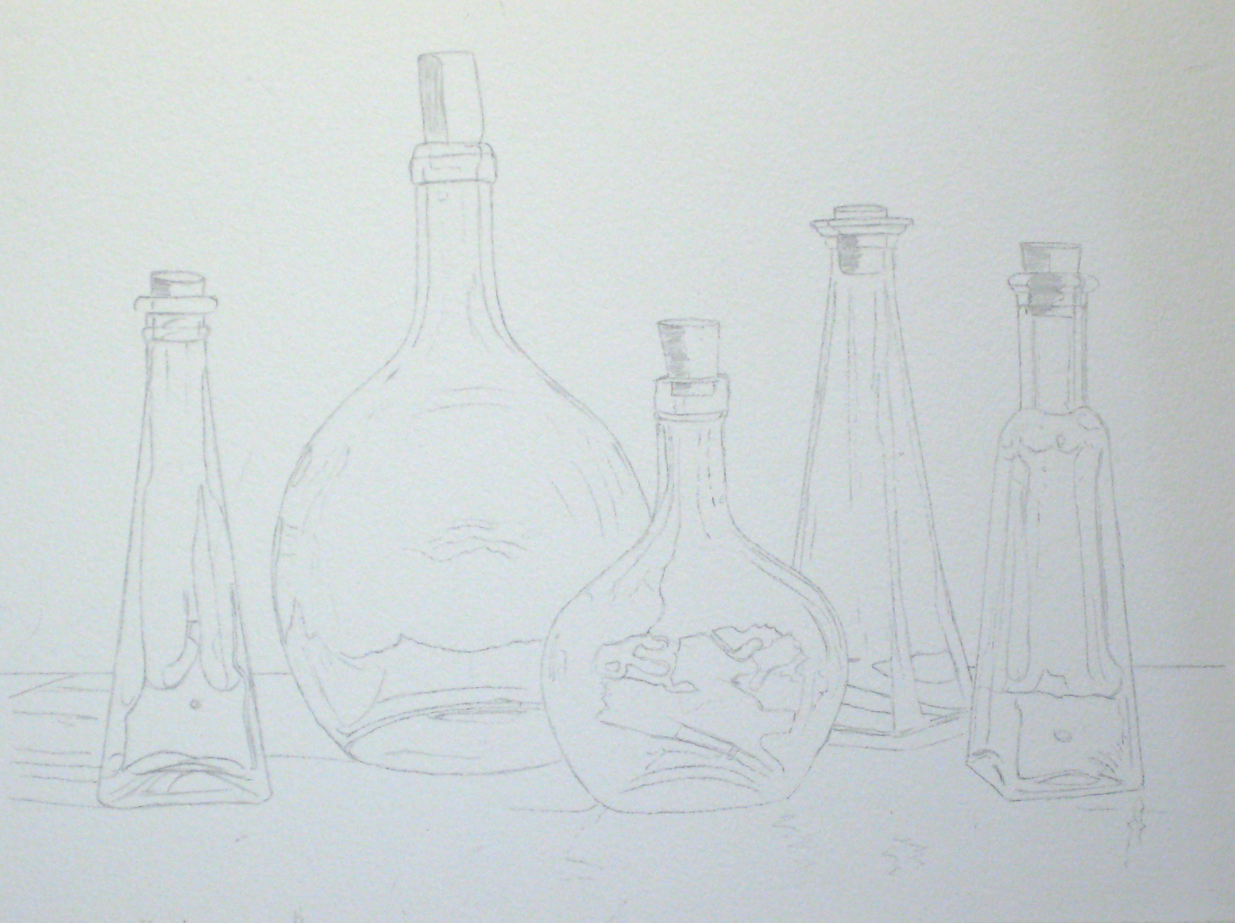
I always start off with a careful drawing, especially with glass or metal objects, as the careful use of masking fluid requires almost paint-by-numbers layout to avoid confusion
Here was was my first mistake. I elected to paint the background in last as part of my teaching of techniques to my beginners and intermediates, accepting that laboriously masking in all the bottles would requires tricky and careful masking with postal tape and liquid masking. I wanted the edges of my bottles to be clean and sharp. As you will see later in this demo it didn’t quite come off the way I intended, and when I do this again for my class I will have them mask off the bottles so we can be a bit more free with our background textures.
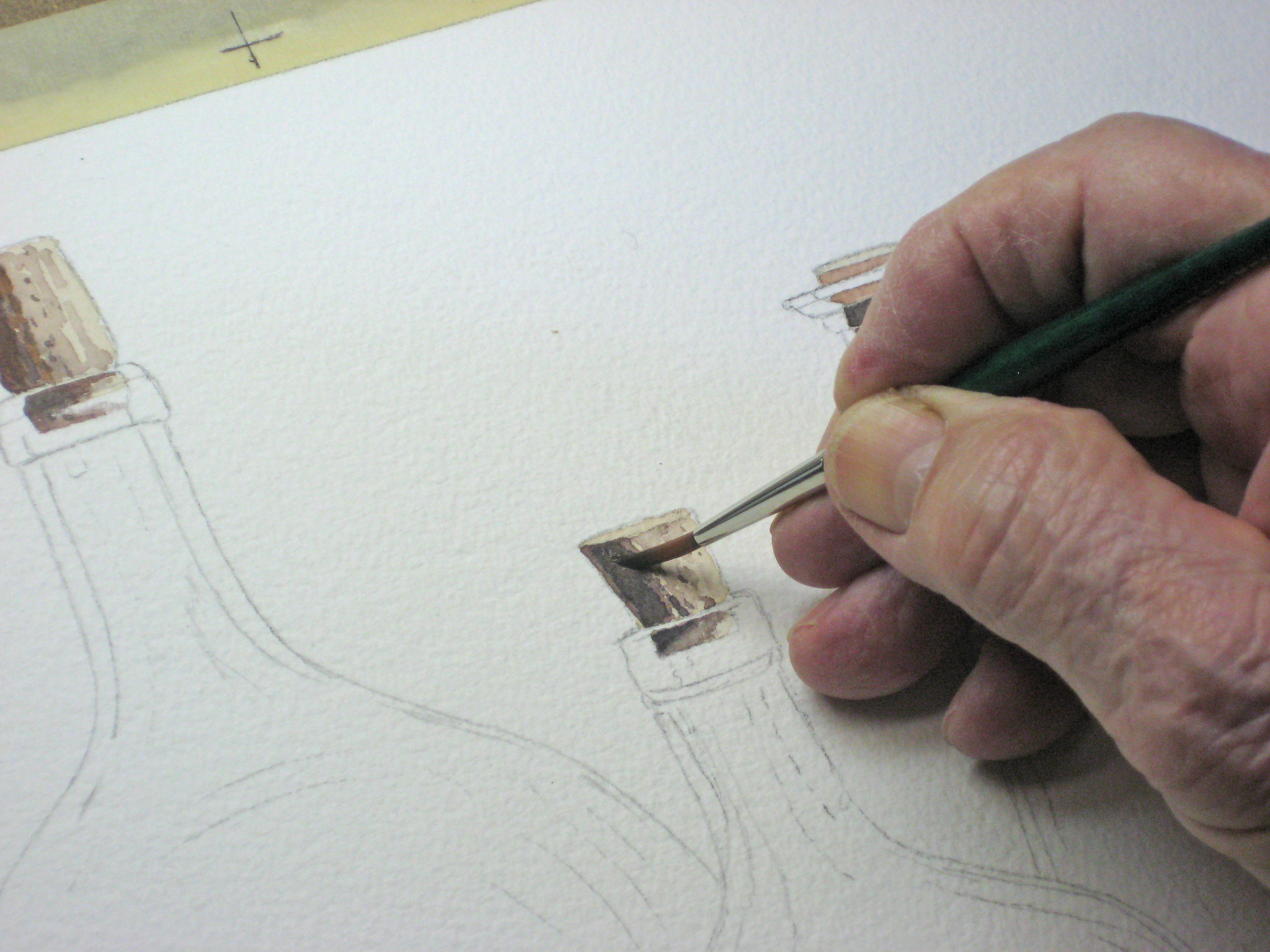
Having made that decision, I decided to paint in the corks first, and I’m using a mixture of Raw Sienna and Brown Madder with a touch of a shadow colour I make using these two colours together. My choice of where to start is purely arbitrary but I try to keep in mind my student’s needs and this is a pretty intimidating project for beginners. The corks are relatively simple and it gets colour on the paper fast.
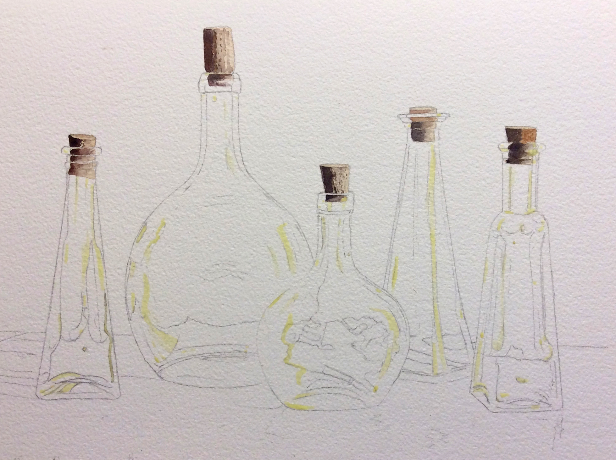
Here I have carefully used liquid masking on those areas I want to be white after I begin my first washes of Viridian Green. The other highlights will be lifted out with a scrub brush later. In a detailed painting such as this your masking fluid must be carefully painted, as later colour washes may leave you with a clumsy looking mess of confusing white patches that bear no resemblance to what you’re trying to achieve. If you’re new to masking fluid practise first on scrap paper. Be patient. You won’t get this project done in one fun-filled afternoon.
Here I’m starting on my first wash using pure Viridian Green. To ensure a nice clean edge I’m using a 1/2 angle brush and carefully following my pencil lines. This first wash is very pale and will be built up with subsequent glazes, and the eventual darker background will help to create the illusion of shiny glass.
I covered all five bottles with this basic pale wash of Viridian Green.
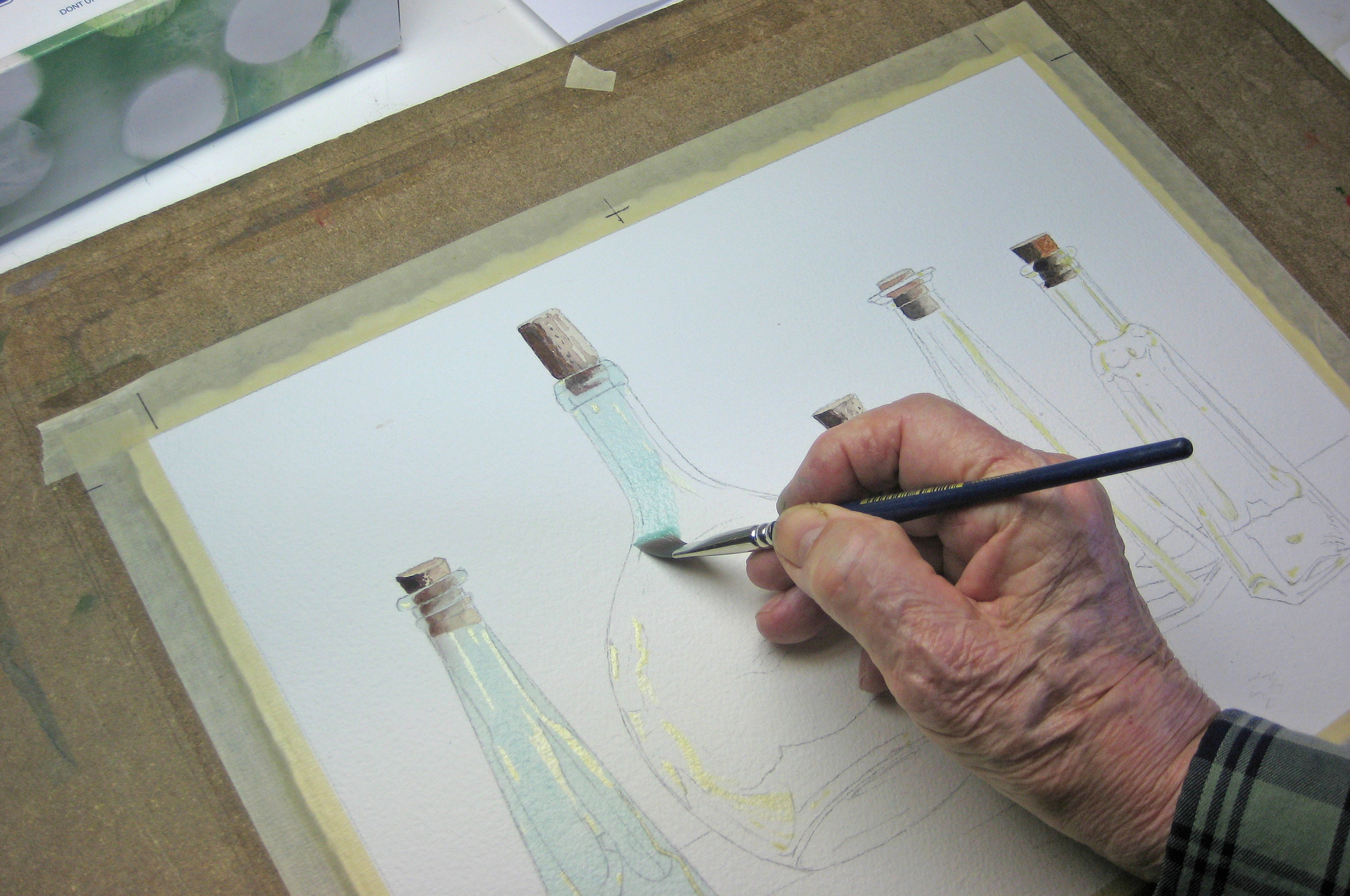
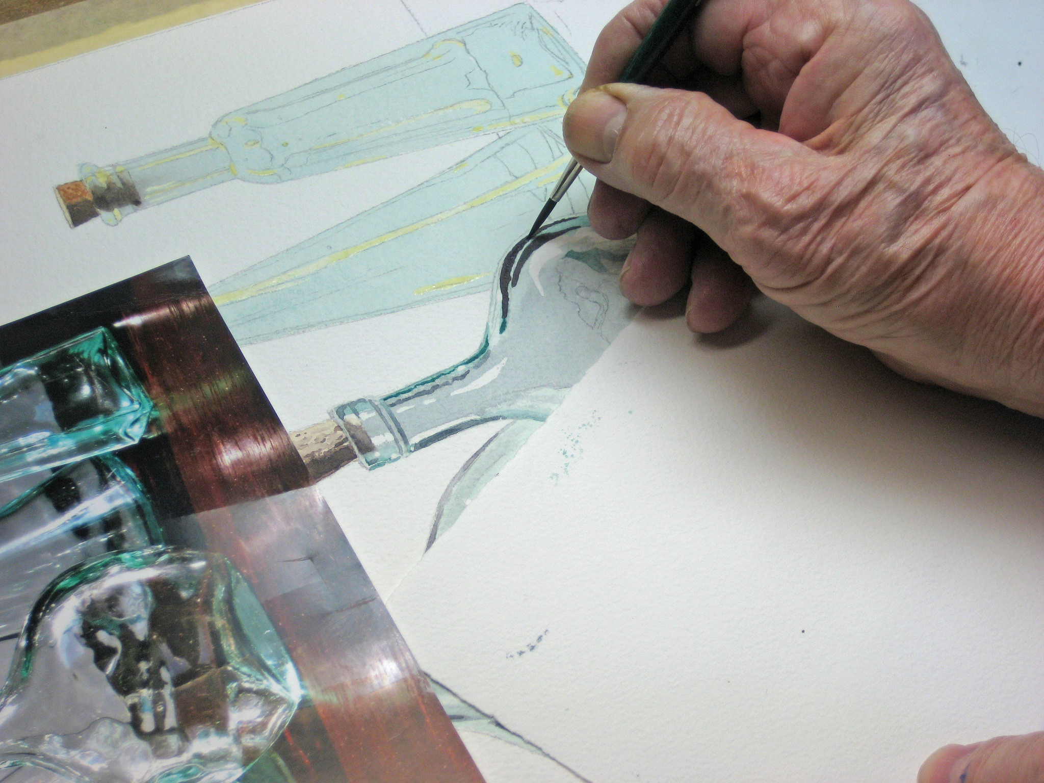
I began completing each bottle by starting on the far left-hand one. Notice I’ve covered up the rest of the paper to avoid damaging or lifting the existing masking fluid, and to keep my paper clean and white. I removed the liquid masking and I’ve added some grey to the Viridian Green made of Brown Madder and Antwerp Blue. I’ve also used some stronger pure Viridian Green straight from the tube to add some contrast in certain areas. I will go in later and soften those stark white areas at the edges and lift some colour from places I think will add to my il
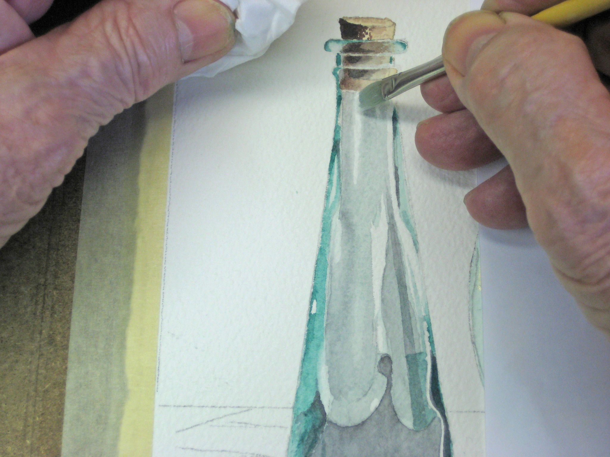
In this extreme close-up I’m softening those edges using a stiff bristle brush, water and facial tissue. If you’ve never tried this technique I recommend you practise first on scrap paper as the exact amount of water, the amount of pressure and how to dab it depends on many factors. Don’t overuse this technique though. It can soon look contrived and obvious.
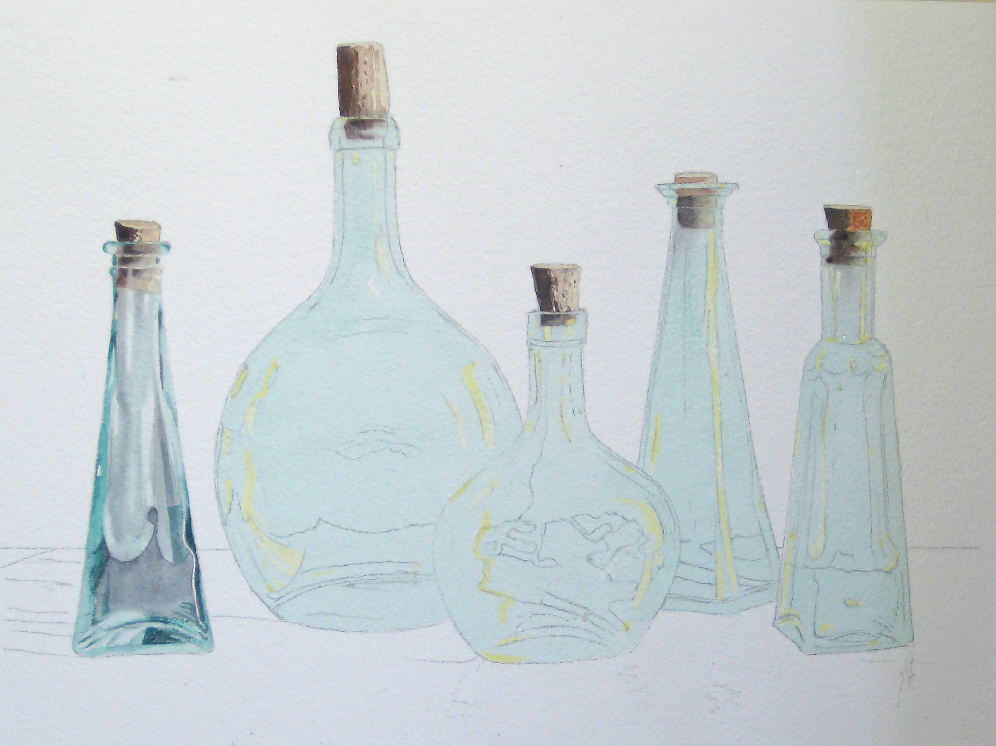
One down and four to go! Remember the background will be essential to this illusion so you have to have faith your tones and colours are right.
Another extreme close-up showing the care you need when painting in your curves. This is a commercial type illustration so loose or careless work may destroy your illusion. Note I masked off the right hand bottle as I’m working on the current one. My masking paper is still in place.
Another extreme close-up to show how I’ve left some of the original pale Viridian Wash in the middle and I’ve yet to remove the liquid masking which will reveal pure white paper.

Two down, three to go! Here I’ve removed the liquid masking and softened all the edges I thought necessary. Now we have a mixture of pure white and slightly tinted areas on this bottle. Now I will removed the liquid masking from the edge of this bottle and start on Number 3.
Here I’m working on carefully painting in some of the curves on my latest bottle. I’ve turned the paper and my reference image sideways as I’m right-handed and the colour flows better for me. In this type of commercial illustration you need a steady hand.
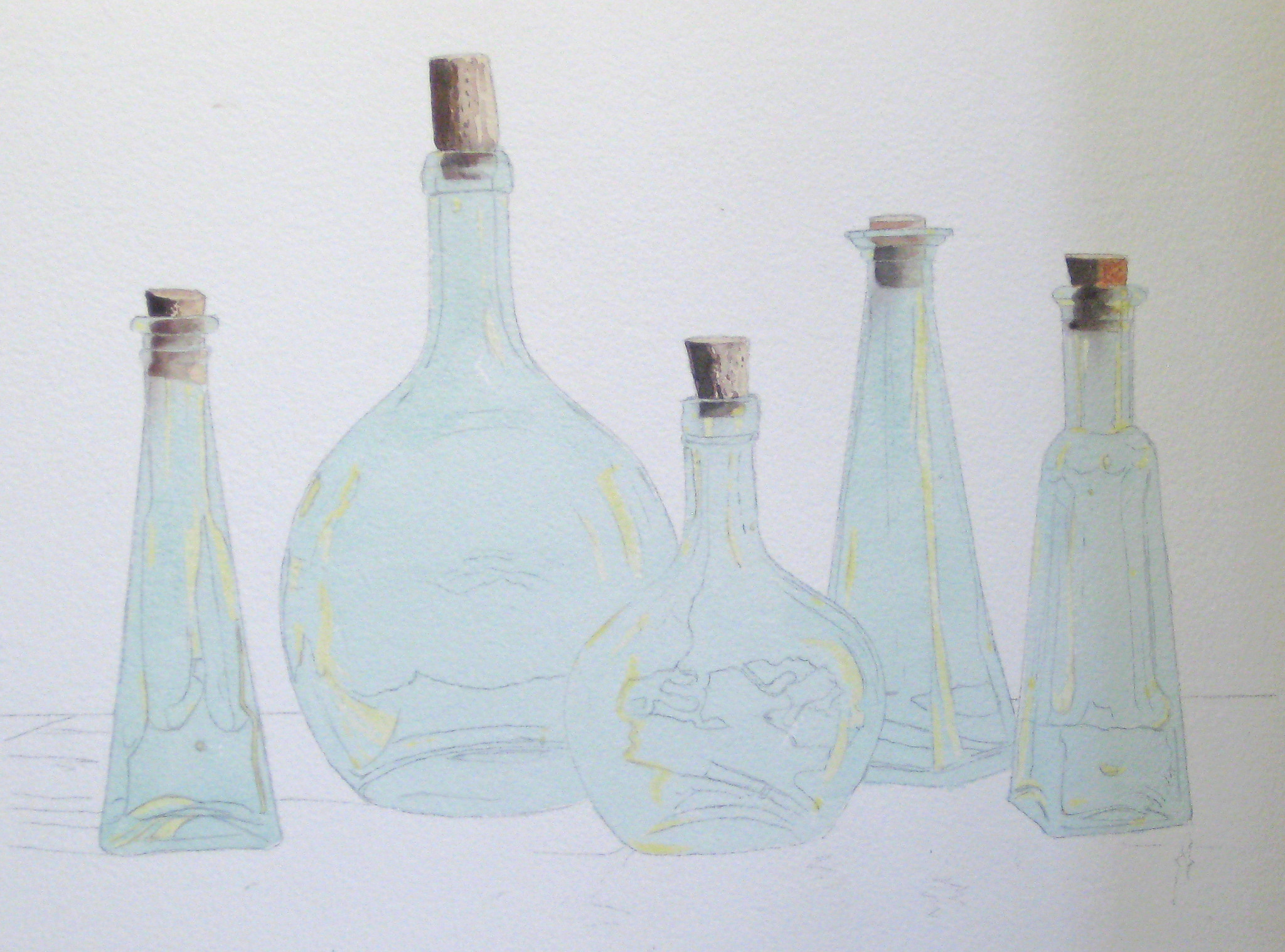
Four down and one to go! My own preference is to do one bottle at a time rather than throw colour around on all the bottles at once. This gives me the chance to learn as I go and I can build on my accumulated experience on what works for me.
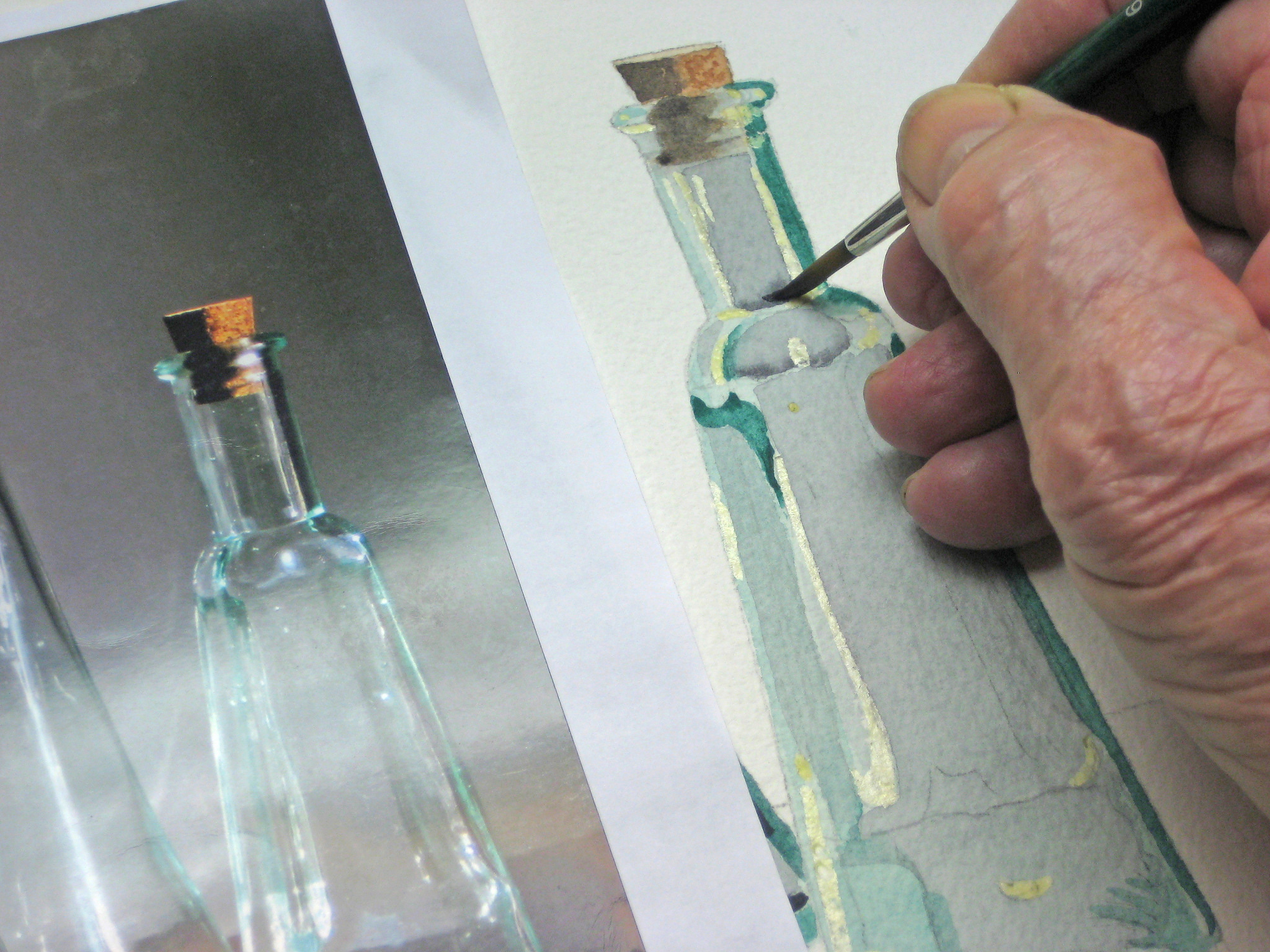
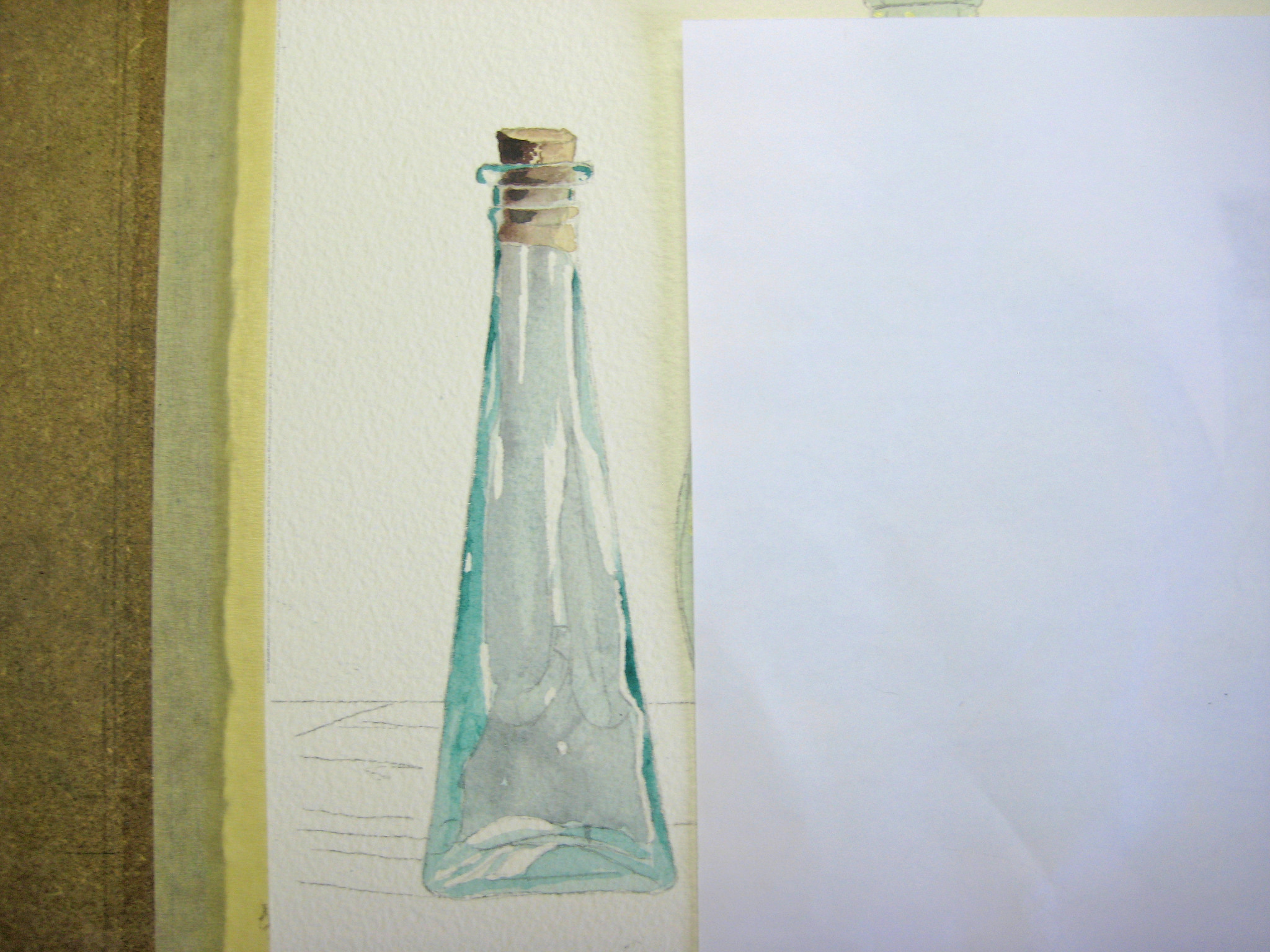
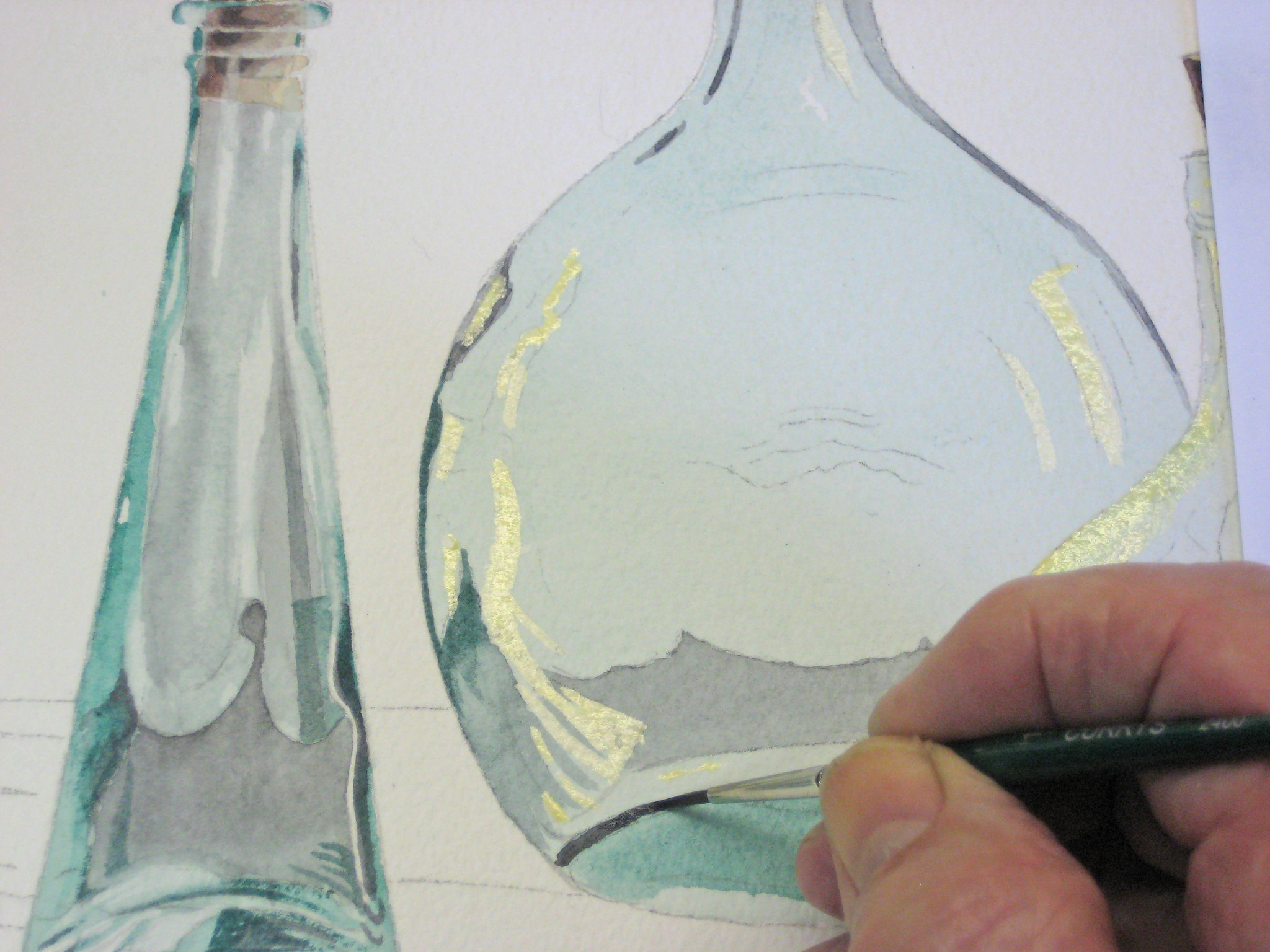
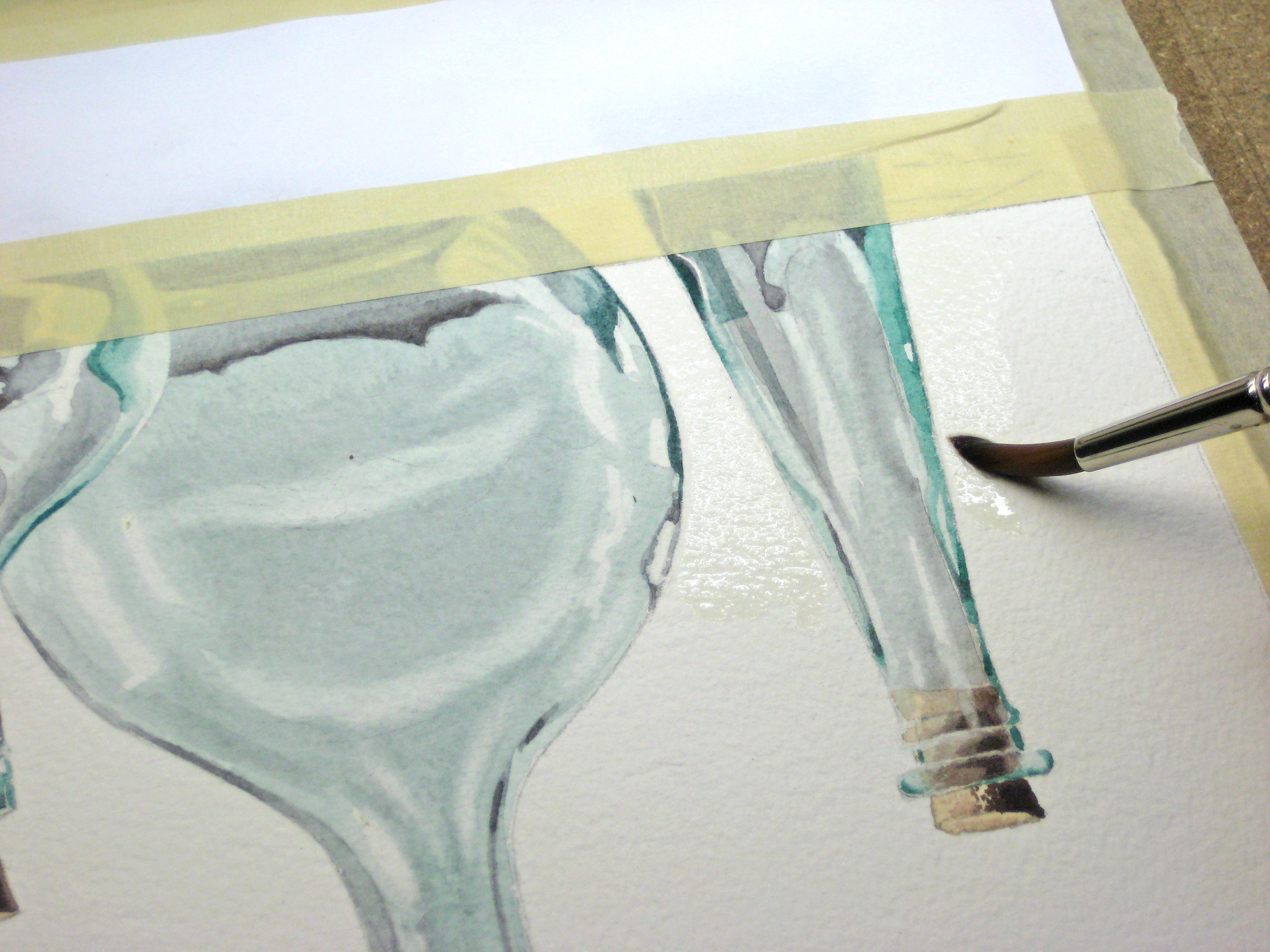
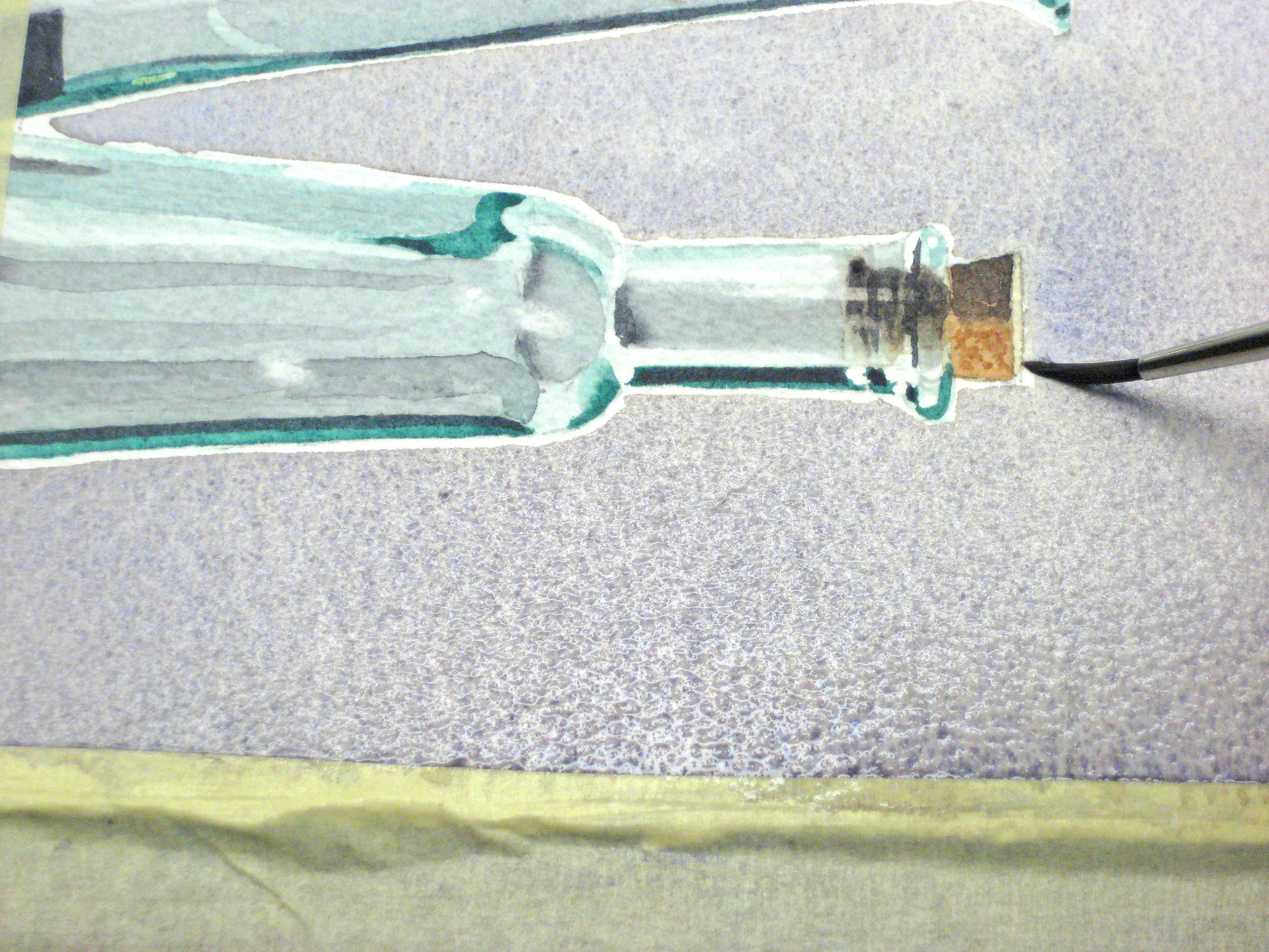
This extreme close-up shows how I drop some dark colour into an almost dry area to give some extra sparkle to any areas I think might benefit. You don’t have to follow your photographic reference image exactly and you can add little touches you think might enhance this illusion of glass and reflections. I have yet to removed the liquid masking on this bottle and soften those hard white edges.
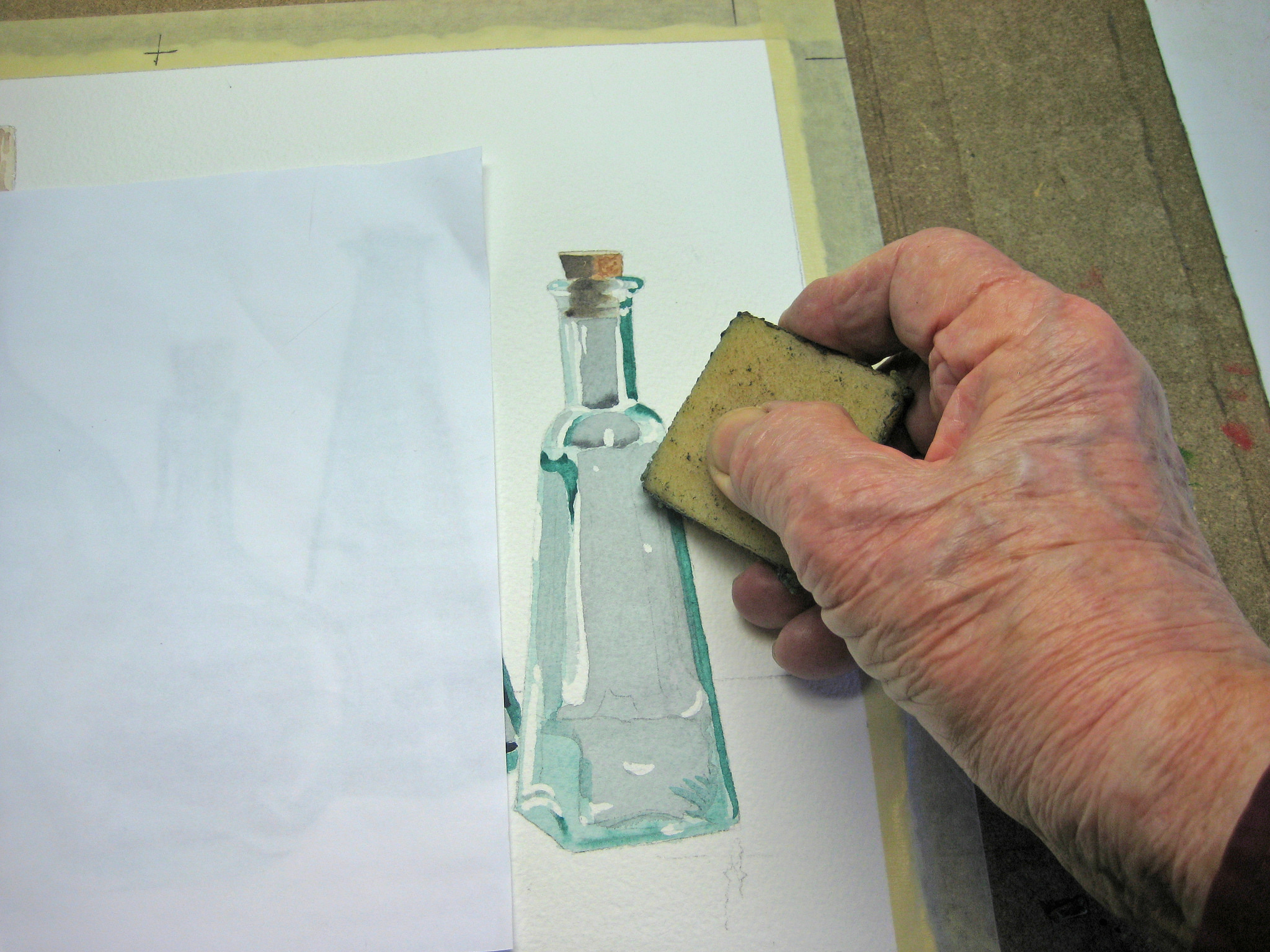
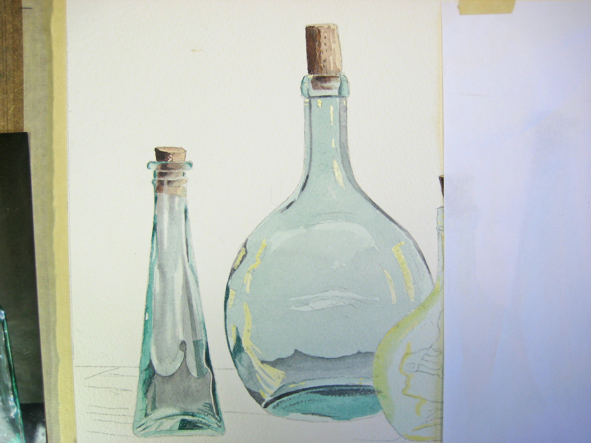
Now I’m removing the liquid masking with special eraser, but you can use rolled up masking tape or your fingers if you wish. Treat this gently as you may damage you paper surface.
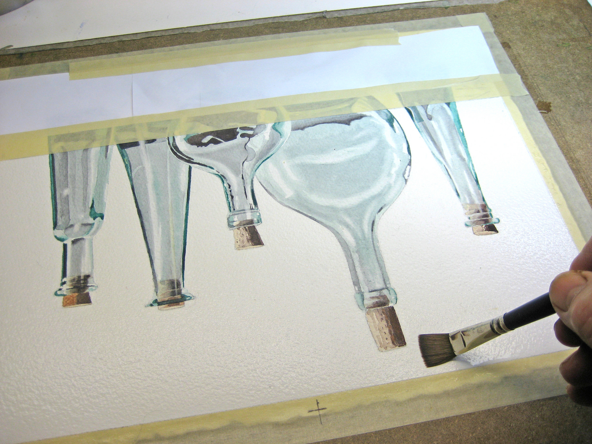
All done. i’ve softened some of this hard white edges and tinkered around a bit to make this look shiny. Now it’s time for the background washes to complete this illusion.
Doing a background wash of this complexity is always a high-wire act with no net, so my advice is to switch off your iPhone, get rid of the dog, lock the front door and threatens the kids with dire consequences if they disturb you for the next twenty minutes. Avoid alcohol although you might be sorely tempted! You might find holding your breath works too, but ultimately you have to plunge in and get on with it. Photographing this procedure is difficult as you have to suspend operations to take images and while you’re doing that vital areas are drying faster than you realize. You need a study hand and nerves of steel!
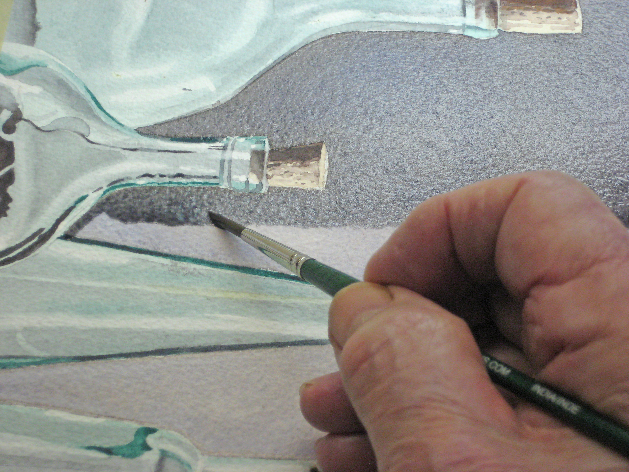
I start off by masking off the lower portion of my painting just to keep it clean and speed things up. Then I apply a wash of pure water all over and right up to about 1/16″ around each object. I’m using a No.10 and 1/2″ square brushes. Remember, colour follows water so if you get careless your colour will naturally follow the water and mess up your carefully painted bottles. If you’ve never tried this I urge you to practise first on scrap paper.
Here I’m finishing up with my 1/2″ brush and being very careful not to splash the dry areas. You will have to keep go back in with a fully loaded brush to keep this fiddly areas around the bottles nice and moist. I couldn’t photograph this as I didn’t have time.
This extreme close-up shows how you paint up to the very edge of your bottles. If you try painting up to those edges with colour you risk hard edges in this project. A smaller painting with fewer complex objects might allow you to paint up to the edges and looser style means it may not even matter.
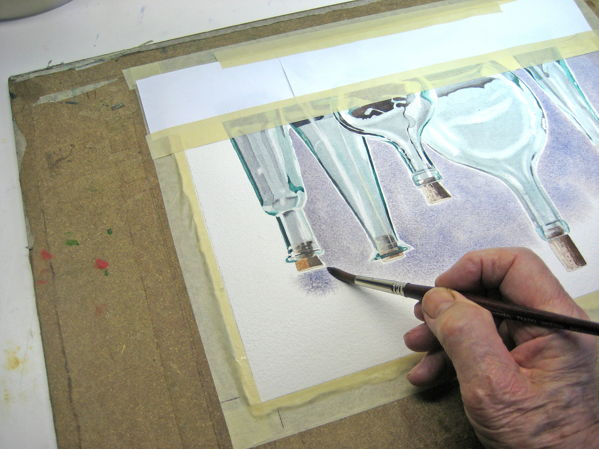
Another extreme close-up showing how I push the colour up against the bottle. This needs a steady hand as you have to reach across wet paint to do this. Don’t worry if this first coat looks a little grainy and uneven, the second coat will cover a lot of sins.
A bit blotchy where I stopped to take photographs for you, but once this is dry the remaining coats will go on much easier and we can paint right up to the ages from now on.
I use a smaller round brush to paint in my second coat, keeping the leading edge was wet as possible, then I switch to a bigger, flat brush, for the rest.
The result up to now, and I’ve gone in and cleaned up some ragged edges before tackling the foreground.
I start putting in the foreground with a wet-on-dry wash of Burnt Sienna, Brown Madder and a touch of grey. I made a mistake by not noticing some area of green are reflected in the foreground but I will lift them out later. I have used liquid masking in the appropriate places. While still damp I added a few extra areas of darker shadow colour.
Before lifting the liquid masking off I work in some more highlights and shadows
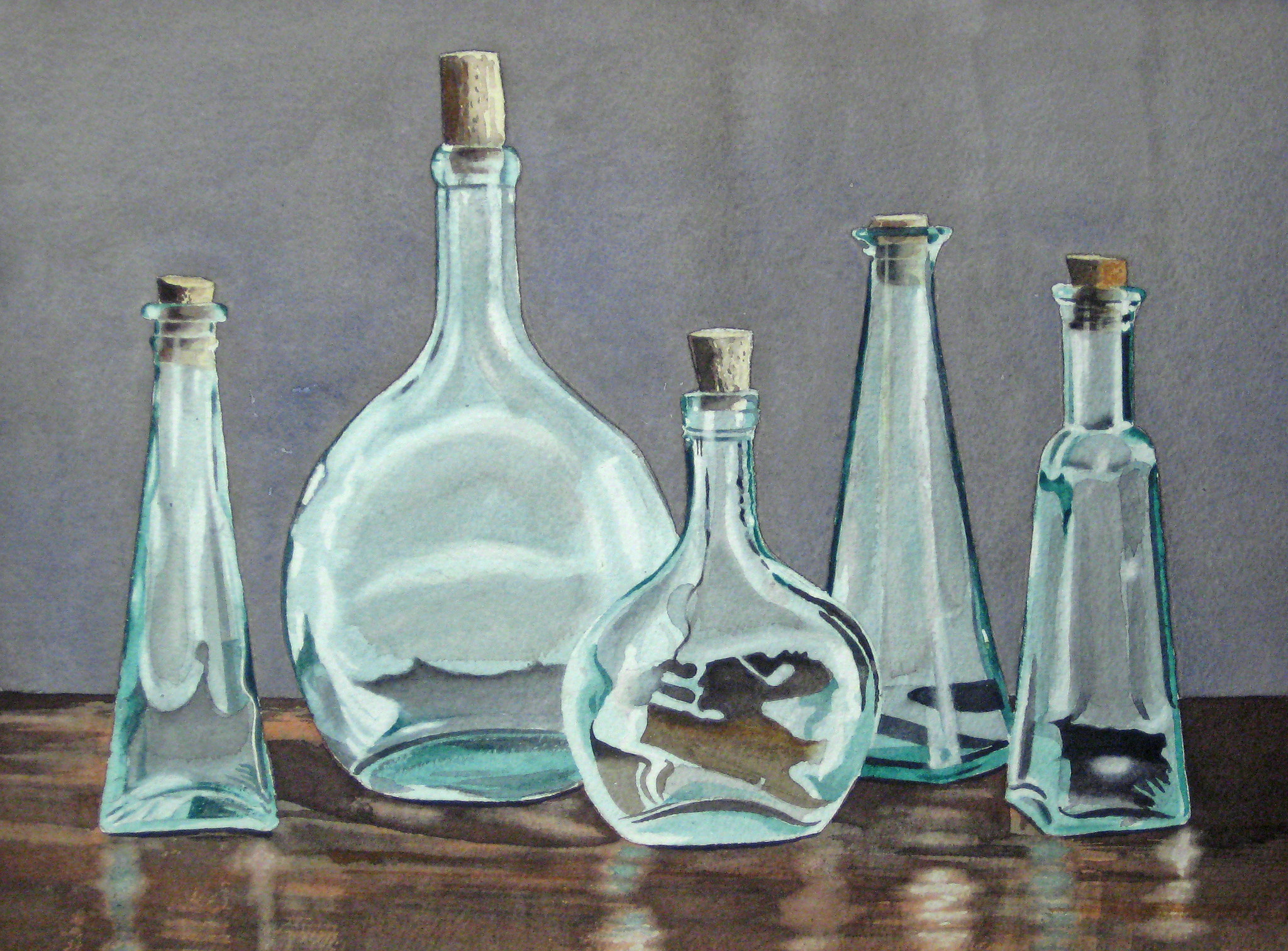
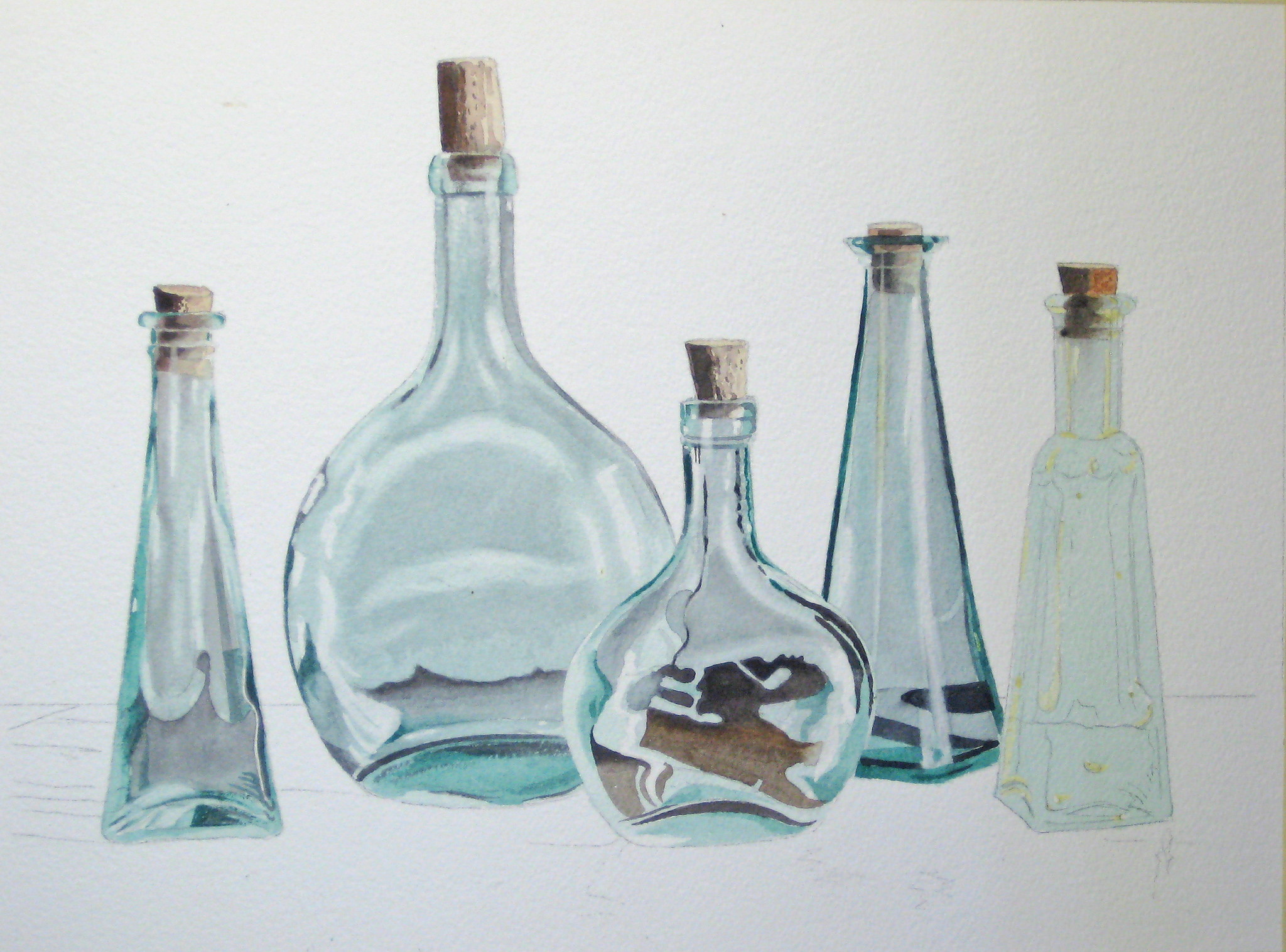
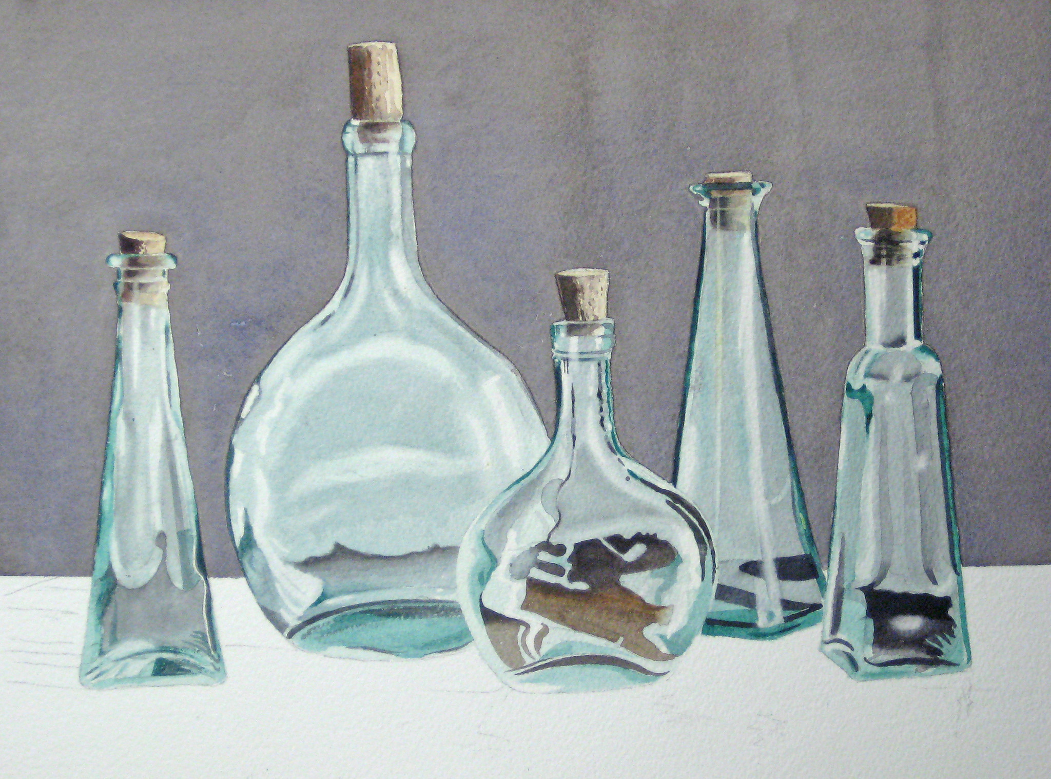
Here is my completed project. I’ve softened those hard edges into muted refections and added the green areas. I also added some extra shadow areas to the glass bottles in places as the overall effect made them too light I thought. The final touch was those dark shadows along the bottom edges of the bottles to anchor them down.
About John Fisher
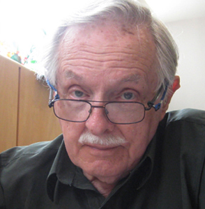
I was born and educated in England, graduating from the Luton School of Arts (now Barnfield College) in 1945. It was my hope to become a graphic artist, but at the end of the Second World War returning service men and women had first crack at the few jobs available, and rightly so. I took a number of jobs while I tried to break into my chosen field, and ended up being a reluctant carpenter. Many years passed and I emigrated to Canada in 1952, married a Canadian woman, started a family, and in 1955 finally started on a career which took in graphic arts, owner of my own graphics arts company, art director at an advertising agency, and careers in marketing, advertising and public relations.
I wish I could claim that my passion for art burned brightly throughout those years, but alas, the need to make a living took prominence. As with many people, I always promised myself that when I retired I would get back to painting again. That time came in 1989, when my wife and I were living the winter months in our condo in Destin, Florida. Robert Long, a talented watercolour artist, was offering private lessons from his nearby condo. He was my mentor, and made my retirement years infinitely richer.
In those days Robert taught only technique, and there were rarely more than four to six of us in those early classes. From Robert I regained my interest in photography as an adjunct to painting, and as the cliche goes – I never looked back. I have had many paintings accepted and hung in exhibitions in Florida and Ontario, where I now live. I’ve won some prizes, come first in some exhibitions, and occasionally won the Citizens’ Choice awards. But I mainly paint for fun – hence the choice of name for this site.
To learn more about John and to view more of his work, please follow the link below:
John, your watercolor, “bottles” is stunning. I need to get busy!
Sandy Stone
John Fisher, this is exactly what I was looking for.
Wanted to do a watercolor of a message in a bottle washed up on the shoreline, and your instructions are just perfect.
Thanks John.
Jim Fetter jimfetter@live.com
https://www.facebook.com/waterillustrator
thank you! I wanted to do a morandi, but with glass and watercolor. you gave me everything i needed to try!
Thank you for this helpful demo. Off to work on my own still life now. Your photos and detailed description are most welcome
Un grand merci pour ce tuto détaillé que je vais m’appliquer à suivre. ??