About the Artist
Born in 1980 and father of 2 sons, Jean-Claude Grillet bisanti is a Swiss lawyer passionated by impressionism and figurative art.
His passion, strenghten by years of practice, finally led him to acquire some artistic skills. He published an artbook dedicated to his wildlife painting in 2013
http://www.blurb.com/books/4324114-wildscape-a-painterly-journey-collector-edition
Jean-Claude’s Websites:
http://www.swisswildlifeartist.com/
Pastel Demonstration
Click Images for Larger Views
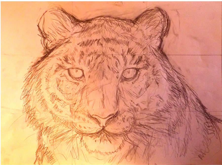
1) Everything starts with just a simple sketch done with a 2B pencil on paper. I use as many references as possible notably regarding the anatomy.
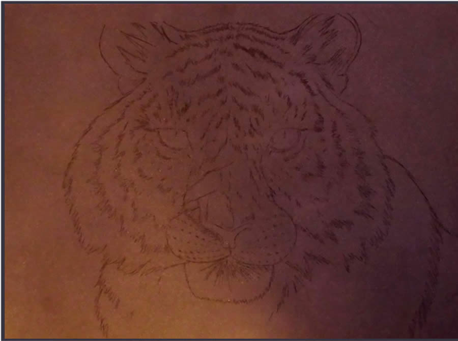
2) I transfered the sketch on pastel card. This material is quite expensive, but it accepts more layers than velours paper.
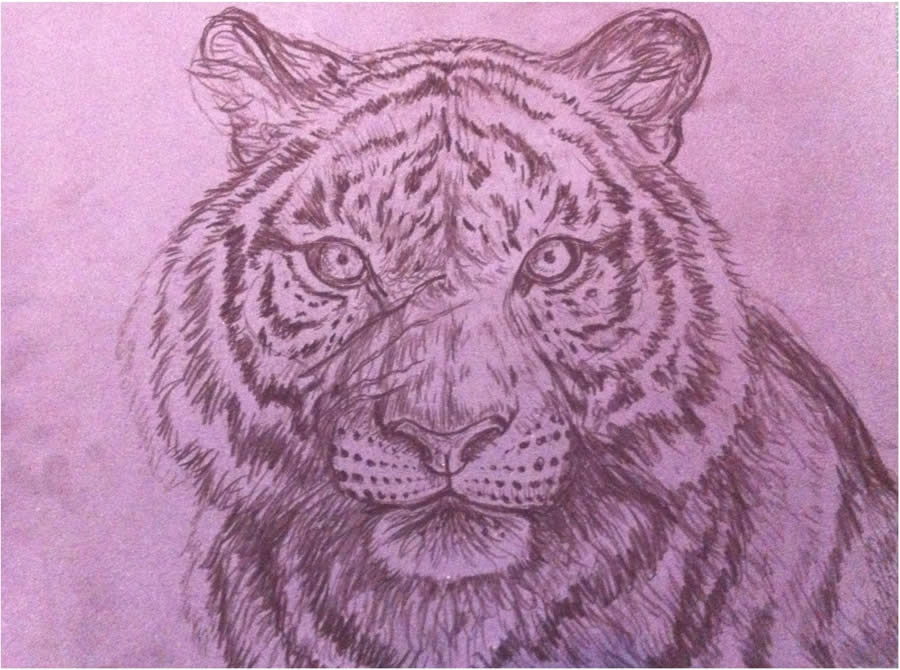
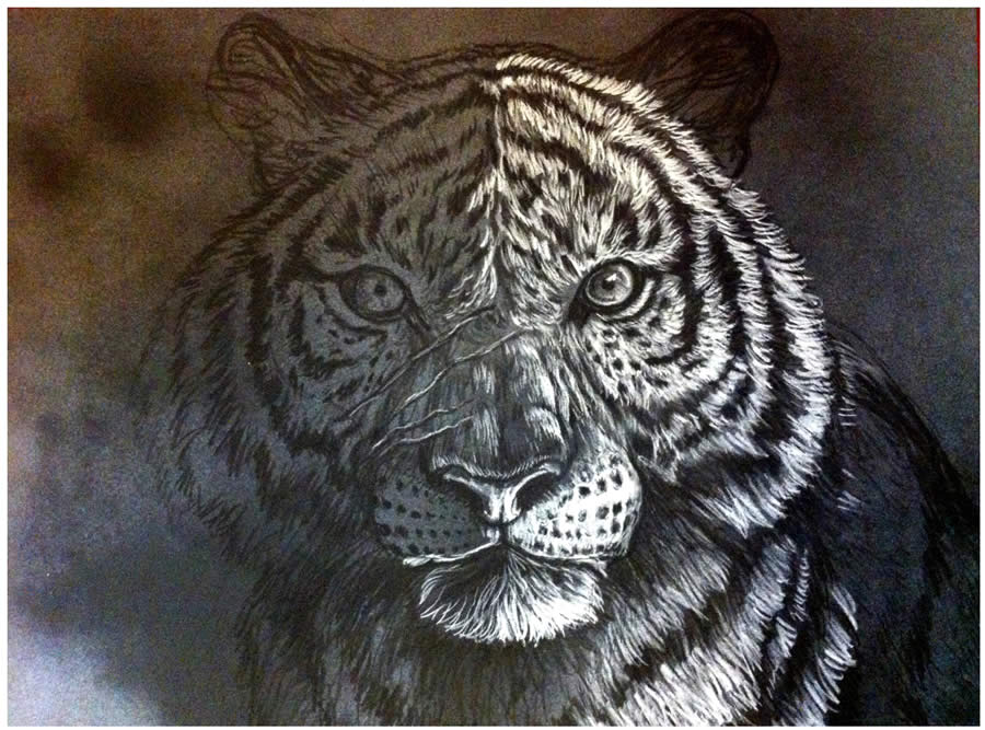
3) Using sharpened black pastels, I carefully render most of the details of the painting. For steps 3 and 4, I use a very strong light to take the pictures as it is the only way to show you the rendering of the black lines on the dark grey pastel card.
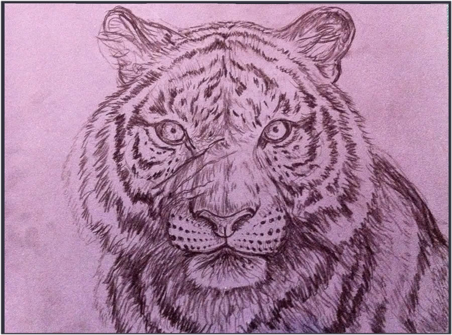
4) Then with the same black pastels I again render the details of the painting so that it will create an interesting underlying texture. I fix the whole painting with a pstel fixative.
5) I switch to an almost white pastel that I sharpened and work slowly to create the texture of the fur on the whole body. This step is almost like working on scratch board.
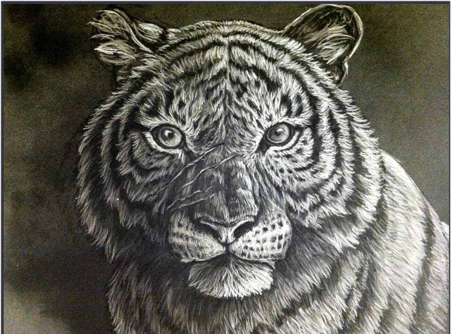
6) Choosing a mid grey value I do the same on the darker side of the face. I have 4 values – white, black, grey and the paper color. But by playing with the pressure, I already have dozens of colors.
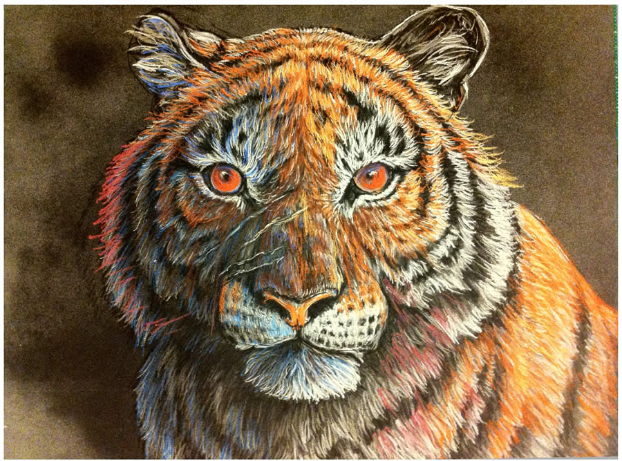
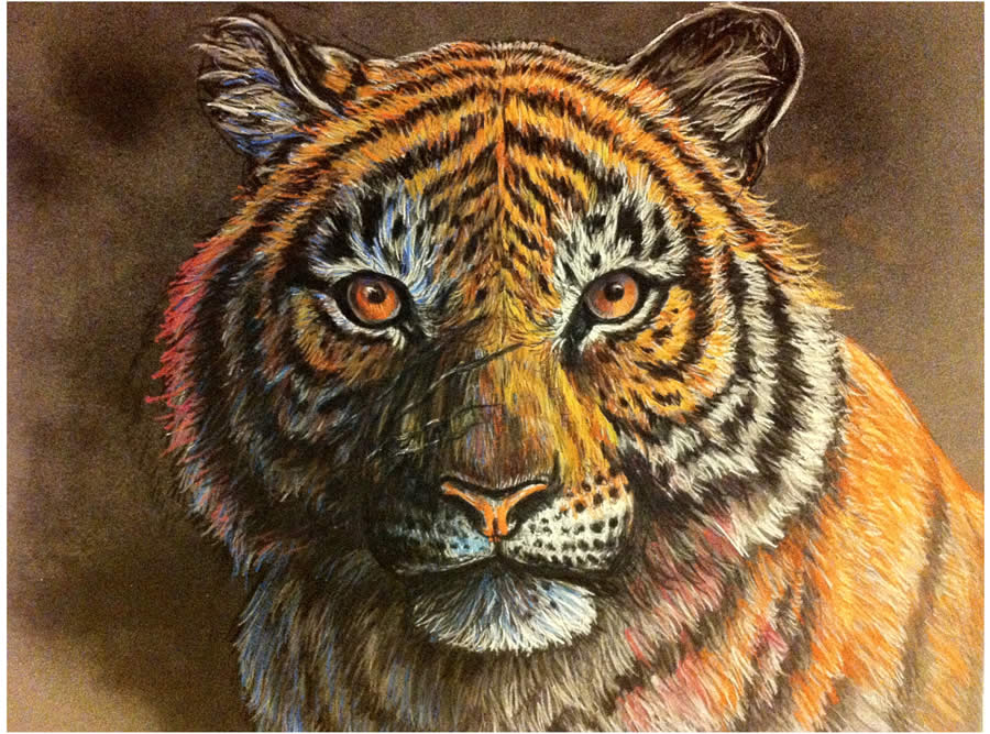
7) This step is done very quickly (30 min), with the side of an ochre pastel. I use very little pressure and apply a small amount of color without changing the details that much.
8) This technique is similar to glazing with oil paints where transparent colors are used. Here you can see the results after applying 3 layers of color.
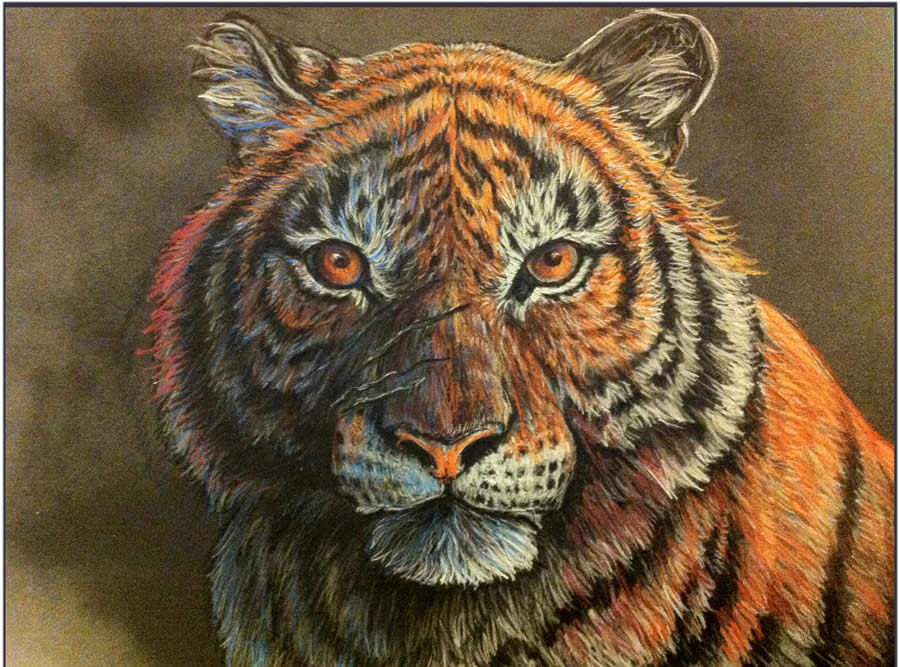
9) Here I reworked the shadows and the black stripes. At this stage it is important that you do not apply any more fixative as the fixative can affect the colors in an adverse way.
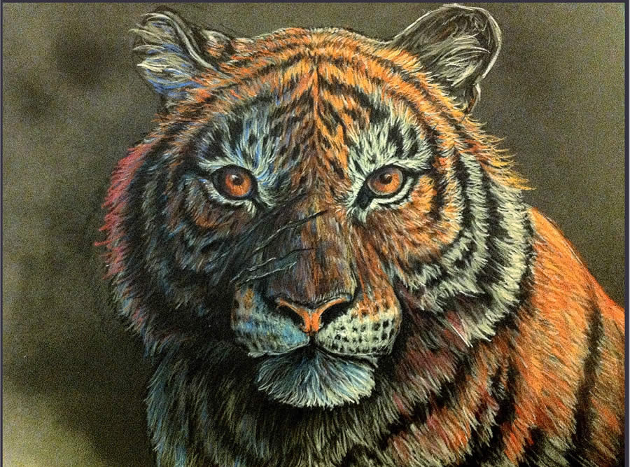
10) I then work on the edges to improve the contrast leaving some of the edges soft in order to create more depth. For example: the grey blue fur on the lower left of the picture.
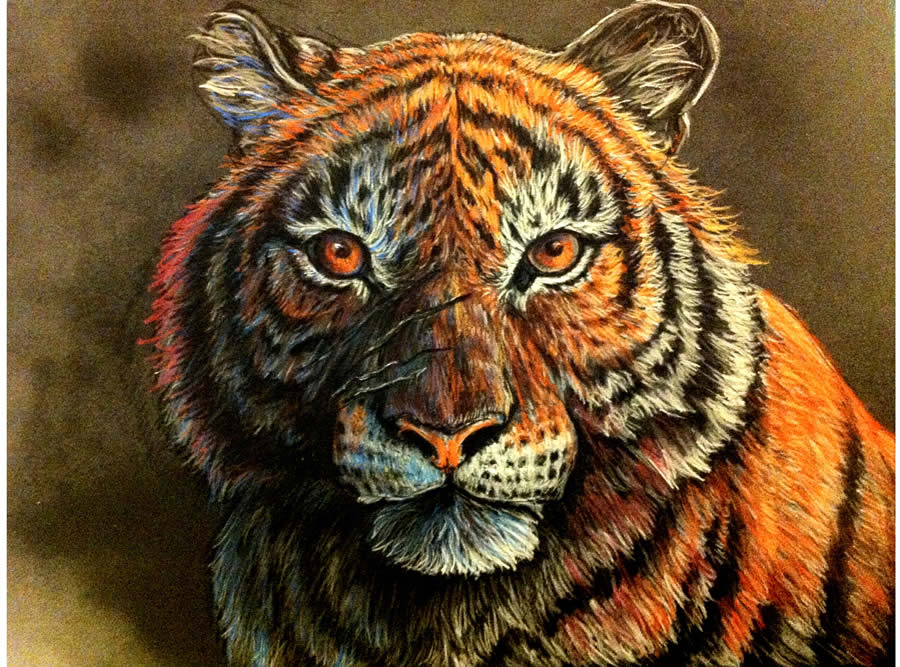
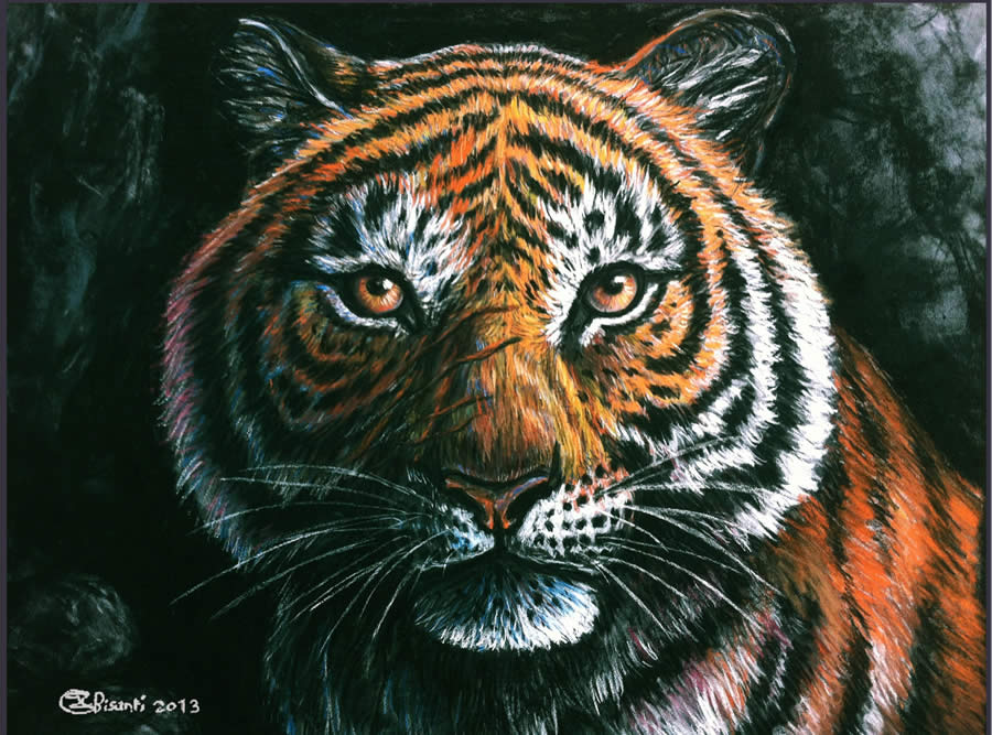
11) I added two more layers to the picture to add more textures and contrast to the fur.
12) I started to work on the background to suggest that the tiger is sitting in front of his cavern. I avoid adding too much detail to the background so that it doesn’t draw the viewers eye away from the center of interest, the tiger.
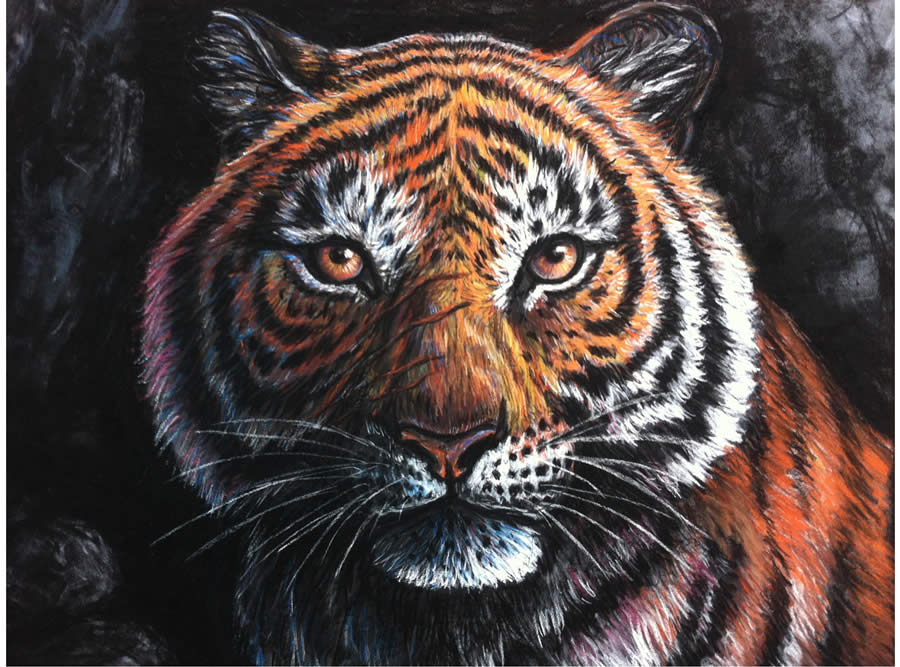
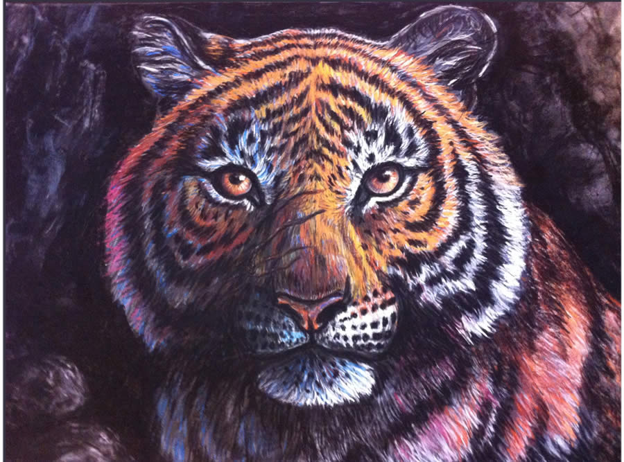
13) The rocks were too sharp, so I reduced their contrast. I also reworked the fur in order to better blend the tiger with its environment.
14) Finally , I increased the contrasts again and reworked the light direction to give the impression that the light is coming from the above right of the painting.
wow, this is absolutely lovely. As an Artist on oil colour,i appreciate this pastel work. Nice one
Once I laid my eyes onto this drawing, i couldn’t look away. This piece truly inspires me to draw, create and design anything possible. Great work, inspiring. c: