About Veronica
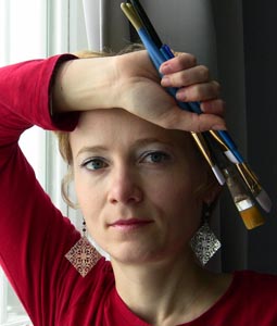
Native of Russia, Veronica Winters was born in 1976 in Smolensk Region. She has spent her childhood living in Zelenograd, a suburb of Moscow known for its electronic industry. Veronica always thought of herself as an artist but with the collapse of the Soviet Union she pursued a different career and received her Bachelor’s degree in Business Administration from Zelenograd Business College, a joint venture of the Moscow Institute of Electronic Engineering and the University of Tulsa. In 1995-1996 she was awarded a full-ride scholarship and studied at the University of Tulsa for two semesters.
Veronica and her husband immigrated to the United States in 1997. Only in the United States Veronica could fully explore her artistic abilities and started taking courses first at the Tulsa Community College and then in 2003 completing her Bachelor’s of Fine Art degree at the Oklahoma State University. From the very beginning colored pencil was Veronica’s medium of choice and she has shown formidable skill. Her colored pencil works has always displayed astonishing detail and vivid colors.
In 2005 Veronica completed her M.F.A. degree in painting at the Pennsylvania State University. Veronica also took figurative art classes at the Art Students League of New York and the Grand Central Academy of Art in New York City in 2008-2012. Today Veronica paints in her studio as well as teaches art. Veronica currently teaches at the Art Alliance of Central PA and the Galaxy, art-in-education program in Pennsylvania. She always welcomes new students to study painting and drawing in her studio.
The artist has received numerous awards and magazine publications (including Artists & Illustrators, American Art Collector, and Leisure Painter UK art magazines) and commissions and her works can be found in private collections in the U.S.A. and Europe.
Veronica is represented by the Green Drake Gallery (Millheim,PA), KR Designs Gallery (Fort Myers, Florida), and Fleyta Art Salon (Zelenograd, Moscow, Russia).
Visit the artist’s page on FB: www.facebook.com/veronicasart , watch videos on YouTube:www.youtube.com/veronicasart , and read her blog at: www.veronicawintersart.blogspot.com .
Still life with Pumpkin and American Flag: Step-by-Step Demonstration
Materials and Colors
- Prismacolor Premier Colored Pencils (not verithin, other brands that are either wax based or oil based are OK).
- Drawing paper like Strathmore brand with slight or no texture at all
- Turpenoid or Mineral spirits / Gamsol with a small brush
- 2H graphite pencil (hard)
- Pencil sharpener (general’s or other German brand)
- Kneaded eraser.
Photo
This is the picture for this demo. On the right side you see a black-and-white version of it. The grayscale picture illustrates the right tones (values) to shade in color. Most of the time students’ drawings lack contrast and a nice range of tones (values) because we get destructed by color.
Tone means shading from white (light) to black (dark) in successive gradations.

STEP 1: Develop a line drawing
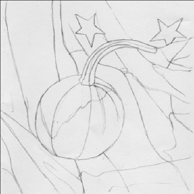
- Pick a rather small smooth piece of paper. (Colored pencil drawing is a very time-consuming process). I recommend 5×7″.
- Spend enough time to make the best outline possible. Work in very light strokes with your graphite pencil. (You can also copy and enlarge my outline drawing via Photoshop or Xerox).
- Tap the outlines with your kneaded eraser to clean up the page and to make the outlines as thin as possible.
- Draw the pumpkin first and then add stripes in the background.
STEP 2: Separate between lights and darks (underpainting)
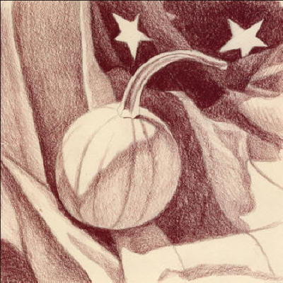
- Take “Tuscan red” and start drawing from the shadows. That means that you shade all the darks in the picture in one color only. Work on the pumpkin first and then shade the background with various pencil pressure. Notice, even white stripes have color in the shadows (purplish-red). Use various pencil pressure and sharp point of your pencil to create variations in tones. After the under painting is complete, stand back and look at it from the distance to see if you have enough contrast in your drawing. Ideally, the underpainting should look as close as possible to your grayscale picture.
- Your highlights (purest lights) must stay free of any color!
STEP 3: Lay cool darks

- Let’s color. Take “indigo blue” and shade blue stripes in the background. Apply the same color under the pumpkin.
STEP 4: Lay warm reds

- Take “Poppy red” and shade the stripes in the background. Bring the same color into the shadowy part of the pumpkin. Keep your pencil sharp not to lose clarity while shading. The harder you press on your pencil, the darker and richer your color would be.
STEP 5: Add color variety (apply middle tones)
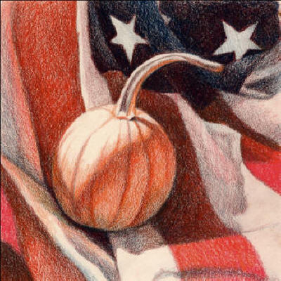
- Apply “Carmine red” into the rest of the red stripes. It’s a cooler version of red that gives a nice contrast to warm “Poppy red.”
- When you draw always overlap colors slightly. It creates nice fluidity of color as opposed to making broken “strips” of colors.
- Take “Orange” and shade the pumpkin, leaving its lightest area free of any color. Throw the same color around the object onto the flag. It creates not only unity in color but also adds variety to your still life.
STEP 6: Blend, layer the lights
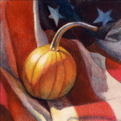
- Apply “Canary yellow” and “Yellow ochre” into the light side of the pumpkin. (Other yellows may be substituted for these colors). Leave the purest highlight free of any color. Shade around it with your lightest yellow. Crosshatch colors.
- Shade the “tale” of the pumpkin with “Peacock blue.” You can add the same color mixed with “lilac” into the stars and white stripes of the flag with a light touch.
- Take your small brush and paint carefully with turpenoid/gamsol over your drawing. Let it dry completely. Be careful not to drag your darkest colors into the light! Turpentoid dissolves wax in pencils and gives this “painterly” look to your drawing.
STEP 7: Increase color saturation

- Adjust values and colors by crosshatching the same hues over previous layers. Colors will layer much smoother this time.
- Take “white” or “French grey 20%” to apply over white stripes in the shadow. Highlights stay free of any color!
Thank you for sharing this with us, it’s inspirational! That last step, to increase the colour saturation with cross hatching is the icing on the cake and really does intensify the colours. I’ll have to try this in my next project.
Once again, many thanks for taking the time to share your knowledge in this was, it’s greatly appreciated
Ian
Beautiful job. Thank you for sharing some of your ‘trade secrets’. This kind of valuable information is hard to find for beginners and fans of colored pencil drawing. Much appreciated!
nicely DONEI can’t wait to try!
Hi, I showed your work for my primary schoolers and they loved it! they wanted me to tell you how much they learnt from it and appreciate it!