Artist Bio
After moving to the US as a teenager, Jane Hunt studied illustration at the Cleveland Institute of Art. She continued her art education by experiencing art communities in France, England, Indonesia and China while studying various painting techniques. The award-winning painter now resides in Colorado, where she continues to be awed and inspired by the natural beauty surrounding her. Drawn to the sweeping landscapes of the west, Hunt works primarily in oils, often creating smaller pieces en plein air. Jane Hunt’s work is represented by galleries in the US, as well as her native England.
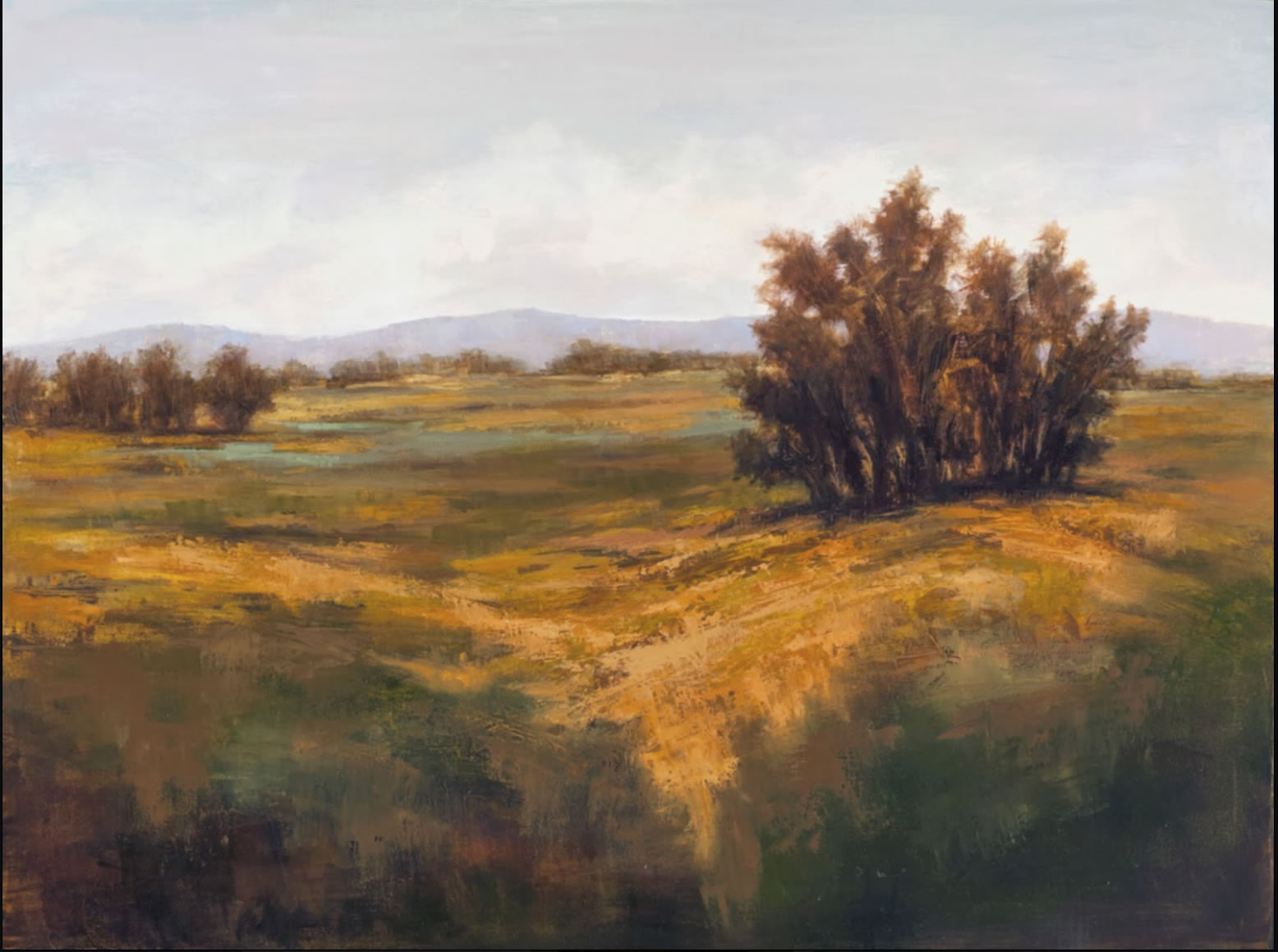
“Autumn Field” – Oil Painting Demo
Click Images for Larger Views
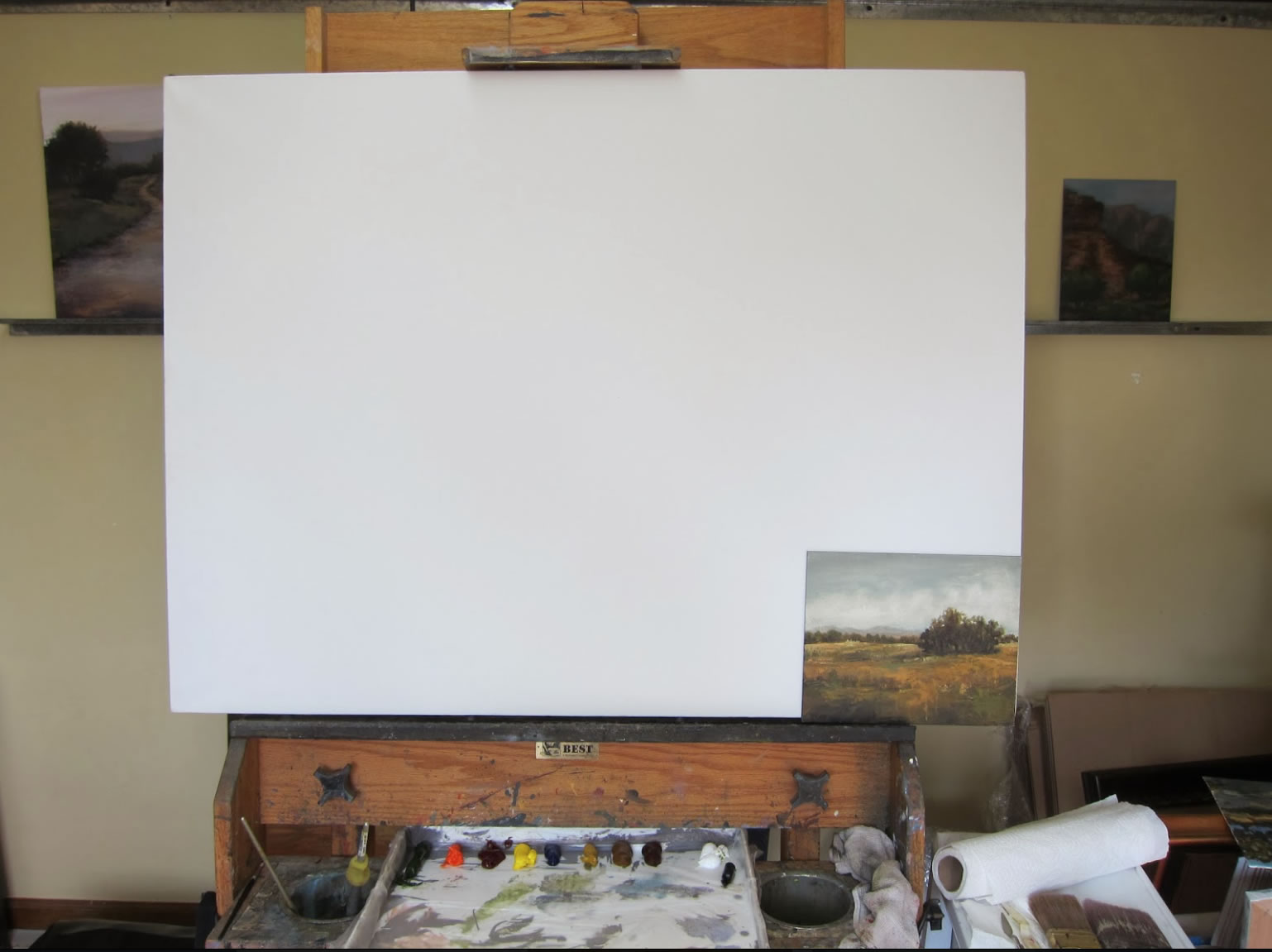
Step 1 – I gather reference materials – in this case I’m using my plein air study and a few photos I’ve taken. I plan on painting large – 30” x 40” but I hope to keep some of the liveliness and spontaneity that I like in the 8″ x 10″ study. I also lay out my paints – twice as many as I use outside. I never use black on my palette, I often use a mix of verdian green and alizarin crimson to create more colorful darks. By the way – I strongly
recommend using a glass palette, but this was taken days after I broke mine
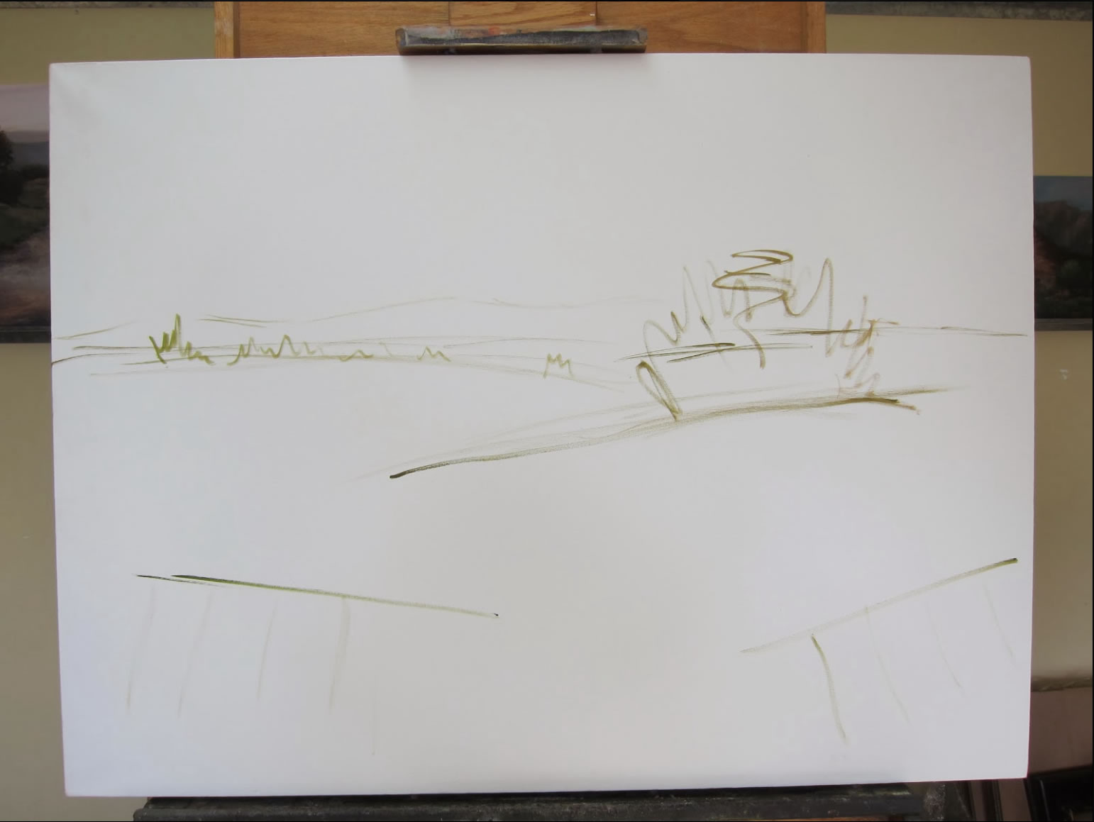
Step 2 – I sketch in the general layout of the scene using thinned out oil paint. There’s no need for a ton of detail, I just suggest placement and lines to remind myself how I wanted the viewer to move through the painting. I make sure the horizon line is not dead center (as that tends to chop a painting into two).I also make sure the focal point is placed correctly (according to the rule of thirds) for the eye to travel around the painting and back to my intended center of attention. In this piece my focal point will be the clump of trees in the mid-ground.
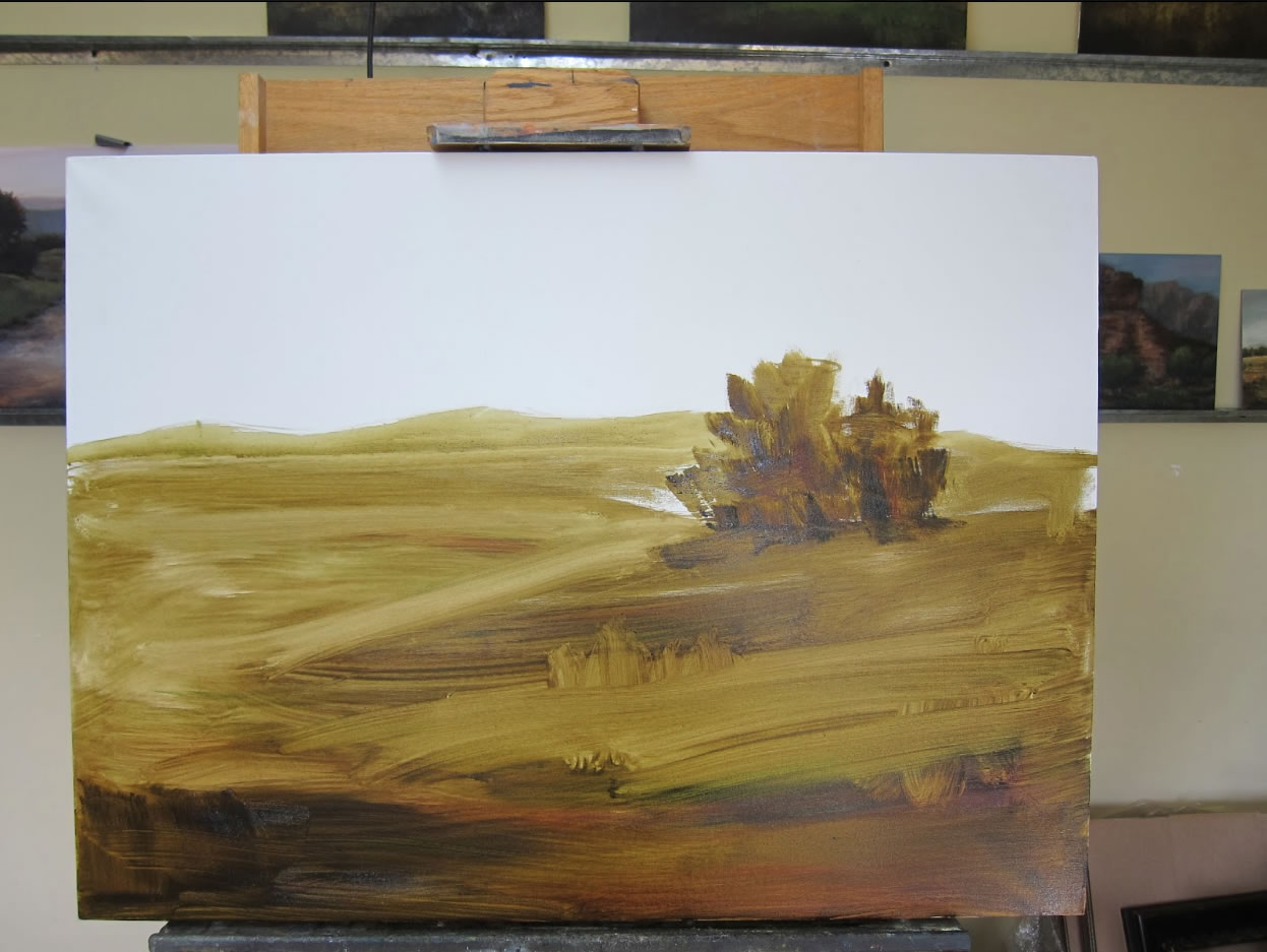
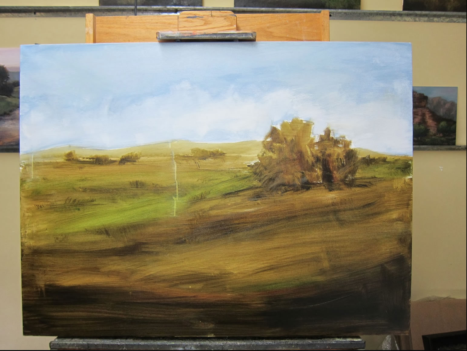
Step 3 – Using a large brush I block in the general values of the scene. I usually recommend putting in your darkest dark (and lightest light, but we already have that in the sky). I didn’t do that here – breaking my own rules!
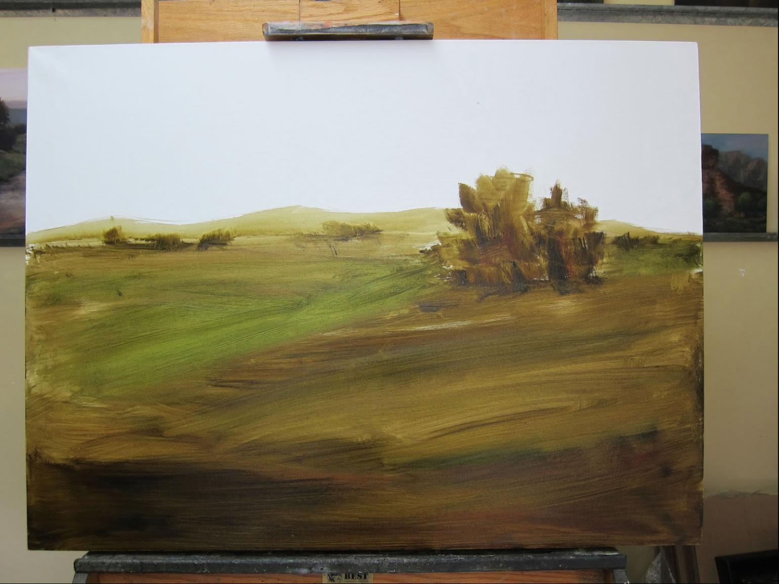
Step 4 – I add in various values of green to compliment the warm color scheme I have planned. Using an underpainting of a complimentary color (opposite on the color spectrum) often adds more vibrancy to the finished piece. Now I also start adding in some distant trees. Repeating objects in the distance that are smaller, less detailed and lighter versions of the fore or midground is a great tool for helping create atmospheric perspective.
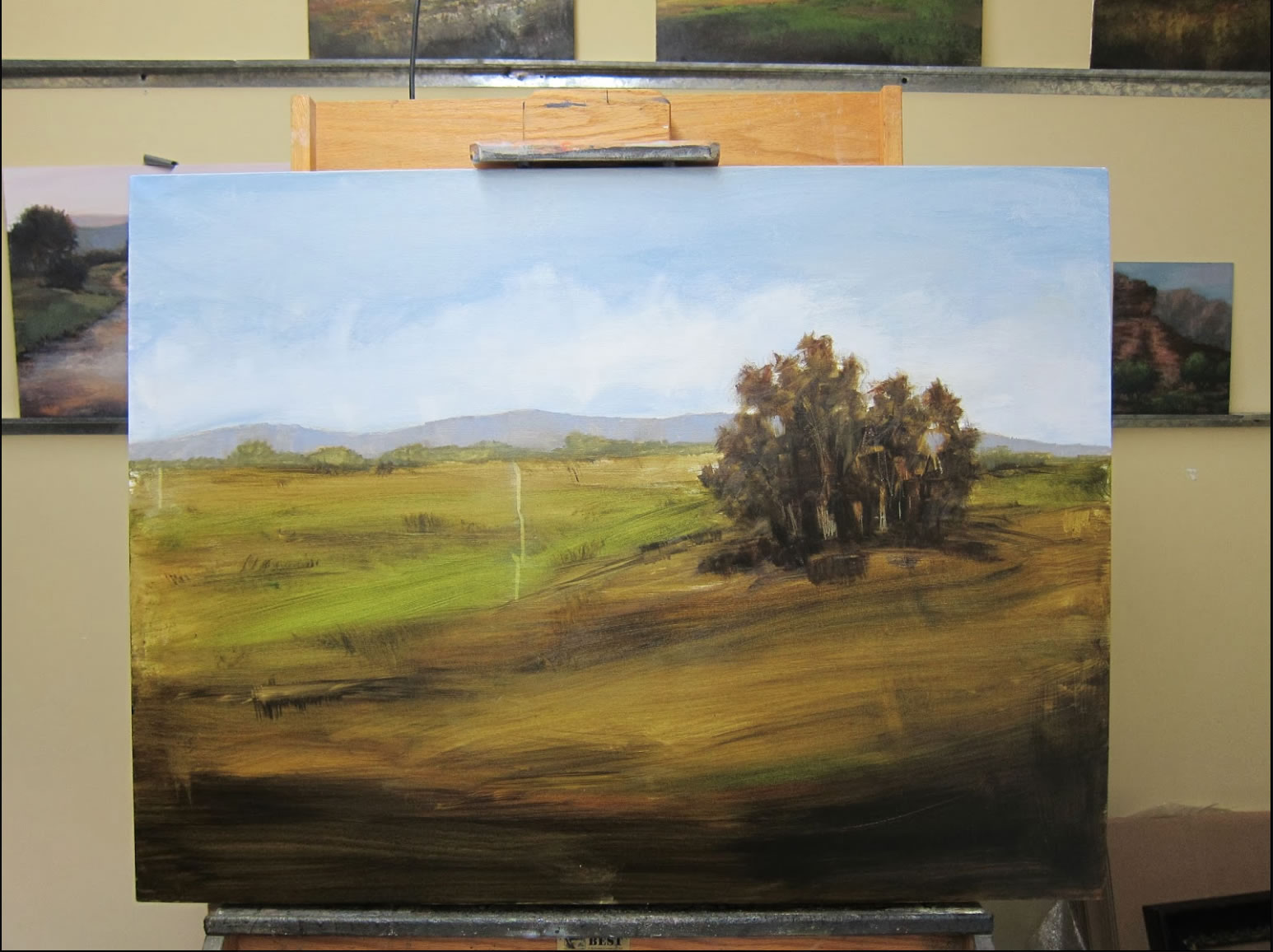
Step 5 – Next, I paint in the sky. I keep it fairly neutral as I want the main focus to be the field and trees rather than the sky. I do, however, suggest some gentle movement in the sky by using clouds. Here, the low clouds help to ‘anchor’ the sky to the rest of the painting.
Step 6 – I add color to the mountains and fill out the grouping of trees. I also make a lot of mental decisions about how I want the field to look when finished.
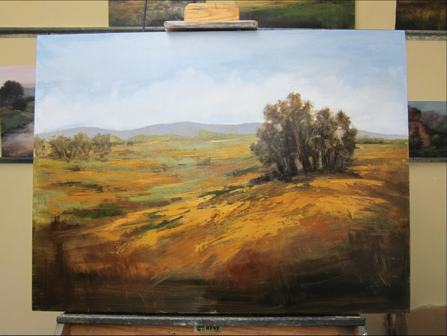
Step 7 – I start to add in layers of color to the field. I make sure the colors are lighter, cooler, and the shapes simpler as they recede further back. I also add details to the background trees.
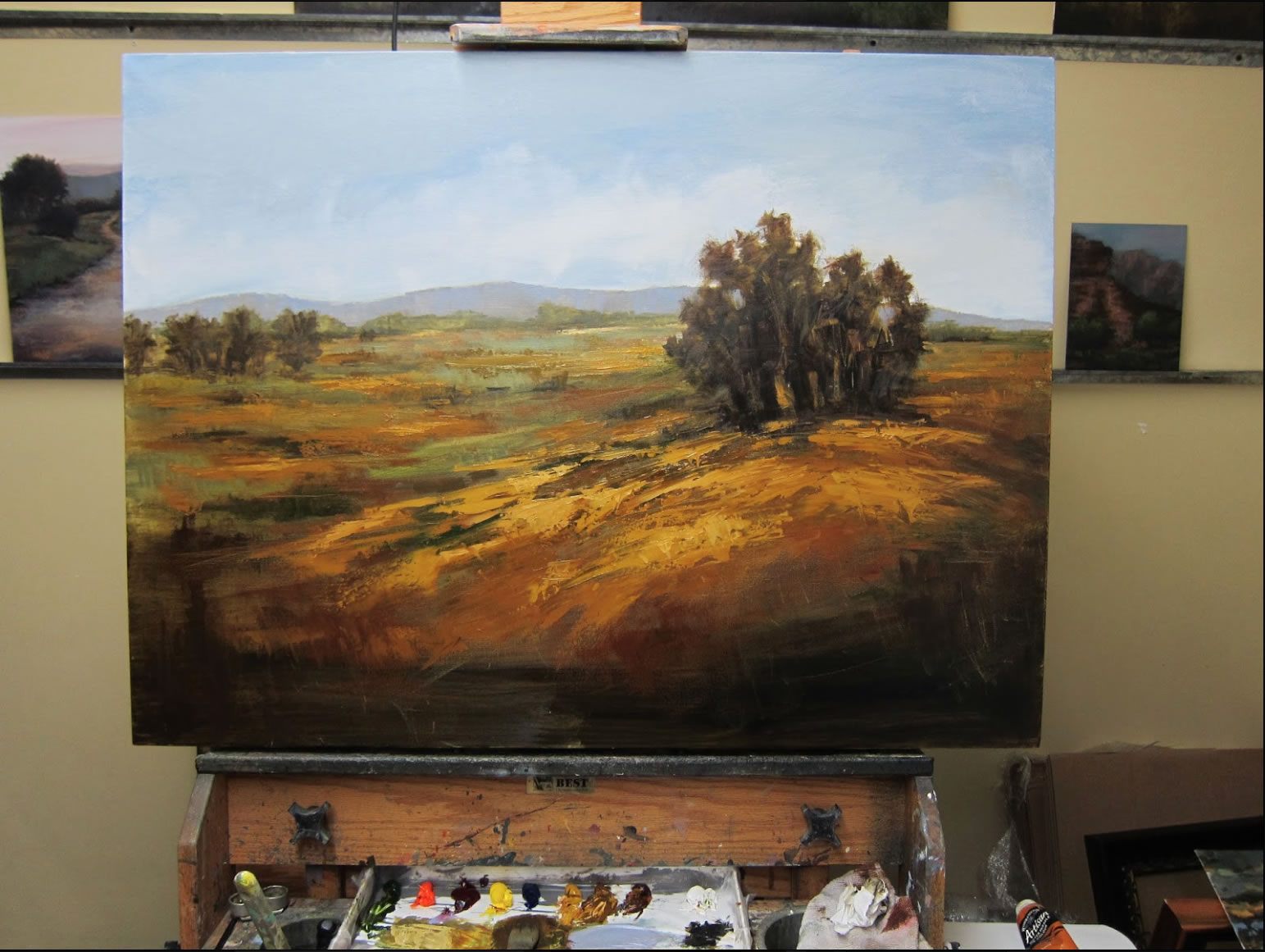
Step 8 – I basically scuffle with the painting at this point – adding and subtracting detail, slashing and scraping for texture until I get the desired effect! I decide at this point I need to add in additional directions of line to draw the viewer’s eye into the painting, then to the focal trees and around the painting.
Step 9 – Finished piece!
If you enjoyed this demo please ‘follow’ my blog and ‘like’ me on Facebook!!
coin nas?l al?n?r sorusunun cevab? burada.