Artist Statement
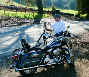
“I paint the places I love to be. I paint the freshness of eternal nature, icy lucid streams, thunderous waterfalls, and soaring granite crests over silent lakes. I paint the descriptions of John Muir, the echoes of Ansel Adams, the American West of Albert Bierstadt and Thomas Moran. I paint luminosity filtering through the landscape, reaching to the foundation of a stream, bouncing off rocks, and illuminating the shadows.
Using oil and acrylic, painting realistically is merely my means to an end. I want the viewer to connect with the places I love to be. I hope the observer will want to walk right into my painting and maybe even drop a line in the water to catch a trout.
My published works include both “plein air” and studio paintings, which helps me translate the dynamic experience of the moment and communicate in a more personal way of what I am trying to say..”
– Donald Neff
Follow this link to learn more about Donald and to view more of his work.
Although I don’t advertise the fact, I occasionally do commission work. I generally only accept work which is similar to what I normally paint, so if for some reason the commission agreement falls apart, I can sell the painting to another party.
In this instance, the commission came through one of my galleries, James Harold Gallery in Tahoe City, California. Commission terms were handled by the gallery, so I won’t go into that here. The collectors are a married couple from San Francisco, who had seen my work in the gallery. They liked my work of Lake Tahoe, but were avid Yosemite lovers (the husband is on the board of the Yosemite Fund) and wanted a fall scene of Yosemite Valley.
After sending various images back and forth in emails, plus a number of phone calls, we decided to do a composite of several scenes and colorations. The scene is fairly close to an actual place, but some of the colors and details were borrowed from elsewhere. One of the main concerns of the couple is that the painting complements, at least in color, another painting they have in the same room. The painting shown further below, I eventually learned is by Walter Bailey, a noted muralist and landscape painter of the early 1900’s and is somewhat of a tonalist quality. We also decided on a standard size of 30×40.
Below is a narrative of the development of the project. In some instances, I copied parts of the emails we traded as the process continued. Since the collectors initially worked with James Harold Gallery to arrange the commission, I did not actually met them in person until I hand delivered the painting. Although the collectors didn’t mind me using their names, I will use only her first name in the narrative.
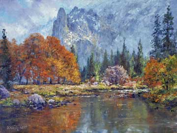
I first did a small color study of the final scene. I chose 9×12 as it is the same aspect ration as the final 30×40 painting. Below is part of an email I sent with a jpg of the first small study which gives some though process of the composition–
 |
Study #1 |
Dear Mary,
I have attached a jpg of the 9×12 study… First, let me walk through the painting a bit…
For the background, I put a little blue in the sky as you requested, splashed some light across Sentinel Rock, etc. I left the right side of the cliff face fairly undefined as this helps lead your eye away from here and towards the center of interest. I might add a touch of clinging snow to this area, but not much.…
Concerning the large black oaks, which is the primary center of interest. I actually painted them several times, with back light, direct light, with different shades of yellow and orange, and finally what you see. This seemed to look the best against Sentinel Rock. I also added more red than the original photos. I am not sure if you had specific fall colors in mind, but this seemed to work the best, at least to me. I also opened up the oaks a little so the bluish glow from the valley floor comes through. This really sets off the colors of the leaves. The bright colors of the oaks needed to be balanced with the rest of the painting, so I made one of the small bushes in the far right river bank more red, and muted the reddish tree in the middle ground.…
I added a little more interest to the stream bank, staggering it rather than just the straight line in the photos. One thing I want to change in the final painting is to lower the stream bank slightly, and open up the middle ground. This will allow me to make the oaks just a bit bigger.
In response to my first study, the collectors emailed me back:
Dear Donald,
We like the study you did very much, but would like the colors adjusted to better match our other picture. We also thought that the study had a sense of winter, with the gray sky and the clouds and the touch of snow–and we would prefer a sunnier, fall perspective, before the first snow. We like the oaks, but were less attached to the smaller tree in the center which is now a mauve color, and probably not a good match with the palette of our other picture. We are happy to have you decide on the size of the pines–you have a much better eye than either of us! Let me know what you think.
They also sent me a photo of the other painting in the room, shown further below, which gave me a better idea of the color of the foliage they want.
 |
Study #2 |
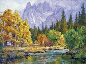
After seeing a jpg of the other painting in the room, I painted another study with the foliage more golden yellow to match. I also warmed up the cliffs in the background to match. I didn’t want to just paint over my first study as I thought it was a good salable painting in it’s own right.
Dear Mary,
I won’t walk through the painting again, but the first jpg seemed to have too much yellow, especially in the big trees. It seemed once I painted it large, the yellows would be overpowering. So, I thinned out the leaves a little and added a few more oranges & reds. These are actually a bunch of Black Oaks (or Cottonwoods??) and if I treat them more like individual trees with their own color it looks a little better. Also, the cliffs seemed too dark and blue for a fall scene, so I lighted and warmed them up considerably, and adjusted the rest of the painting accordingly.
I mailed the actual second study to the collectors and asked them to take a photo of it beside the painting in the room. Since cameras, monitors, lighting, etc. can vary widely, the only way to get an exact comparison is to have both in the same picture.
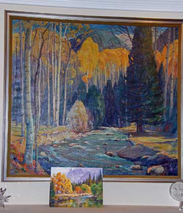 |
Painting by Walter Bailey with my study. |
Here is my response to Mary:
Dear Mary,
Seeing the two paintings side by side is very revealing! The yellows in the Bailey painting are a little brighter than I thought, but seem fairly in line with my study. Yes, I can put more blue in the sky and gray/blue out the cliffs if you want. There was a method to my madness…
The cloudy skies represent a harbinger of winter, and I would suggest we might leave in just a few wisps to keep a little interest in that area. The very dark, very saturated blue in the Bailey painting I don’t think would work across the entire sky, but more something in between.
I originally had the cliffs grayer and bluer, but thought a little more purple would represent warmer fall colors better, but either is fine. In the final large painting, (attached it again for your convenience) they are actually grayer/bluer, but still have quite a bit of purple and I would like to leave just a touch of purple on Sentinel Rock, as that draws your eye back into the painting a little more. At any rate, if this sounds OK with you, I will proceed.
As you can see the yellows in the two paintings were similar, and the collectors were satisfied with this study.
I had already started blocking in and working on the large final canvas, but no changes needed to be made as I had not yet reached the stage where colors were an issue.
My palette here consists of Ultramarine Blue, Cobalt Blue, Quinacridone Red, Cadmium Red Medium, Sap Green, Transparent Iron Oxide, Cadmium Orange, Yellow Ochre, and Cadmium Yellow Medium. I occasionally use other colors, but this is my primary palette.
I usually pre-mix a combination of Ultramarine Blue and Quinacridone Red to form a purple. This is usually the only use of Ultramarine I use in a painting. For most of the blue tones during the painting process, I usually stick with Cobalt Blue. I also mix Cobalt Blue and Cadmium Red Deep to get a rich gray.
My brushes are a #12 Bright for about 90% of the painting. I did occasionally use other brushes such as #12 filbert to do the sky and part of the cliffs. I used the round in order to get a little softer edge in places.
Starting the final large canvas, I first drew in the basic composition. Since I had a fairly complete study to go by, I didn’t need a lot of detail in the drawing. I did however detail Sentintenal Rock in the background. The profile had to be correct as it is a recognizable landmark in Yosemite Valley.
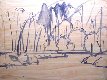
Dear Mary,
Thought you might like to get periodic updates on the progress of the painting. The attached jpg is my initial sketch-in. It doesn’t look like much, just a general indication of major masses. Since I have a study to work from, many details can be left out of the sketch. The one important item though, is the profile of Sentinel Rock. Since it is a recognizable landmark, I have to get it’s profile just right or the painting won’t work. I hope to get the background cliffs done by the beginning of next week as I will be in Tahoe much of that week.
Normally, I would block in much of the painting prior to working in detail. However, in this instance since I had a fairly detailed study to work with, I basically painted the canvas top down.
The sky and cliffs are painted primarily with my pre-mixed gray and purple with touches of other colors such as Cobalt Blue in the sky. I used primarily a #12 filbert bristle in order to keep the edges soft.
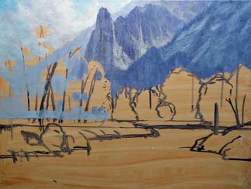
I sent a new jpg to the collectors, and received this response:
Dear Donald,
Overall we really love the painting. There is one adjustment we would like to suggest to see what you think. As you will see from the photos (and it’s even stronger in daylight), your painting’s mountains have a purplish cast and the sky is fairly white. These are the elements that most differ from the Bailey painting. And we our best memories of Yosemite tends toward gray granite and bright blue skies–which I think might line up better with the Bailey. Do you think those adjustments would work?
I now begin the painting in earnest. I agreed with Mary’s assesment that the cliffs were a little too warm or purple. I used mainly some Cobalt Blue, white, and some gray to cool them down and lighten them up.
The cliffs are now basically complete and I start blocking in the foliage and stream bank. With the foliage, I block in the rear darker, working my way forward in lighter colors. I use a variety of colors from Transparent Red Oxide to Cadmium Yellows. Highlight areas are left for last.
I will do the stream and reflections last as they need to accurately reflect the landscape.
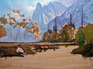
Continuing to work on the foliage, I paint the background evergreens, the large oaks and continue on the stream bank. I keep using brighter Cadmiums such as Orange and Yellow in more purer colors as I layer in the foliage.
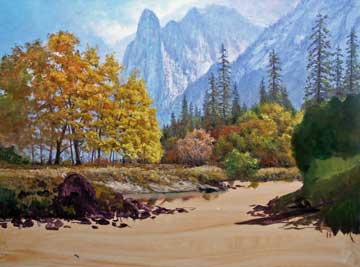
Dear Mary,
Here is another update. Much of the middle ground foliage and stream bank is in, maybe about 2/3 done. When the painting got large, the grassy stream bank looked too monotonous, so have added even more interest with a little erosion, more rocks, etc. Am still on track to finish the bulk of the work this week. Once this is done, I usually put it away over a period of several weeks and look at it occasionally with a fresh eye every few days to make adjustments.
After putting in most of the stream, I was starting to become dissatisfied with parts, especially the stream reflections.
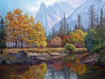
Dear Mary,
Just an update. I have painted in the Merced, fleshed out more of the river bank, and put more definition in the left and right banks. Frankly, I am not happy with the results, but here it is anyway. I painted and scraped parts of the Merced multiple times and it is still not right…the small jpg may look OK, but it is a mess, and the Merced deserves better. I may scrub much of it entirely tomorrow with a fresh look. The rocks on the left stream bank are not right…there is no balance.
I did scrub much of the stream and redo it. It had become too thick and muddy with paint. I generally paint water fairly thin without a lot of paint. This gives it a more liquid look as contrasted with the surrounding ground, which is put on more thickly.
I also scraped out the far left evergreen…
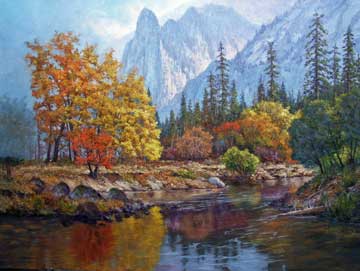
Dear Mary,
Attached is another jpg of where I am at now. Since I last emailed, I scraped and redid the water. Although it still needs more work, it looks much better now, but you may not be able to tell a lot of difference just from the jpg. I also changed the rocks, and the river bank needed something more, so added a redbud to break it up. I also modified the large foreground rocks, and may change them more once I get further along. I also painted out the evergreen on the far left. As I had it, it made the painting look a little claustrophobic. I need something there to bring your eye back into the painting, so might either paint another evergreen with less foliage, or maybe a dead tree or leafless tree.
The evergreen on the left is painted back in with a little less foliage, and the stream is improved.
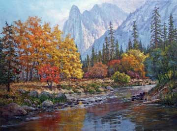
Dear Mary,
Attached is another jpg. At this point, all the elements are in and I consider the painting basically ‘complete’. However, as I mentioned before, I let it sit for awhile and make adjustments over a period of several weeks with an occasional fresh look.
Although not readily apparent in the jpg, minor adjustments are made all over the painting. After emailing the latest jpg to the collectors, I received this response.
Dear Donald,
I think it’s gorgeous. I have only two things to suggest: (1) The four boulders in a row in the lower left corner (starting at the new tree and reaching into the river) are rather uniform in shape, I might like some differentiation. (2) I also think the sky still looks a little grey–I do love the bright blue mid day sky in Yosemite. What do you think?
This was the response I was looking for. They liked the work overall, but also took enough time to go over it in detail to offer suggestions.
After a few more adjustments and adopting their suggestions, here is a little larger image of the final painting.
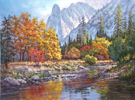
Since the collectors live in San Francisco, which is a little over an hours drive, I delivered it personally, which was the first time we met face to face.
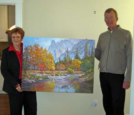
I also brought my paints along in case they wanted any minor color adjustments. They liked it as delivered so no further changes were made. Here is a photo of them holding the painting in front of the wall it will hang. The original agreement was to deliver it unframed. They seemed very pleased and I hope they still are!
I hope you enjoyed this oil painting demonstration landscape by Artist Donald Neff.
Follow this link to learn more about Donald and to view more of his work.
great talent,i would to know which book i can buy to help me how to paint still-life.
An interesting insight into the back & forth dialogue between you (the painter) and the purchasers (patrons, so to speak).
Thanks for sharing it!
I certainly appreciate your sharing this commentary with others. I am a fairly new painter of 4 years and started doing commissions for friends family members so do appreciate seeing how the true artists handle situations like that. I loved the first painting and the last one. both beautiful. thanks again for your time to lay this out and giving some insight on your work. I did bookmark your site.
This was an absolutely fascinating demonstration. Donald, your talent is unbelievable. I hope to enjoy many more of these in the future.
Joyce
Congratulations very beautiful your work, sorry that I live here in Brazil, because I would personally known to the artist.
.-= Evilinha Ramos´s last blog ..Baú em MDF =-.
absolutely fantastic work! I am so grateful for artists like yourself who are so willing to share some of their experiences and insights. Blessings to you!
Great fantastic work! Its just so refreshing to see work from such tallented artist like your self.Could spend hours looking at projects.Lets see more
Thanks for another great post!