About The Artist
Leslie Pease graduated from UMass Dartmouth with a BFA in illustration, in 1987. After many years of working as a computer graphic artist, she decided to return to her fine art roots. In April, 2002 Leslie began to seriously teach herself how paint. Floundering around for a short while, things started to “click” when Leslie fell into Portraits and Still Lifes. That was Fall, 2002 and she has not let the brushes dry since.
How to Paint Hands in Acrylics
INTRODUCTION
My name is Leslie Pease and welcome to my demonstration on hands! I hope this demonstration is helpful and more importantly, is clear! Doing the best I can, I conceed I am not a writer. I am going to try to make this as brief as possible, but hands are complex to paint; especially when they are the dominant subject. BUT certainly hands are not impossible and in this demonstration, you will see how I attempt to paint them.
KEEP IN MIND
There are a few things to keep in mind, before painting hands: Are the hands the subject of the piece? Are the hands as important as the primary subject of the painting? The way the hands are portrayed is important. If they are to be gently placed on the lap of a child, then the hands probably won’t need as much detail. If it’s a painting of hands holding something significant, or the hands themselves are the subject of the painting, then the detail should be more distinct.
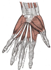
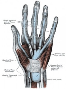
Anatomy is another thing that is extremely important to remember. What happens under the skin is what determines what happens on top of the skin. There’s no need to remember all the ligaments, muscles and bones by name, but it’s important to realize they do exist underneath and are the form and volume of the hand. It helps you understand why a wrinkle or a shadows happens “there” as opposed to “there”.
The images shown below are from “Gray’s Anatomy”, an excellent book that lists the entire body, including the hand. The wording is small in the images I’ve posted, but you have the idea of what is being shown.
 |  |
SKETCHING
After looking at the anatomy of a hand, you must sketch! it’s a good way to practice hands and you are always with a model! Waiting for the bus? Draw your hand! Someone’s late for an appointment, another good time to pose your built-in model! You know when you’ve got the free moment! With something to draw and a drawing surfacce, you are never bored and staying in condition!
PROMISE TIME!
Before you go any further, it’s promise time… It’s very important to keep in practice. Sketch books are a great journal and a way to not only keep in condition, but it’s also a good reference book for future ideas! So, please promise to keep a book and sketch often! Also, exercise the brain… look at something and draw it, with one continuous line AND without looking at your paper! Now, that’s a brain-twister and also a good way to learn to “trust” what you see. Eventually, you will be surprised at how accurate it can be!
THE COLORS
It’s time to address the subject of palette (colors). Here’s where I break your heart. There’s no such thing as a skin tone recipe! There are so many factors to consider – lighting, reflected color, skin tone, etc. A good example would be to take a white ceramic or porcelain cup (dish, bowl, whatever’s on hand) and walk around the room, holding it up to different objects. You will see colors reflected onto the white surface.
So, if you read this article (or scan to my palette) and try the colors on your painting and it doesn’t work, it’s probably because the colors in my palette are different from the colors you are using. You have to find the colors that are actually on the subject which you are painting to obtain “accurate” skin tones.
Click Image For Larger View
GETTING STARTED
Now, with the information provided, it’s time to pick a subject! There are MANY great subjects in the reference library from which to choose. So, please (!) go through the reference library, and sketch, draw, scratch or paint away! For my image, I have selected from the collection of hands I recently uploaded; a photo of my daughter’s hands.
Click Image For Larger View
THE UNDER-DRAWING
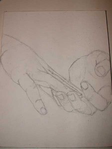
For my very first layer, I apply lots of layers of gesso. My painting style tends to be quite thin; therefore, the canvas texture shows through a bit too much. Once the gesso is completely dry, I start the sketch. In this case because of time restrictions, I didn’t appy the layers of gesso. You can really see the bite of the canvas, in the last photos…
I’ve selected an 8×10 inch canvas board and decided to paint the hands, “portrait style” (vertical), instead of “landscape” (horizontal), because the image is so powerful – the gentle touch of sister’s hands. Because there is such weight of love between those gentle fingers, I wanted a lot of space above them.
Also, it’s better not to cut the composition in “half”, so placing the hands below the halfway point keeps the painting’s composition strong. Also nice is the way the left hand flows into the hand on the right, where the flow is stopped by the open hand. Equally as fun is the weight the brightness gives to the right hand; the area where the subject of the painting is centralized.
Click Image For Larger View
PUTTIN’ ON THE PAINT
After the sketch is completed, gently “pounce” an eraser over the canvas to eliminate heavy pencil lines and lose graphite. Don’t work on the sketch too much. The graphite from the pencil does muddy in the first layers, if you aren’t careful.
Everyone goes about a painting, differently. Some load the paint on and all over the canvas, first layer out. Others paint from the top or bottom of the canvas, working towards the opposite end, completing the image as they go along. Some work on an area of the painting until that area is completed before moving on, while other painters work in thin layers all over the canvas. My style falls in the latter group; I paint in very thinned layers all over the canvas. As one section dries, another is addressed.
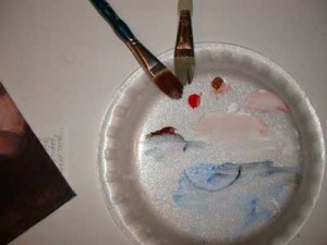
Another separation of artistic style is the actual palette. Everyone has different colors with which they feel comfortable. My palette is very limited and usually never changes. Although my paintings look as though just a few colors have been used, eight or nine colors are my usual palette. Keeping the palette relatively small is deliberate for several reasons.
- When I first started painting, PAINTING was hard enough without confusing things with many colors to choose from.
- My favorite art movement is the Rococco and Baroque period(s). The masters successfully created depth and beautifully illuminated subjects while still keeping the colors simple.
- Lastly, a limited palette helps the painting relate and flow well, unifying the painting.
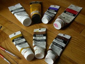
Although my demonstration can be attempted with any medium, I will be using acrylic (Liquitex) and my palette consists of:
Titanium White
Burnt Sienna
Raw Sienna
Cadmium Yellow Light
Cadmium Red Light
Cadmium Red Medium
Ultramarine Blue
Hookers Green
Yellow Oxide
My brushes usually range from new and in good shape to old and really ragged. The brushes are usually very inexpensive ones; the craft style, multi-pack brushes works well for me. I rarely throw them away, as they make great brushes to really scrub on the paint or to use for soft wispy like strokes. Of course, for a clean, crisp line, I will use a brand new or fairly new brush.
Remember, not all people are the same. The old and rough brushes may not work for you. So, experimenting is always a good suggestion.
Click Image For Larger View
FIRST LAYER ON CANVAS
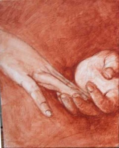
I like to immediately create the extreme contrasts between the dark and lights. In some cases, it might be as small as the tip of a dog’s nose. In this case, it’s the entire background. I started the painting as a monochromatic showing darkest areas and depth making it easier to see the form of the hand.
Putting the underpainting down helps me to see the image on the canvas better and corrections can be made.
Click Image For Larger View
THE NEXT LAYER – ADDING COLOR
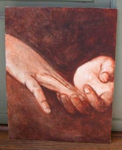
In this layer, I have begun to really darken the background and parts of the fingers. My mixture of colors are Ultramarine Blue and Burnt Sienna with a small bit of Cadmium Red Dark (pulling the color of the hands into the background). Some of the light areas in the background are intentional and some are a result of applying the paint while the layer beneath was still wet. The areas mostly around the left side of the painting and the bottom right are the areas where I tried to keep the background light.
When you apply a wet layer on a layer that hasn’t completely dried, the layer beneath tends to lift or rub off the canvas. This is something to keep in mind when painting in layers with acrylics. Although it tends to be a problem only with the first couple of layers; subsequent layers tend to not show the lifting as badly.
Click Image For Larger View
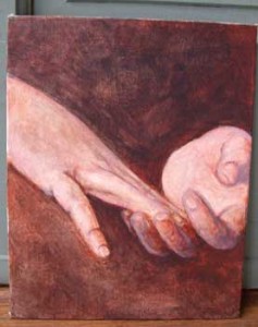
To create depth, I tried to avoid “outlining” the hands by using the shadows and the reflected light to define the hands. Although the painting appears to be blotchy at this point, that’s not a worry. As more layers of color are added, things will smooth out.
UPSIDE DOWN
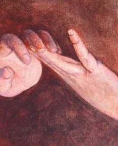
In the image to your right, you will see the image upside down. That is deliberate… It’s at this point, I am most UNHAPPY with my work and viewing it at this angle helps me to stop seeing the painting and image as I “see” it and more the way the image actually is. After a little time of painting, I am surprised at how much better things look right side up!
In the next few photos, you will see where I’ve started to add the light flesh tone. For this, I used Cadmium Red Light, White and a touch of Cadmium Yellow Medium. I use large brushes when doing this because I am not concerning myself with the small details, yet.
Click Images For Larger View
LIGHTEN AND DARKEN
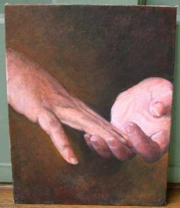
While still working over the surface of the entire painting, I have lightened areas and darkened others continuing to define the mass of the hands. If you look at your own hands, you will see that the curves and lines are defined by the shadows and highlights. In the images below, you can see the subtle adjustments. After many hours, those subtle “adjustments” eventually accumulate into a finished piece.
In the next image, after a few hours of adjusting, I am almost there. The top side of the hand on the left still looks rough. Also, the entire painting lacks the softness needed to finish the “emotion” of the touch. That usually happens in the last layer or two and that is when I am finally happy with my work.
Click Image For Larger View
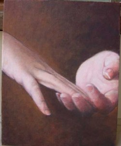
“A SISTER’S TOUCH”
And here is the final image! I have named this painting, “A Sister’s Touch”, after my daughters and their wonderful friendship. Soon it will be made even more special, surrounded by a beautiful gold frame, lovingly handmade by my husband.
Click Image For Larger View

Your painting of the hands is so eloquent and beautiful. Thank you fro sharing this wonderful talent.
Hands are a very detailed subject, and after having painted a
few pairs myself, I admire your demonstration/info very much. I have never really had a system in mind, or at hand, when I started my “hands” I have painted on portraits, but I will remember your system for the next time, proven effective! The lighting is really the most challenging part of hands painting, fingers, angles, etc.
Very good guide,thank you very much.Strange,that there is no charge for sharing your knowledge. 🙂