Meet the Artist :
From an early age, Greg has worked to hone his craft, learning from past masters and inventing his own techniques and styles. In the process, he has built a body of work and list of awards that any painter would be proud to call his own.
With 30 solo and many juried group exhibitions to his credit, Greg Biolchini’s list of shows is testament to his solid local and growing national reputation. After winning his third national award at the National Arts Club in New York City, Greg was awarded Master Pastelist status by the Pastel Society of America. This, combined with his growing list of national honors and awards has helped further his reputation.
Greg enjoys tremendous popularity as a teacher. His workshops and demonstrations are well attended and consistently rated by attendees as superb.
Greg lives and works in Southwest Florida, with studio and teaching space on the Caloosahatchee River in North Fort Myers. He holds ongoing workshops in pastel, oil, and portraiture in his teaching studio and for art groups throughout Florida and the US (see workshop schedule).
Visit Greg’s Site:
A Direct Approach to Acrylic Painting by Greg Biolchini
Originally published by Daniel Smith Art Supply Co.
“For years I stayed away from acrylics, thinking they were certainly not a medium for a representational realist painter such as myself. They dried too fast, making it impossible for serious paint manipulation. I am very glad my curiosity finally got the best of me and I began to experiment with this wonderful, timesaving, uncomplicated medium.”
To begin, I like to prepare my own canvas. I start with a medium-textured canvas that I stretch myself on heavy-duty professional stretcher bars. I give the canvas three or four good coats of acrylic gesso, sanding between coats.
Working from my own photographs, I started my Great Blue Heron painting by drawing a center of interest with soft willow vine charcoal. Using a big stick of soft charcoal, I drew the lily pads and grass, quickly blocking in the darks and lights. The soft charcoal was well-suited for this spontaneous process—all I had to do to make changes was wipe away the charcoal with a paper towel.
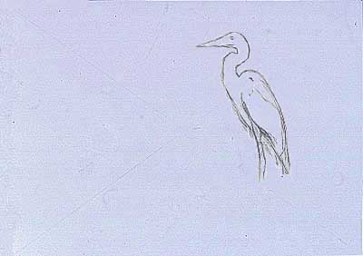
Figure 1: Center of interest is sketched in for placement in the picture plane.
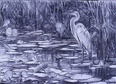
Figure 2: Rough preliminary charcoal drawing.
At this stage, I am composing the preliminary drawing directly from my photographic references onto the canvas. Now, using hog bristle brushes, I removed some of the charcoal to produce the grasses in the background. For removing very dark areas of charcoal, I used erasers such as a kneaded eraser and magic rub. I did not use my fingers to remove or spread the charcoal. Fingers leave oils from your skin on the canvas, making it difficult to further manipulate the charcoal. Once I was satisfied with my charcoal drawing, I sprayed it with clear acrylic fixative. Figure 1 shows my painting at this point of completion.
Next, I began blocking in warm and cool acrylic washes over my charcoal drawing. I thinned the acrylics with water, making them transparent and allowing the charcoal drawing to show through. I used cobalt and phthalo blue for the cool, blue washes, and hansa yellow medium and deep for the warm washes. The yellows mixed with a little permanent red became orange.
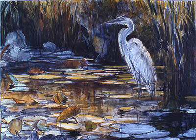
Figure 3: Transparent acrylic wash over charcoal drawing.
I applied the acrylic glazes quickly with a large flat brush made especially for acrylics. I did my color mixing and thinning in a Stay-wet palette. The Stay-wet Palette was indispensable because, as the name implies, it keeps my acrylic mixes wet and workable for a very long time. For this transparent wash stage, I was able to determine where the cool and warm, darks and lights should be in my painting, based on my reference photography and a little imagination. Figure 2 shows the painting at this stage.
This acrylic wash over a rough charcoal drawing is an easy process compared to doing several separate preliminary drawings. At this early stage of my painting, I had already gotten a pretty good idea of what my finished painting would look like.
At this point, I thickened my paint, using less water than in the previous stage, and allowed it to become more opaque. I added only three additional colors to my palette: titanium white, quinacridone magenta, and violet. I used the magenta mostly in the lily pads. I began to use softer smaller brushes, the type called flats—numbers 6, 4, and 2—on the more detailed areas throughout my painting, see Figure 4.
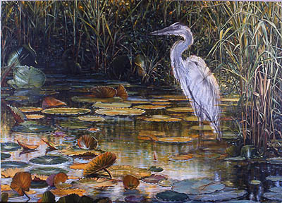
Figure 4: Near-completion with opaque acrylic paint.
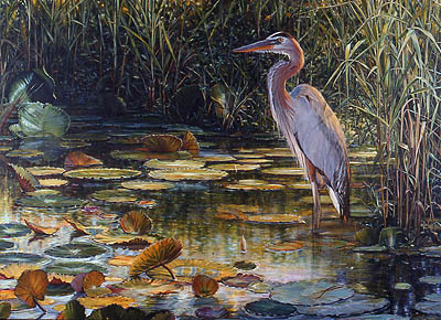
Figure 5: More details are added to the bird and highlights and shadows are more developed. Light is given a more luminous, natural feel.
A note about brushes: I always do better using a brush that is a bit bigger than would seem necessary to do the job. I have found the slightly larger brushes do a better job and are a bit faster. I use the very smallest brushes only after trying and failing with a slightly larger brush. I used the tapered edge of high quality responsive synthetic flats for the smaller, more detailed areas in this painting. I want to stress that I used the softer synthetic flats only for the finest details, and only after first blocking everything in with the larger slightly stiffer nylon brushes.
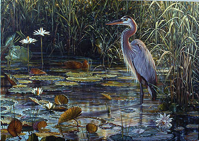
Figure 6: Lighter-colored plants and flowers are added to improve the overall composition and move the viewers eye through the painting.
Standing back and looking at the painting, I decided the background was a bit too busy and needed some additional elements to lead the viewer’s eye from place to place. I decided to add white lily flowers. The lily flowers were in some of my reference photographs but I hadn’t been sure I needed them until now. Working in the same fashion I had done for the rest of the painting, I blocked in the big, bold strokes using a slightly stiffer, larger, and more responsive brush. I then painted back over these big strokes with my slightly softer smaller brushes, for the detail. Notice that I also worked over the entire painting, adding touches of almost pure white accents to areas such as the bird and the flowers, and almost pure mars black, especially to the bird. I saved most of my darkest darks and my lightest lights for near the end of the painting. Almost like the final seasoning on food, these strong contrasting accents directed the viewer’s eye to areas of interest throughout my painting.
With these final accents, I brought this painting to completion, see Figure 4. The last step was to varnish it immediately with several coats of gloss acrylic medium.
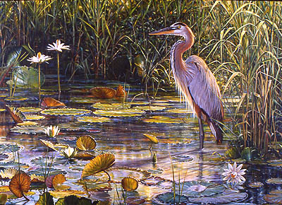
Figure 7: Finished Great Blue Heron acrylic painting, 38″ x 53″.
I am very happy to say this preliminary drawing method done directly onto my canvas was much faster and more satisfying than having to first do a series of rough drawings to develop my composition. I have found that using transparent acrylic washes over a fixed charcoal drawing enabled me to establish my warm and cool values quickly and early on in my painting process, allowing the finishing stages of my painting to progress smoothly and quickly.
All acrylic brands and brushes are compatible with each other.
What a magnificent painting, Greg!!!
Beautiful, quite lovely. I especially appreciate his ability to paint “light” to bring the painting to life.
Really LOVE this picture, it is amazing
Brilliant art, magnificent painting, i learned a lot from this description, it encouraged me to paint with confidence while using acrylics.
Not so long ago I discovered your blog and have been reading along quietly. I thought I might leave my opening comment. Im not sure what to say but that Ive really enjoyed reading. Interesting blog. I intend to carry on coming to this site in the future. I have also got your rss feed to get updates.
What a fabulous painting. So far I’m just a self-taught painter and have a lot to learn. I haven’t found anything I would rather be doing than painting.
Greg this is truly a wonderfully executed painting.
I my self am an art student and had been able to consolidate my style of charcoal drawings but seemed dumb struck about how to build on this and develop the ability to paint with acrylics. My initial attempts were really dismal to say the least. Reading your instruction about putting down the initial sketch in charcoal and then cover with fixative, seems like the missing link for me.
Thank you
will try this and certainly let you know how it going
fingers crossed.
Donna
Your painting is incredible! I really enjoyed seeing how it evolved. I’ve never painted with acrylics before but I just bought my first set and I’m checking out tutorials. This one of yours is wonderful.
Great idea to put the charcoal value sketch directly on the canvas! I wish I had read this before I started the acrylic painting I am working on now. I will try this next time. Oh, and I love your painting.
Thanks for sharing your techniques. I’m in my 3rd acrylic painting course and none of the instructors teach (or know?) how to paint realistically. This is welcome encouragement. You are a very talented painter!
My spouse and I came here simply because this particular blog site was tweeted by a girl I was following and i am excited I made it here.
My brother recommended I might like this web site. He used to be entirely right. This submit truly made my day. You cann’t consider just how much time I had spent for this info! Thanks!